Fashion & Apparel Welcome Email Template
“Welcome to Radical Transparency”

Design Score
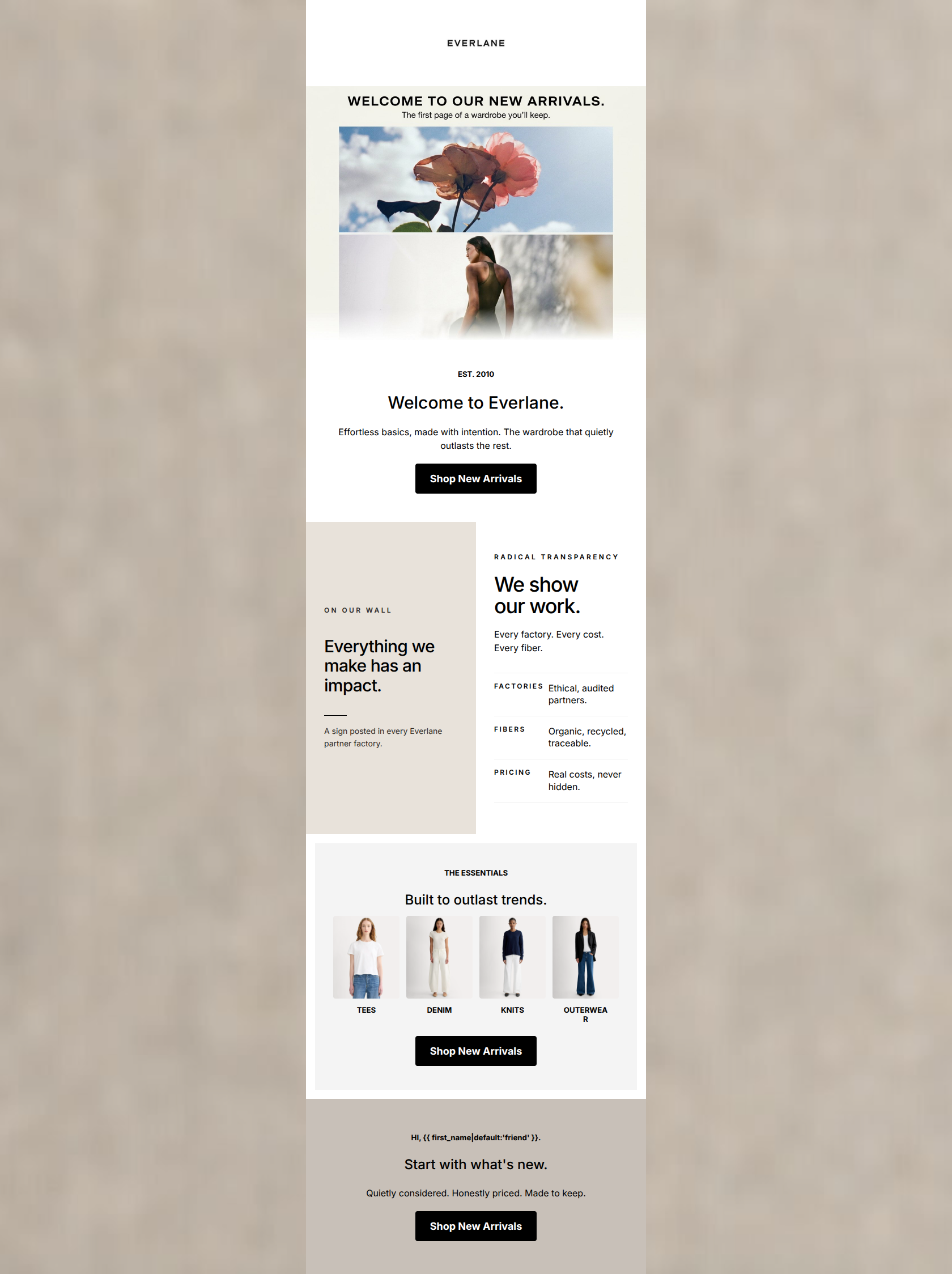
74/100A visually cohesive welcome email that perfectly captures Everlane's 'quiet luxury' aesthetic and 'Radical Transparency' ethos. However, it functions more as a corporate manifesto than a conversion vehicle. By focusing entirely on brand philosophy at the expense of product discovery, and repeating the same 'factories and materials' message across multiple sections, it misses the opportunity to immediately guide the new subscriber into a shopping journey. The transition from a strong 'Start Shopping' CTA to secondary 'read about us' CTAs dilutes the primary goal.
Create Your Own
Generate professional email designs like this one in seconds with Kopi AI.
Email Details
- Subject Line
- Welcome to Radical Transparency
- Brand
- Everlane [eval 2026-03-26]
- Industry
- Fashion & Apparel
- Email Type
- Welcome
- Created
- March 26, 2026
Brand Colors
Email Copy
Made Right. Priced Right.
Every piece in our collection starts with the best materials, ethical factories, and honest pricing. No markups, no games.
→ Start Shopping
Built to Last
We partner with the world's best ethical factories and use premium materials. Quality you can feel, from people treated fairly.
→ Our Story
Why This Email Works
A visually cohesive welcome email that perfectly captures Everlane's 'quiet luxury' aesthetic and 'Radical Transparency' ethos. However, it functions more as a corporate manifesto than a conversion vehicle. By focusing entirely on brand philosophy at the expense of product discovery, and repeating the same 'factories and materials' message across multiple sections, it misses the opportunity to immediately guide the new subscriber into a shopping journey. The transition from a strong 'Start Shopping' CTA to secondary 'read about us' CTAs dilutes the primary goal.
Hero Impact
85/100- Striking, brand-aligned editorial photography.
- Clear, high-contrast primary CTA button.
- Immediate introduction of the core brand differentiator.
Content Structure & Flow
75/100- Distinct visual sections prevent the email from looking like a wall of text.
- The dark footer section creates a strong, anchoring conclusion.
Visual Hierarchy & Layout
82/100- Strong visual framing of the CTAs.
- Generous padding allows the content to breathe.
- The dark section acts as a strong visual pattern interrupt.
Call-to-Action Strength
70/100- Excellent color contrast makes buttons impossible to miss.
- Action-oriented verbs are used consistently.
Message Clarity & Tone
78/100- Confident, unapologetic tone.
- Avoids cheap promotional language or urgency gimmicks.
Readability & Scannability
85/100- Excellent use of descriptive subheadings.
- High contrast between text and background across all sections.
- Bite-sized copy blocks.
Offer & Value Proposition
72/100- The 'Radical Transparency' differentiator is front and center.
- The 'Know Your Costs' breakdown is a compelling, unique value add.
Personalization & Audience Fit
75/100- Aesthetic perfectly matches the audience's desire for 'quiet luxury'.
- Messaging addresses core audience pain points regarding fast fashion and opacity.
Copy Conciseness & Word Economy
65/100- The 'Know Your Costs' section is tightly written and explains a complex concept simply.
- Headings are punchy and concise.
Quick Wins
- Change the 'Our Story' button to 'Shop Essentials' to drive users toward shoppable categories rather than informational pages.
- Rewrite the body copy in the 'Built to Last' section to remove the redundant mention of factories and materials, focusing solely on product longevity.
- Shift the 'we' language in the hero paragraph to 'you' language to make the value proposition more customer-centric.


Create Professional Email Designs
Generate beautiful, on-brand email designs in seconds. Just enter your brand URL and let AI do the rest.