Health & Wellness Welcome Email Template
“Welcome to PureSmile: The Art of Oral Care”

Design Score
74/100This email succeeds visually, perfectly capturing the brand's 'Tech-Luxury' aesthetic with high-quality imagery and a clean layout. However, it suffers from 'designeritis': the copy is too passive, the core offer is buried in body text, and the headlines rely on vague aspirational clichés rather than concrete benefits. It looks premium but fails to aggressively sell the value.
Create Your Own
Generate professional email designs like this one in seconds with Kopi AI.
Email Details
- Subject Line
- Welcome to PureSmile: The Art of Oral Care
- Brand
- PureSmile LT
- Industry
- Health & Wellness
- Email Type
- Welcome
- Created
- February 6, 2026
Brand Colors
Email Copy
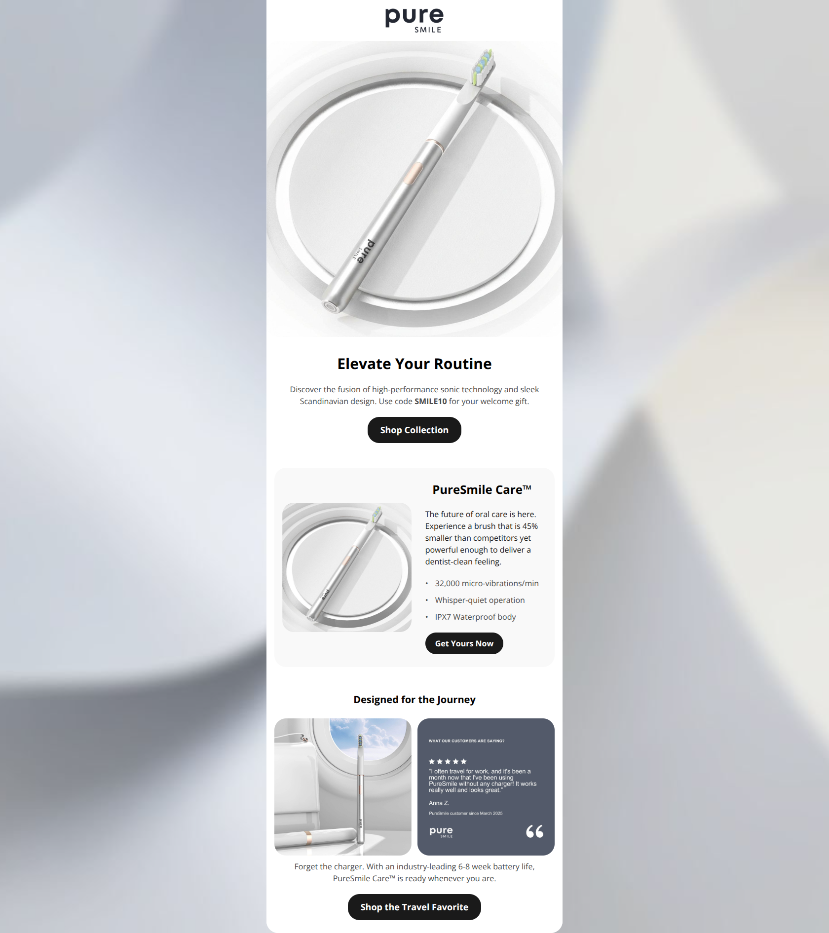
Preview text: Experience Scandinavian minimalism meets sonic technology. Your 10% gift inside.
Elevate Your Routine
Discover the fusion of high-performance sonic technology and sleek Scandinavian design. Use code SMILE10 for your welcome gift.
→ Shop Collection
PureSmile Care™
The future of oral care is here. Experience a brush that is 45% smaller than competitors yet powerful enough to deliver a dentist-clean feeling.
- 32,000 micro-vibrations/min
- Whisper-quiet operation
- IPX7 Waterproof body
→ Get Yours Now
Designed for the Journey
Forget the charger. With an industry-leading 6-8 week battery life, PureSmile Care™ is ready whenever you are.
→ Shop the Travel Favorite
Why This Email Works
This email succeeds visually, perfectly capturing the brand's 'Tech-Luxury' aesthetic with high-quality imagery and a clean layout. However, it suffers from 'designeritis': the copy is too passive, the core offer is buried in body text, and the headlines rely on vague aspirational clichés rather than concrete benefits. It looks premium but fails to aggressively sell the value.
Hero (top/initial part) Impact
72/100- High-quality product photography that immediately establishes the premium aesthetic.
- Clean use of whitespace that focuses attention on the center path.
Content Structure & Flow
80/100- Clear separation of sections using background colors (white vs. light grey).
- Logical progression from 'what is it' to 'why is it better'.
Visual Hierarchy & Layout
88/100- Excellent use of the 'Zig-Zag' layout in the product card section to break up vertical scanning.
- Restrained color palette reinforces the luxury positioning.
Call-to-Action Strength
70/100- High-contrast black buttons stand out clearly against the light background.
- Buttons are consistently placed at the bottom of their respective logic blocks.
Message Clarity & Tone
75/100- Consistent brand voice that feels sophisticated and calm.
- The '45% smaller' claim is a specific, clear differentiator.
Readability & Scannability
85/100- Use of bullet points for technical specs reduces reading effort.
- Typography size is legible on both desktop and mobile.
Offer & Value Proposition
60/100- The unique selling proposition (compact size, battery life) is present, even if the financial offer is weak.
Personalization & Audience Fit
60/100- The imagery and tone perfectly match the 'design-conscious' target demographic.
Quick Wins
- Extract the 'SMILE10' code from the paragraph and place it in a bold, distinctive element above the CTA.
- Rewrite the Hero Headline to be concrete: 'The Sonic Toothbrush, Reimagined' instead of 'Elevate Your Routine'.
- Swap the headline 'Designed for the Journey' with the much stronger sub-text: 'Forget The Charger For 8 Weeks'.
- Change the main CTA text from 'Shop Collection' to 'Shop PureSmile Care' to reduce friction.
Create Professional Email Designs
Generate beautiful, on-brand email designs in seconds. Just enter your brand URL and let AI do the rest.