Design Score
85/100This welcome email effectively serves as a 'user manual' for new shoppers, addressing the brand's key pain point: the overwhelming nature of a massive marketplace. By focusing on two 'tricks' (Image Search and Seller Ratings), it empowers the user with utility. The CTA strategy is flawless in its consistency, though the visual design leans a bit too 'clean' and 'safe,' missing some of the energetic, maximalist bustle that defines the Taobao brand identity.
Create Your Own
Generate professional email designs like this one in seconds with Kopi AI.
Email Details
- Subject Line
- 欢迎来到万能的淘宝,送你一份不迷路指南
- Brand
- Taobao (淘宝)
- Industry
- Other
- Email Type
- Welcome
- Created
- July 7, 2026
Brand Colors
Email Copy
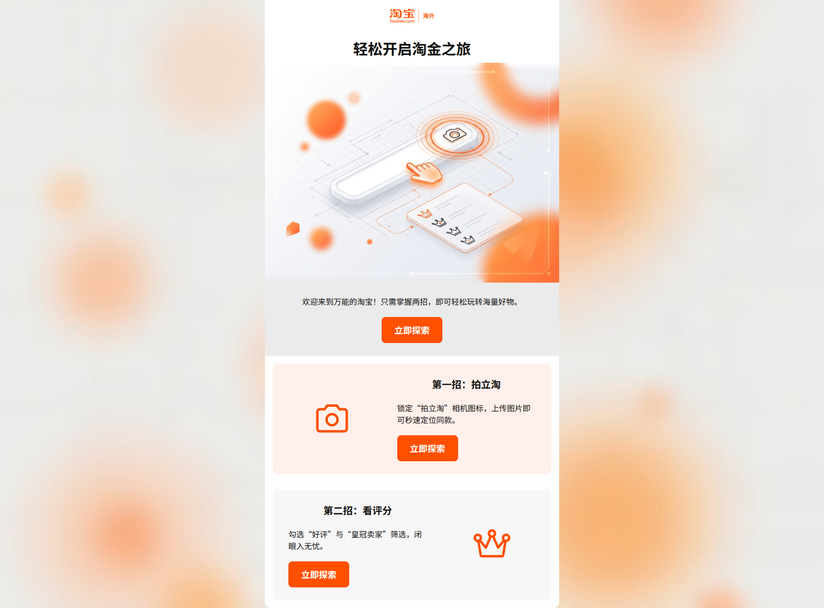
Preview text: 开启你的探索之旅:手把手教你巧用“拍照识图”与“高评分筛选”,轻松淘到心仪好物。
轻松开启淘金之旅
欢迎来到万能的淘宝!只需掌握两招,即可轻松玩转海量好物。
→ 立即探索
第一招:拍立淘
锁定“拍立淘”相机图标,上传图片即可秒速定位同款。
→ 立即探索
第二招:看评分
勾选“好评”与“皇冠卖家”筛选,闭眼入无忧。
→ 立即探索
Why This Email Works
This welcome email effectively serves as a 'user manual' for new shoppers, addressing the brand's key pain point: the overwhelming nature of a massive marketplace. By focusing on two 'tricks' (Image Search and Seller Ratings), it empowers the user with utility. The CTA strategy is flawless in its consistency, though the visual design leans a bit too 'clean' and 'safe,' missing some of the energetic, maximalist bustle that defines the Taobao brand identity.
Hero (top/initial part) Impact
82/100- Clear, benefit-oriented headline.
- High-quality isometric illustration that supports the 'utilitarian' brand voice.
Content Structure & Flow
90/100- Excellent use of the 'Rule of Three' (Intro + 2 Tips).
- Clear modular layout using cards to separate different concepts.
Visual Hierarchy & Layout
88/100- Consistent use of the brand orange (#FF5000) for primary actions and icons.
- Good balance between text and iconography.
Call-to-Action Strength
98/100- Perfect implementation of the 'Single Primary Action' rule.
- High contrast buttons that pass the squint test with ease.
Message Clarity & Tone
92/100- Clear, jargon-free explanations of technical features.
- Focus on 'how to win' as a shopper.
Readability & Scannability
94/100- Short, punchy sentences.
- Bold headings for each value-add section.
Offer & Value Proposition
75/100- Strong 'soft' value prop: teaching the user how to shop smarter.
Personalization & Audience Fit
50/100- Appropriate use of simplified Chinese for the target market.
Copy Conciseness & Word Economy
98/100- Zero redundant sentences.
- Action-oriented verbs throughout.
Quick Wins
- Swap the neutral grey background (#ebebeb) for white or a very pale orange (#FFF9F7) to keep the visual energy high and brand-aligned.
- Add a 'First Order' coupon code or promotional banner at the very top or bottom to provide a concrete reason to 'Explore Now.'




Create Professional Email Designs
Generate beautiful, on-brand email designs in seconds. Just enter your brand URL and let AI do the rest.