Electronics & Tech Product Launch Email Template
“Welcome to liquid glass.”
Design Score
80/100This email exemplifies Apple's classic minimalist aesthetic, delivering a clean, readable, and on-brand experience that communicates quality. However, it relies too heavily on implicit navigation—specifically in the 'Camera Control' section which lacks a button—and uses repetitive copy ('major leap' vs. 'giant leap') that dilutes the narrative progression.
Create Your Own
Generate professional email designs like this one in seconds with Kopi AI.
Email Details
- Subject Line
- Welcome to liquid glass.
- Brand
- Apple
- Industry
- Electronics & Tech
- Email Type
- Product Launch
- Created
- February 7, 2026
Brand Colors
Email Copy
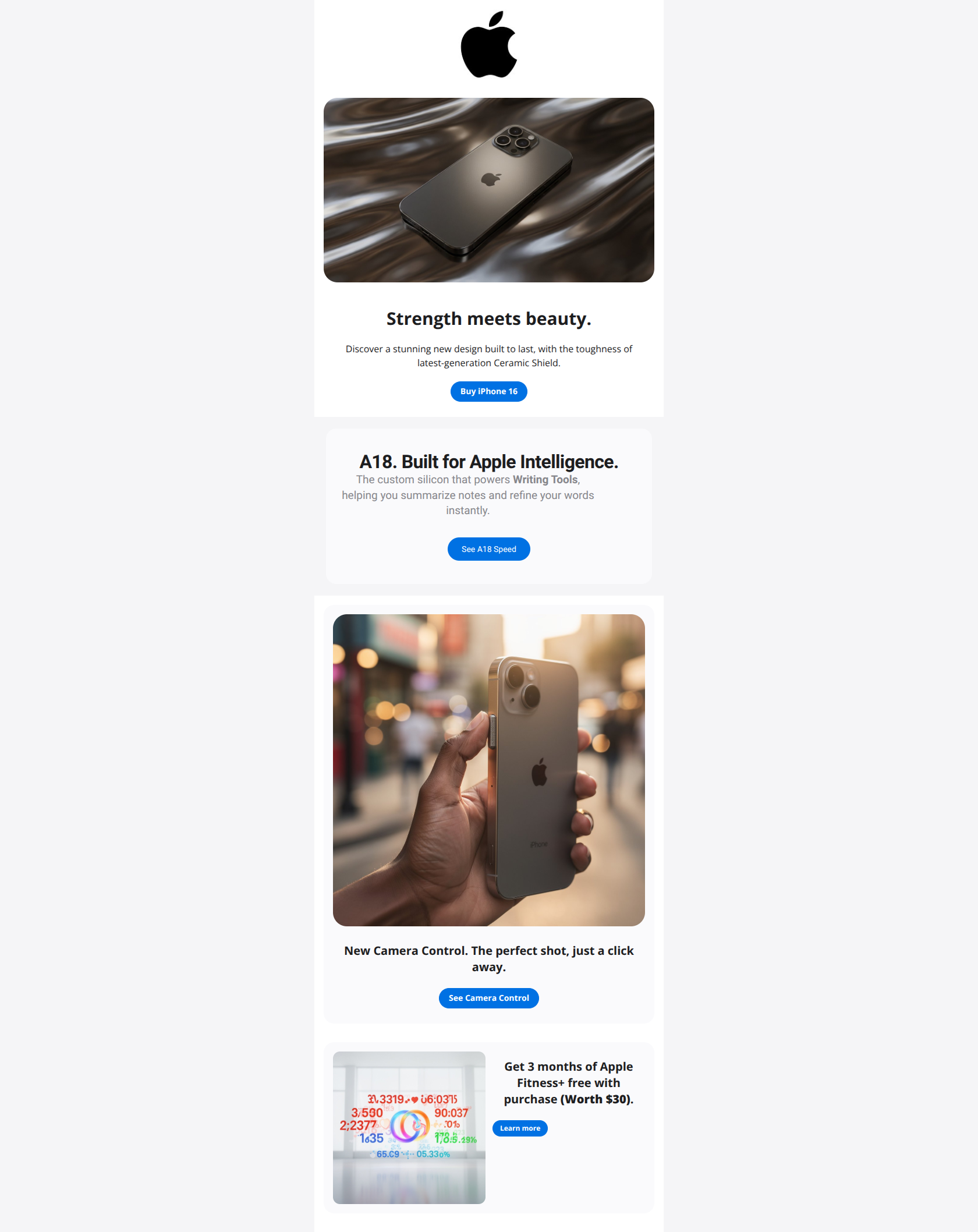
Strength meets beauty.
Discover a stunning new design built to last, with the toughness of latest-generation Ceramic Shield.
→ Buy iPhone 16
New Camera Control. The perfect shot, just a click away.
→ See Camera Control
Get 3 months of Apple Fitness+ free with purchase (Worth $30).
→ Learn more
Why This Email Works
This email exemplifies Apple's classic minimalist aesthetic, delivering a clean, readable, and on-brand experience that communicates quality. However, it relies too heavily on implicit navigation—specifically in the 'Camera Control' section which lacks a button—and uses repetitive copy ('major leap' vs. 'giant leap') that dilutes the narrative progression.
Hero Impact
85/100- Primary CTA 'Buy iPhone 16' is high-contrast, perfectly positioned, and distinct.
- Minimalist aesthetic immediately establishes premium brand identity.
Content Structure & Flow
80/100- Clear progression from emotional appeal (Beauty) to rational proof (A18 Chip) to lifestyle benefit (Camera).
- Sections are well-separated, preventing information overload.
Visual Hierarchy & Layout
78/100- Typography hierarchy (H1 vs. H2 vs. Body) is consistent and clearly guides scanning.
- Generous padding prevents the design from feeling cramped.
Call-to-Action Strength
70/100- Primary 'Buy iPhone 16' button uses the brand's core blue (#0071E3), offering perfect contrast against the white background.
- Button shape (pill) is consistent with web/OS interface expectations.
Message Clarity & Tone
88/100- Short, punchy sentences make the content easy to digest.
- Consistent premium tone that aligns with the website experience.
Readability & Scannability
90/100- Dark grey text (#1D1D1F) on light grey/white backgrounds passes all accessibility contrast checks.
- Headlines break up the content effectively.
Offer & Value Proposition
78/100- Inclusion of the Fitness+ offer provides a rational 'tipping point' incentive for on-the-fence buyers.
- Reference to 'durability' addresses a known customer pain point (breaking phones).
Personalization & Audience Fit
70/100- Smart framing of the A18 chip comparison targets users on older 2-year cycles (A16 generation).
Quick Wins
- Add a visible CTA button (e.g., 'See Camera Control') to the Camera Control lifestyle card.
- Change the secondary CTA copy from 'Learn more' to 'See A18 Speed' or 'Compare Performance'.
- Bold the text '(Worth $30)' in the Fitness+ section to make the monetary value pop.


Create Professional Email Designs
Generate beautiful, on-brand email designs in seconds. Just enter your brand URL and let AI do the rest.