Jewelry & Accessories Welcome Email Template
“Welcome to Kelly Bello Design”
Design Score
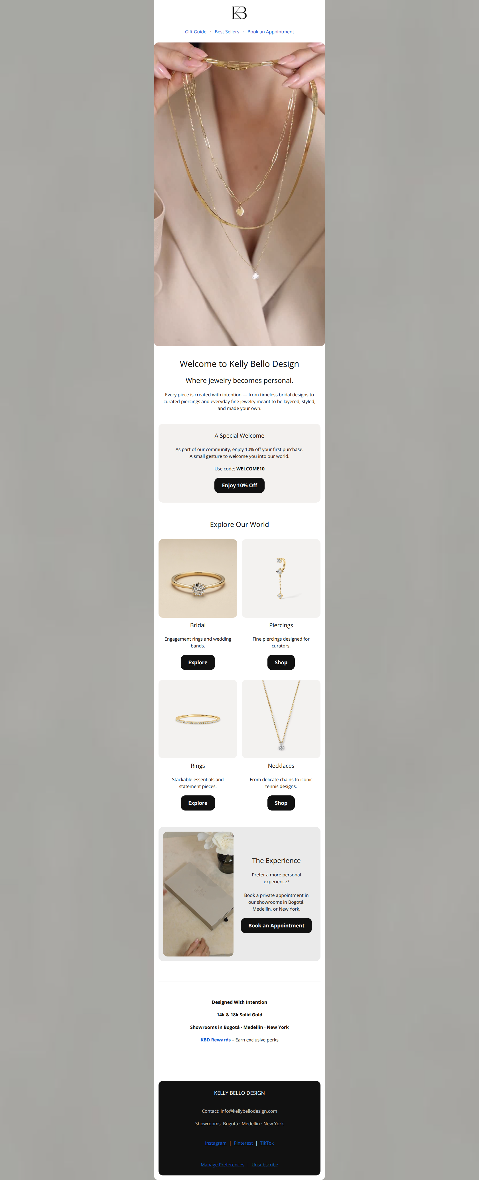
75/100This welcome email presents a strong, on-brand aesthetic that aligns well with the minimalist luxury positioning of Kelly Bello Design. While the visual storytelling is effective, the conversion path is diluted by a lack of clear CTA hierarchy and a buried primary offer.
Create Your Own
Generate professional email designs like this one in seconds with Kopi AI.
Email Details
- Subject Line
- Welcome to Kelly Bello Design
- Brand
- Kelly Bello Design
- Industry
- Jewelry & Accessories
- Email Type
- Welcome
- Created
- March 1, 2026
Brand Colors
Email Copy
Gift Guide · Best Sellers · Book an Appointment
Welcome to Kelly Bello Design
Where jewelry becomes personal.
Every piece is created with intention — from timeless bridal designs to curated piercings and everyday fine jewelry meant to be layered, styled, and made your own.
A Special Welcome
As part of our community, enjoy 10% off your first purchase. A small gesture to welcome you into our world.
Use code: WELCOME10
→ Enjoy 10% Off
Explore Our World
Bridal
Engagement rings and wedding bands.
→ Explore
Piercings
Fine piercings designed for curators.
→ Shop
Rings
Stackable essentials and statement pieces.
→ Explore
Necklaces
From delicate chains to iconic tennis designs.
→ Shop
The Experience
Prefer a more personal experience? Book a private appointment in our showrooms in Bogotá, Medellín, or New York.
→ Book an Appointment
Designed With Intention
14k & 18k Solid Gold
Showrooms in Bogotá · Medellín · New York
KBD Rewards – Earn exclusive perks
KELLY BELLO DESIGN
Contact: info@kellybellodesign.com
Showrooms: Bogotá · Medellín · New York
Instagram | Pinterest | TikTok
Manage Preferences | Unsubscribe
Why This Email Works
This welcome email presents a strong, on-brand aesthetic that aligns well with the minimalist luxury positioning of Kelly Bello Design. While the visual storytelling is effective, the conversion path is diluted by a lack of clear CTA hierarchy and a buried primary offer.
Hero Impact
65/100- The hero image is high-quality, aspirational, and perfectly captures the brand's aesthetic of layered, fine jewelry.
Content Structure & Flow
80/100- Clear progression from the primary goal (redeeming the welcome offer) to secondary goals (shopping categories, booking an appointment).
- The inclusion of 'The Experience' section adds a strong luxury touch that differentiates the brand from purely e-commerce competitors.
Visual Hierarchy & Layout
70/100- The 2x2 product category grid is perfectly balanced and easy to scan.
- Alternating background colors (white, taupe, light gray) subtly but effectively separates distinct content blocks.
Call-to-Action Strength
65/100- Button text is action-oriented ('Enjoy', 'Explore', 'Book').
- Buttons have sufficient tap-target size and contrast against their backgrounds.
Message Clarity & Tone
85/100- The tagline 'Where jewelry becomes personal' immediately communicates the brand's unique value proposition (customization/curation).
- The tone is perfectly balanced between luxury and approachability.
Readability & Scannability
80/100- Excellent use of clear, descriptive subheadings ('Bridal', 'Piercings') paired with concise, one-sentence descriptions.
- High contrast text (black on white/light gray) ensures legibility.
Offer & Value Proposition
75/100- The inclusion of fundamental brand value props at the bottom (solid gold, showrooms, rewards) reinforces trust for a first-time buyer.
- The offer is straightforward with no complex tiered conditions visible.
Personalization & Audience Fit
80/100- Highlighting 'Piercings' as a distinct top-level category speaks directly to the brand's specific, trend-conscious audience.
- The 'Experience' section speaks directly to a luxury audience that values high-touch, private appointments.
Quick Wins
- Demote the visual style of the secondary 'Explore/Shop' buttons to text links to make the main 10% off CTA stand out.
- Change the standard blue link color at the top and bottom of the email to black with an underline to match the brand aesthetic.
- Make the promo code 'WELCOME10' bolder and larger so it is unmissable.

Create Professional Email Designs
Generate beautiful, on-brand email designs in seconds. Just enter your brand URL and let AI do the rest.