Fitness Welcome Email Template
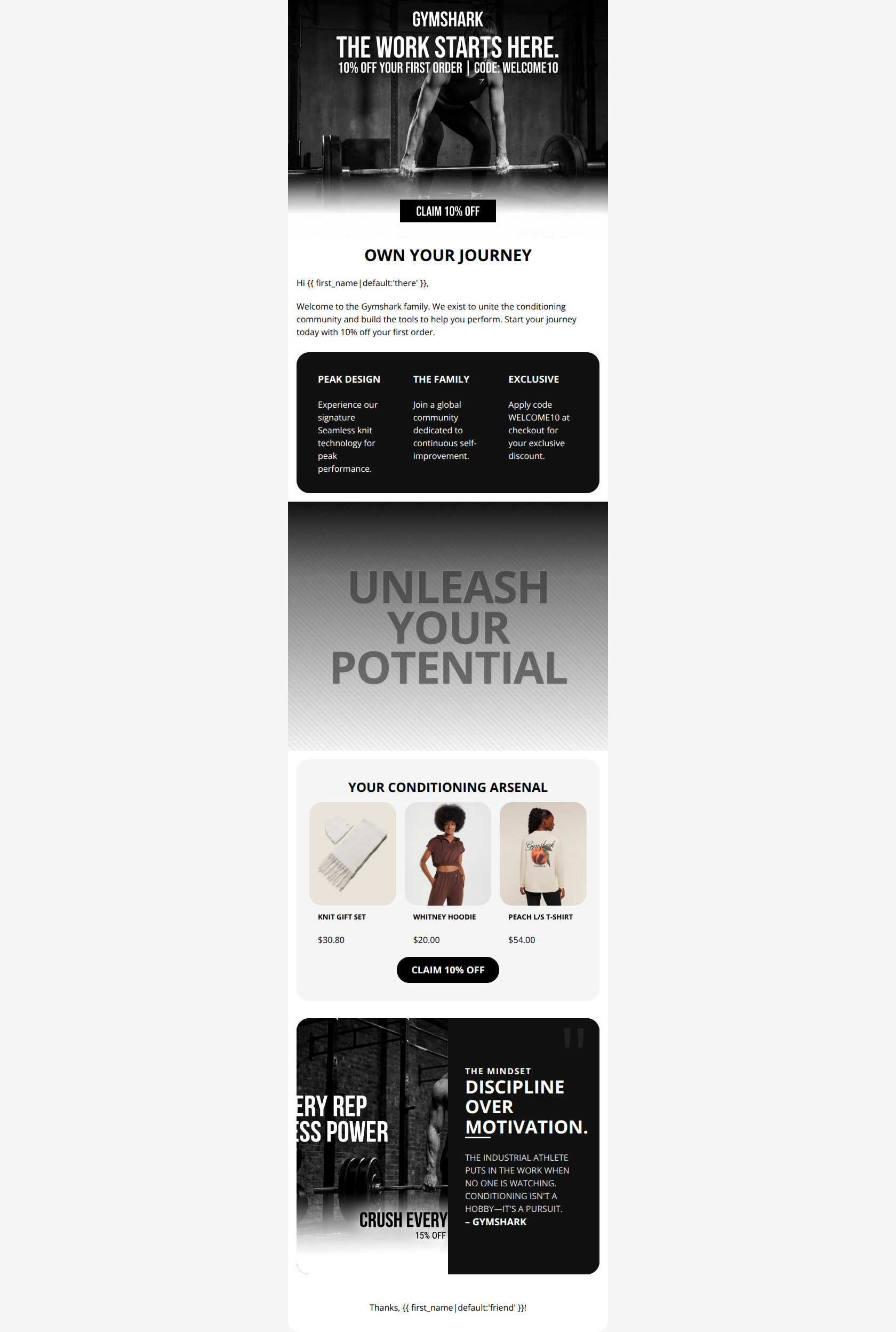
“WELCOME TO GYMSHARK. HERE IS 10% OFF.”
Design Score
71/100This welcome email effectively establishes Gymshark's gritty, high-performance brand identity and clearly communicates the introductory 10% offer. However, conversion is hindered by a poorly placed primary CTA that disrupts the visual flow and a massive, unclickable interstitial banner that creates a 'dead zone' for engagement.
Create Your Own
Generate professional email designs like this one in seconds with Kopi AI.
Email Details
- Subject Line
- WELCOME TO GYMSHARK. HERE IS 10% OFF.
- Brand
- Gymshark
- Industry
- Fitness
- Email Type
- Welcome
- Created
- March 4, 2026
Brand Colors
Email Copy
OWN YOUR JOURNEY
Hi there,
Welcome to the Gymshark family. We exist to unite the conditioning community and build the tools to help you perform. Start your journey today with 10% off your first order.
PEAK DESIGN
Experience our signature Seamless knit technology for peak performance.
THE FAMILY
Join a global community dedicated to continuous self-improvement.
EXCLUSIVE
Apply code WELCOME10 at checkout for your exclusive discount.
YOUR CONDITIONING ARSENAL
KNIT GIFT SET
$30.80
WHITNEY HOODIE
$20.00
PEACH L/S T-SHIRT
$54.00
→ CLAIM 10% OFF
Thanks, friend!
Why This Email Works
This welcome email effectively establishes Gymshark's gritty, high-performance brand identity and clearly communicates the introductory 10% offer. However, conversion is hindered by a poorly placed primary CTA that disrupts the visual flow and a massive, unclickable interstitial banner that creates a 'dead zone' for engagement.
Hero (top/initial part) Impact
65/100- The offer ('10% OFF YOUR FIRST ORDER | CODE: WELCOME10') is front and center, leaving no ambiguity for the new subscriber.
- The imagery perfectly matches the 'Industrial Athlete' aesthetic, instantly grounding the user in the brand world.
Content Structure & Flow
60/100- The transition from the welcome offer into the core brand pillars (Seamless, Community) helps justify the purchase beyond just the discount.
- The 'DARK_EDITORIAL' block at the bottom serves as a strong, brand-reinforcing anchor to close the email.
Visual Hierarchy & Layout
65/100- The alternating use of white, dark grey (#111111), and light grey (#F5F5F5) backgrounds effectively segments the email into digestible chunks.
- The product grid is clean and gives the product imagery room to breathe.
Call-to-Action Strength
65/100- The stark black buttons on light backgrounds provide excellent contrast, ensuring they pass the 'squint test'.
- The copy 'CLAIM 10% OFF' is benefit-driven and tells the user exactly what they get for clicking.
Message Clarity & Tone
85/100- Headings like 'OWN YOUR JOURNEY' and 'YOUR CONDITIONING ARSENAL' are highly authentic to the brand and audience.
- The motivational quote ('DISCIPLINE OVER MOTIVATION') perfectly encapsulates the brand ethos without feeling overly promotional.
Readability & Scannability
75/100- The use of three-column layouts for both value props and products makes the information highly scannable.
- Text contrast is extremely high throughout the email.
Offer & Value Proposition
80/100- The 10% off offer is stated three times (hero image, intro text, value prop block), ensuring it cannot be missed.
- The proprietary 'Seamless knit technology' is explicitly called out as a key differentiator.
Personalization & Audience Fit
70/100- Use of the first name merge tag in the intro and footer.
- The gritty, high-contrast visual style speaks directly to the target weightlifting/bodybuilding audience.
Quick Wins
- Fix the placement of the top 'CLAIM 10% OFF' button so it does not overlap sections.
- Left-align the main welcome paragraph for better readability.
- Change the bottom CTA to 'SHOP NEW ARRIVALS' or 'SHOP MEN / WOMEN' instead of repeating 'CLAIM 10% OFF'.

Create Professional Email Designs
Generate beautiful, on-brand email designs in seconds. Just enter your brand URL and let AI do the rest.