Fashion & Apparel Welcome Email Template
“Welcome to Everlane.”
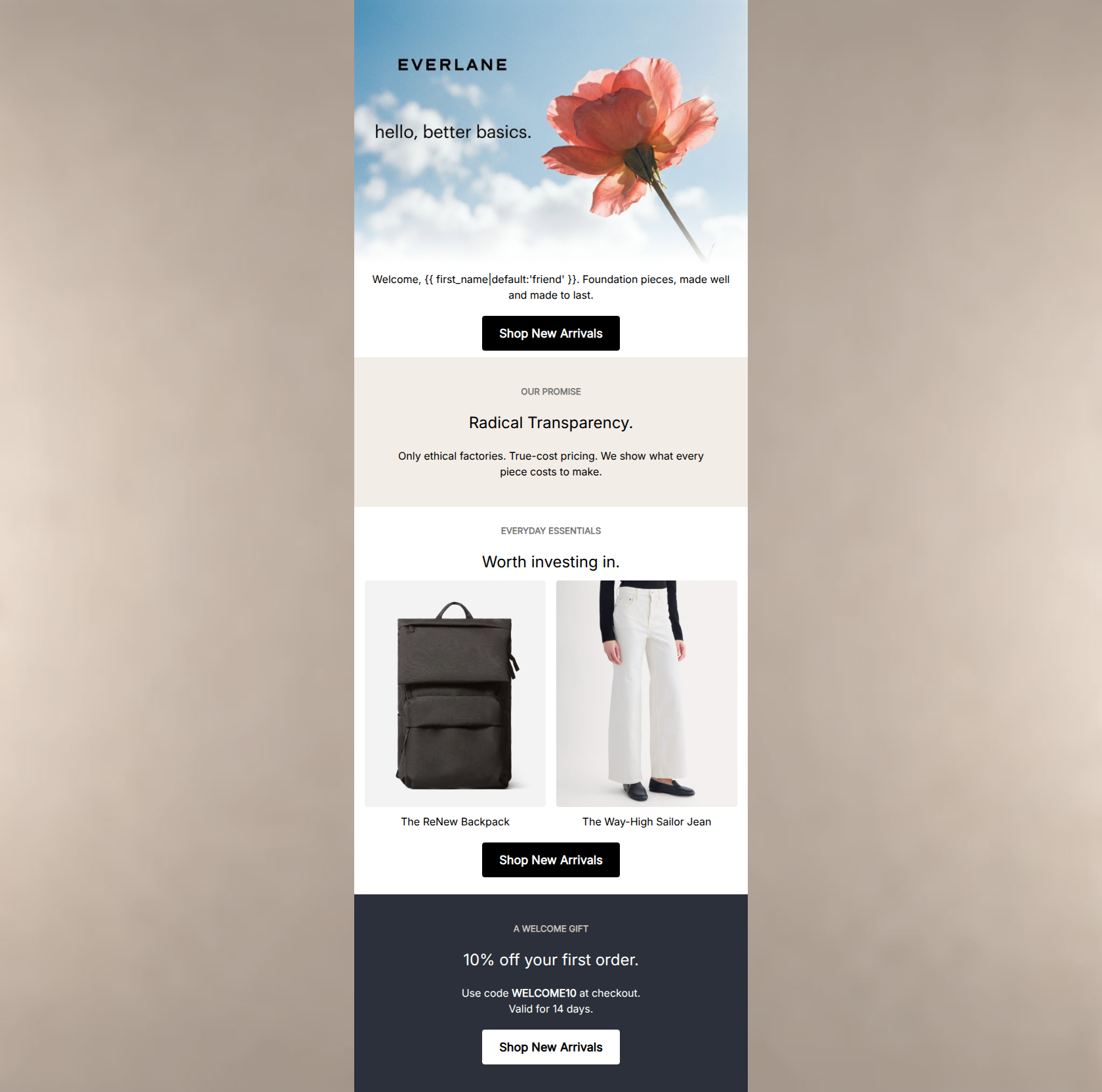
Design Score
82/100A visually striking and highly on-brand welcome email that beautifully communicates Everlane's 'Radical Transparency' ethos. The minimalist aesthetic, concise copy, and flawless CTA execution create a strong foundation. However, burying the primary conversion driver—the 10% welcome discount—at the very bottom of the email creates unnecessary friction. Restructuring the flow to lead with the value proposition the user specifically signed up for will significantly boost initial click-through rates.
Create Your Own
Generate professional email designs like this one in seconds with Kopi AI.
Email Details
- Subject Line
- Welcome to Everlane.
- Brand
- Everlane [eval-prod 2026-04-25]
- Industry
- Fashion & Apparel
- Email Type
- Welcome
- Created
- April 25, 2026
Brand Colors
Email Copy
Welcome, friend. Foundation pieces, made well and made to last.
→ Shop New Arrivals
OUR PROMISE
Radical Transparency.
Only ethical factories. True-cost pricing. We show what every piece costs to make.
EVERYDAY ESSENTIALS
Worth investing in.
The ReNew Backpack
The Way-High Sailor Jean
→ Shop New Arrivals
A WELCOME GIFT
10% off your first order.
Use code WELCOME10 at checkout. Valid for 14 days.
→ Shop New Arrivals
Why This Email Works
A visually striking and highly on-brand welcome email that beautifully communicates Everlane's 'Radical Transparency' ethos. The minimalist aesthetic, concise copy, and flawless CTA execution create a strong foundation. However, burying the primary conversion driver—the 10% welcome discount—at the very bottom of the email creates unnecessary friction. Restructuring the flow to lead with the value proposition the user specifically signed up for will significantly boost initial click-through rates.
Hero (top/initial part) Impact
80/100- Striking, distinct visual imagery that immediately sets the brand mood.
- High-contrast, prominent primary CTA button visible early in the scroll depth.
- Clear integration of the brand logo and core 'better basics' positioning within the hero asset.
Content Structure & Flow
70/100- Distinct background colors effectively separate the narrative into easily digestible chapters.
- A logical progression from brand ethos to product proof (even if the overall order should be flipped).
Visual Hierarchy & Layout
85/100- Excellent use of generous whitespace to reduce cognitive load and let the content breathe.
- Clear typographic hierarchy distinguishing section kickers, main headlines, and body copy.
- Product photography is clean, bright, and consistent in style.
Call-to-Action Strength
98/100- Unambiguous primary action repeated consistently throughout the email.
- Excellent contrast on all buttons (black on light backgrounds, white on dark backgrounds).
- Generous touch targets and padding on all CTA buttons.
Message Clarity & Tone
90/100- The 'Radical Transparency' copy is punchy, confident, and explains the value proposition without fluff.
- The tone feels authoritative yet accessible, exactly matching the 'effortlessly cool friend' persona.
- Avoids generic marketing speak like 'amazing quality' in favor of concrete facts ('True-cost pricing').
Readability & Scannability
88/100- Short, punchy sentences that respect the user's time and skimming behavior.
- Centered text is used sparingly and effectively for short phrases, avoiding hard-to-read centered paragraphs.
- Clear formatting of the promo code (bolded 'WELCOME10') makes it easy to spot and copy.
Offer & Value Proposition
82/100- The 10% discount is clearly stated alongside the necessary promo code.
- The inclusion of 'Valid for 14 days' adds a necessary element of urgency to drive immediate action.
- The brand value proposition (ethical factories, true cost) is articulated succinctly.
Personalization & Audience Fit
85/100- Aesthetic and messaging are highly aligned with a demographic that values sustainability over fast fashion.
- Uses basic liquid personalization to greet the user by name, establishing a slightly warmer tone.
Copy Conciseness & Word Economy
92/100- The 'Our Promise' section communicates a complex supply chain ethos in just 12 words.
- No unnecessary adjectives; relies on strong nouns and direct statements.
- Bullet-point-style delivery of facts ('Only ethical factories. True-cost pricing.')
Quick Wins
- Darken the #757575 section kicker text slightly to improve contrast against the beige background.
- Remove the plain text paragraph below the hero image ('Welcome, [Name]...') to reduce redundancy and push the first CTA higher.
- Make the promo code 'WELCOME10' selectable text rather than relying solely on the user remembering it, or ensure it auto-applies via the URL.




Create Professional Email Designs
Generate beautiful, on-brand email designs in seconds. Just enter your brand URL and let AI do the rest.