Fashion & Apparel Welcome Email Template
“Welcome to Everlane.”
Design Score
88/100This is an exceptionally clean, well-structured, and brand-aligned welcome email. It strictly adheres to best practices for word economy, visual hierarchy, and CTA consistency. The primary missed opportunity is the absence of a concrete introductory offer or shipping incentive, which typically drives first-purchase conversions in this flow.
Create Your Own
Generate professional email designs like this one in seconds with Kopi AI.
Email Details
- Subject Line
- Welcome to Everlane.
- Brand
- Everlane
- Industry
- Fashion & Apparel
- Email Type
- Welcome
- Created
- May 20, 2026
Brand Colors
Email Copy
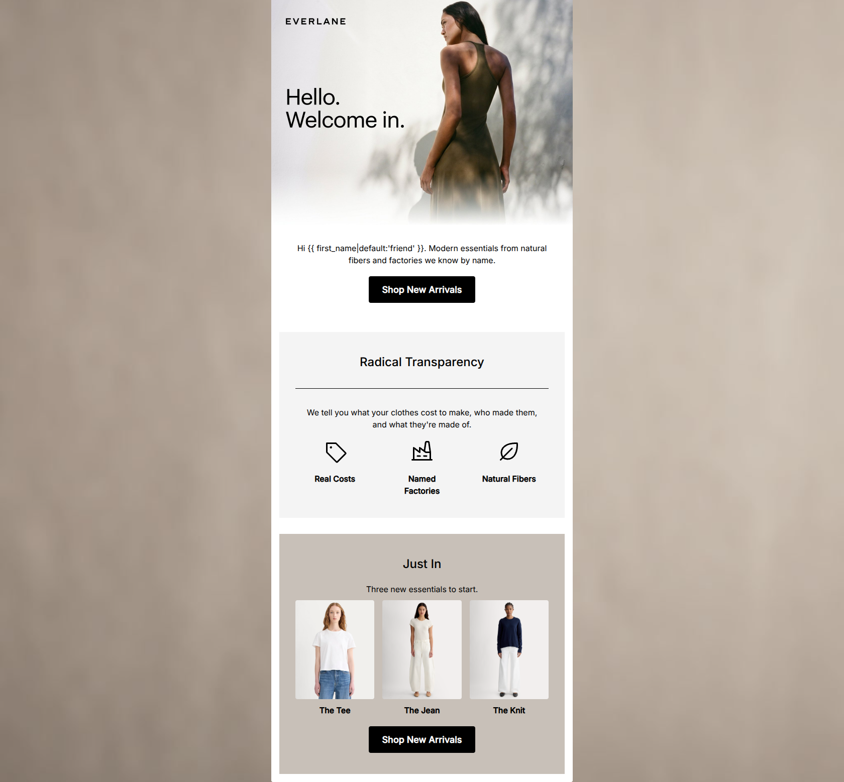
Hi friend. Modern essentials from natural fibers and factories we know by name.
→ Shop New Arrivals
Radical Transparency
We tell you what your clothes cost to make, who made them, and what they're made of.
Real Costs
Named Factories
Natural Fibers
Just In
Three new essentials to start.
The Tee
The Jean
The Knit
→ Shop New Arrivals
Why This Email Works
This is an exceptionally clean, well-structured, and brand-aligned welcome email. It strictly adheres to best practices for word economy, visual hierarchy, and CTA consistency. The primary missed opportunity is the absence of a concrete introductory offer or shipping incentive, which typically drives first-purchase conversions in this flow.
Hero (top/initial part) Impact
85/100- Stunning, on-brand imagery with excellent cropping and soft lighting.
- Clear, concise introductory copy that immediately establishes brand differentiation.
Content Structure & Flow
90/100- Distinct background colors map perfectly to different content sections.
- Logical downward momentum that naturally deposits the reader at the final CTA.
Visual Hierarchy & Layout
92/100- Impeccable contrast with the primary #000000 buttons on lighter backgrounds.
- Clean, grid-based product layout that makes scanning effortless.
Call-to-Action Strength
95/100- Perfect consistency in CTA copy and destination.
- High-contrast black-on-white/taupe buttons pass the 'squint test' with flying colors.
Message Clarity & Tone
88/100- Strong, confident brand voice.
- Highly transparent and literal explanation of the brand's unique selling proposition.
Readability & Scannability
90/100- Excellent use of short, punchy product labels rather than long, technical product names.
- Ample padding around text blocks prevents visual clutter.
Offer & Value Proposition
70/100- Brand differentiation is stated clearly and concisely.
Personalization & Audience Fit
85/100- Direct appeal to the conscious consumer's specific buying criteria.
Copy Conciseness & Word Economy
95/100- Zero filler words or throat-clearing introductory sentences.
- Distilled, impactful product descriptors.
Quick Wins
- Update the default fallback in the greeting from 'friend' to a more brand-aligned term, or remove the noun entirely.
- Add a small text line under the primary CTAs highlighting the '$125 to free shipping' benefit to reduce purchase friction.




Create Professional Email Designs
Generate beautiful, on-brand email designs in seconds. Just enter your brand URL and let AI do the rest.