Fashion & Apparel Welcome Email Template
“Welcome to Everlane.”
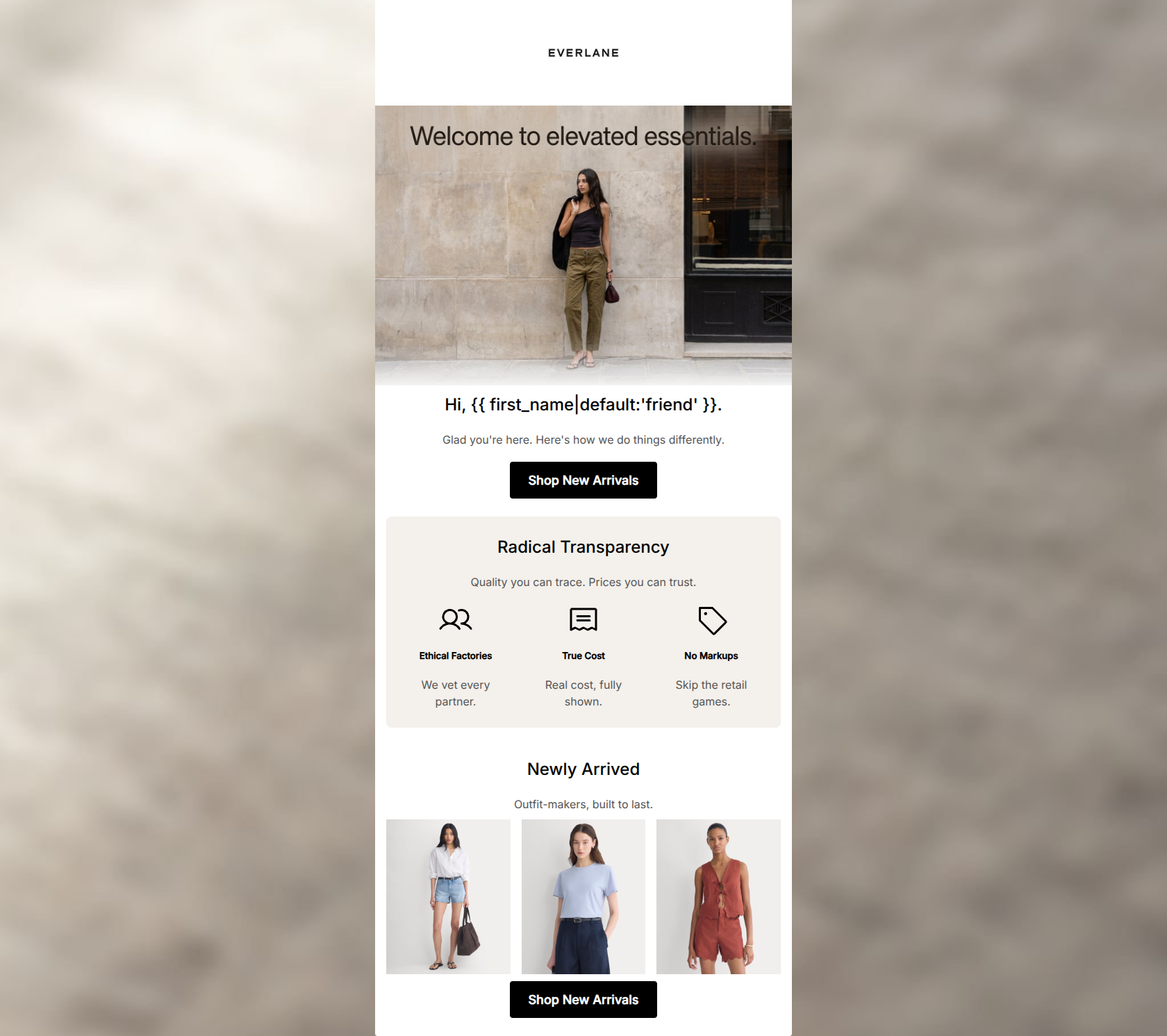
Design Score
81/100This welcome email effectively establishes Everlane's minimalist aesthetic and 'Radical Transparency' value proposition. The visual hierarchy is clean, and the repetitive, high-contrast 'Shop New Arrivals' CTAs create a clear path to conversion. However, it leaves significant money on the table by omitting a tangible welcome offer, and the introductory copy relies on generic pleasantries rather than immediately hooking the reader with product value.
Create Your Own
Generate professional email designs like this one in seconds with Kopi AI.
Email Details
- Subject Line
- Welcome to Everlane.
- Brand
- Everlane
- Industry
- Fashion & Apparel
- Email Type
- Welcome
- Created
- May 6, 2026
Brand Colors
Email Copy
Hi, friend.
Glad you're here. Here's how we do things differently.
→ Shop New Arrivals
Radical Transparency
Quality you can trace. Prices you can trust.
Ethical Factories
We vet every partner.
True Cost
Real cost, fully shown.
No Markups
Skip the retail games.
Newly Arrived
Outfit-makers, built to last.
→ Shop New Arrivals
Why This Email Works
This welcome email effectively establishes Everlane's minimalist aesthetic and 'Radical Transparency' value proposition. The visual hierarchy is clean, and the repetitive, high-contrast 'Shop New Arrivals' CTAs create a clear path to conversion. However, it leaves significant money on the table by omitting a tangible welcome offer, and the introductory copy relies on generic pleasantries rather than immediately hooking the reader with product value.
Hero (top/initial part) Impact
70/100- Strong, on-brand lifestyle imagery immediately sets the aesthetic tone.
- Clean, uncluttered top section draws the eye downwards.
Content Structure & Flow
85/100- Excellent use of the 'Radical Transparency' section to break up the flow and inject brand DNA before asking for the sale.
- Logical progression from brand introduction to product discovery.
Visual Hierarchy & Layout
88/100- The contrasting background box for the value props makes that critical information pop.
- Generous padding and whitespace prevent the email from feeling cluttered.
Call-to-Action Strength
92/100- Repetition of the exact same primary CTA eliminates cognitive load.
- The black buttons on a white/light background offer maximum contrast and visibility.
Message Clarity & Tone
82/100- Distills complex supply chain concepts ('Ethical Factories', 'True Cost') into punchy, easy-to-understand microcopy.
- Maintains a consistent, objective tone throughout.
Readability & Scannability
85/100- Excellent use of formatting (icons, columns) to make the text easily skimmable.
- No intimidating 'walls of text'.
Offer & Value Proposition
60/100- Clearly articulates the brand's unique market position against traditional retail.
Personalization & Audience Fit
75/100- Visuals and copy accurately target the millennial/Gen Z conscious consumer.
Copy Conciseness & Word Economy
90/100- Excellent word economy; communicates maximum value with minimal text.
- Punchy, memorable microcopy ('Quality you can trace. Prices you can trust.').
Quick Wins
- Move the hero overlay text into live HTML text below the image to guarantee readability.
- Rewrite the introductory 'Glad you're here' copy to be more punchy and benefit-driven.




Create Professional Email Designs
Generate beautiful, on-brand email designs in seconds. Just enter your brand URL and let AI do the rest.