Fashion & Apparel Welcome Email Template
“Welcome to Everlane.”
Design Score
88/100This welcome email is a masterclass in brand alignment and word economy. It perfectly captures Everlane's calm, transparent, and minimalist identity, communicating its core values with zero filler. The inverted pyramid structure effectively funnels attention from the initial greeting to the core promise and finally to product routing. However, while the brand messaging is exceptionally strong, the email lacks a transactional hook to drive immediate conversion. The visual hierarchy is slightly compromised at the bottom due to background color bleeding and competing CTA weights. Addressing these minor structural and conversion-focused elements will elevate this from a beautiful brand introduction to a high-converting first touchpoint.
Create Your Own
Generate professional email designs like this one in seconds with Kopi AI.
Email Details
- Subject Line
- Welcome to Everlane.
- Brand
- Everlane
- Industry
- Fashion & Apparel
- Email Type
- Welcome
- Created
- May 7, 2026
Brand Colors
Email Copy
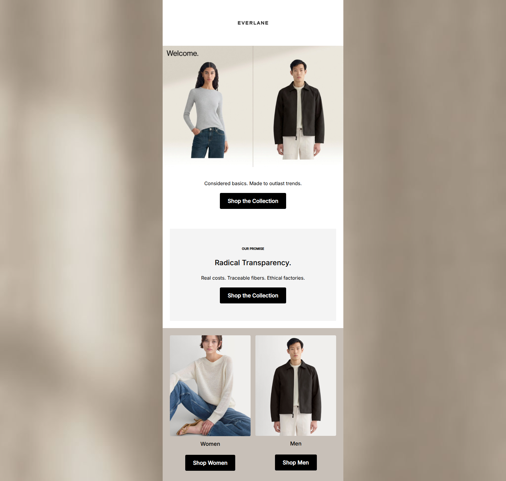
Considered basics. Made to outlast trends.
→ Shop the Collection
OUR PROMISE
Radical Transparency.
Real costs. Traceable fibers. Ethical factories.
→ Shop the Collection
Women
→ Shop Women
Men
→ Shop Men
Why This Email Works
This welcome email is a masterclass in brand alignment and word economy. It perfectly captures Everlane's calm, transparent, and minimalist identity, communicating its core values with zero filler. The inverted pyramid structure effectively funnels attention from the initial greeting to the core promise and finally to product routing. However, while the brand messaging is exceptionally strong, the email lacks a transactional hook to drive immediate conversion. The visual hierarchy is slightly compromised at the bottom due to background color bleeding and competing CTA weights. Addressing these minor structural and conversion-focused elements will elevate this from a beautiful brand introduction to a high-converting first touchpoint.
Hero Impact
85/100- Instant visual brand recognition.
- Copy perfectly aligns with customer psychographics (anti-fast-fashion).
Content Structure & Flow
92/100- Logical narrative flow from 'Who we are' to 'What we stand for' to 'What you can buy'.
- Excellent use of dedicated sections for different logical steps.
Visual Hierarchy & Layout
82/100- Premium use of whitespace and padding.
- Clear section delineation using alternating background fills in the upper half.
Call-to-Action Strength
88/100- Primary CTA is repeated to reinforce the main action.
- High contrast button styling ensures they are unmissable.
Message Clarity & Tone
96/100- Tone is highly confident and avoids pushy sales jargon.
- Directly addresses the primary pain points of the conscious consumer.
Readability & Scannability
95/100- Zero cognitive overload; incredibly easy to skim.
- Excellent text-to-background contrast.
Offer & Value Proposition
75/100- Brand value proposition (transparency/quality) is front and center.
Personalization & Audience Fit
88/100- Imagery and copy are highly relevant to the target demographic.
- Includes standard self-segmentation routing.
Copy Conciseness & Word Economy
98/100- Ruthless editing; highly distilled messaging.
- Impactful use of three-word fragments.
Quick Wins
- Change the background color of the bottom routing section to #FFFFFF to prevent it from bleeding into the outer canvas background on desktop clients.
- Change the 'Shop Women' and 'Shop Men' buttons to an outlined or secondary style so they do not compete visually with the primary 'Shop the Collection' CTAs.
- Add a small text line under the top CTA that says 'Free shipping on orders over $125' to provide a mild transactional incentive.




Create Professional Email Designs
Generate beautiful, on-brand email designs in seconds. Just enter your brand URL and let AI do the rest.