Fashion & Apparel Welcome Email Template
“Welcome to Everlane. Here's 15% off.”
Design Score
84/100This is a highly effective welcome email that perfectly encapsulates the Everlane brand: minimal, transparent, and direct. The copy is exceptionally tight, and the use of stark black-and-white contrast creates a premium editorial feel. The 'Inverted Pyramid' flow is executed well, moving from the welcome offer to brand values, then to products, and finally reinforcing the offer. However, minor layout inconsistencies—specifically shifting alignments—and a slightly weak typographic hierarchy in the hero section prevent it from being a perfect execution. It successfully prioritizes clicks by maintaining a singular focus and utilizing strong, high-contrast CTAs.
Create Your Own
Generate professional email designs like this one in seconds with Kopi AI.
Email Details
- Subject Line
- Welcome to Everlane. Here's 15% off.
- Brand
- Everlane
- Industry
- Fashion & Apparel
- Email Type
- Welcome
- Created
- May 7, 2026
Brand Colors
Email Copy
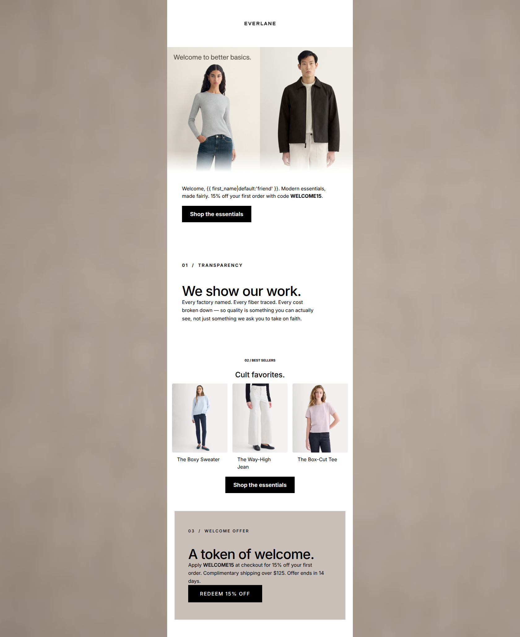
Welcome, friend. Modern essentials, made fairly. 15% off your first order with code WELCOME15.
→ Shop the essentials
02 / BEST SELLERS
Cult favorites.
The Boxy Sweater
The Way-High Jean
The Box-Cut Tee
→ Shop the essentials
Why This Email Works
This is a highly effective welcome email that perfectly encapsulates the Everlane brand: minimal, transparent, and direct. The copy is exceptionally tight, and the use of stark black-and-white contrast creates a premium editorial feel. The 'Inverted Pyramid' flow is executed well, moving from the welcome offer to brand values, then to products, and finally reinforcing the offer. However, minor layout inconsistencies—specifically shifting alignments—and a slightly weak typographic hierarchy in the hero section prevent it from being a perfect execution. It successfully prioritizes clicks by maintaining a singular focus and utilizing strong, high-contrast CTAs.
Hero (top/initial part) Impact
75/100- Image clearly communicates the 'better basics' value proposition.
- Gets straight to the point with the welcome offer.
Content Structure & Flow
85/100- Excellent narrative pacing that doesn't overwhelm the reader.
- The numbering system creates a clear, scannable structure.
Visual Hierarchy & Layout
78/100- Generous whitespace allows the content to breathe.
- The taupe offer card at the bottom provides excellent visual anchoring without breaking the neutral palette.
Call-to-Action Strength
92/100- All buttons point to the same destination, driving a single, clear action.
- Stark black-on-white/taupe contrast makes the buttons impossible to miss.
Message Clarity & Tone
90/100- 'We show our work.' is a masterful, confident headline.
- The tone treats the reader as an informed peer, perfectly matching the psychographic profile.
Readability & Scannability
85/100- No 'walls of text'; every paragraph is tightly edited.
- The 3-column product grid is clean and easily digestible.
Offer & Value Proposition
88/100- The transparency block clearly connects ethical production to customer benefit ('Premium quality without the markup').
- The welcome offer is bookended at the top and bottom of the email.
Personalization & Audience Fit
82/100- The imagery and tone perfectly align with the target audience's desire for an 'anti-fast-fashion' approach.
Copy Conciseness & Word Economy
95/100- Zero fluff or filler adjectives.
- Short, punchy sentences that respect the reader's time.
Quick Wins
- Left-align the '02 / BEST SELLERS' heading and its CTA to match the rest of the email's alignment.
- Bold the promo code 'WELCOME15' in the final taupe card for faster scanning.
- Break the '15% off your first order' text out of the hero paragraph and make it a distinct headline.




Create Professional Email Designs
Generate beautiful, on-brand email designs in seconds. Just enter your brand URL and let AI do the rest.