Fashion & Apparel Welcome Email Template
“Welcome to Everlane.”
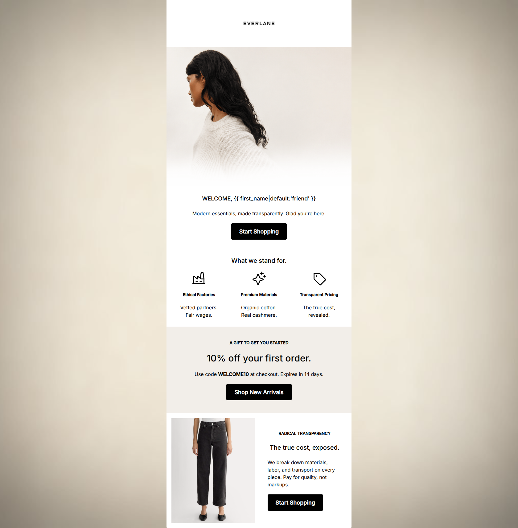
Design Score
81/100This welcome email excellently captures Everlane's elevated, minimalist aesthetic and straightforward brand voice. The visual hierarchy is strong, with ample negative space and high-contrast primary CTAs that clearly direct the user. The primary flaw lies in content structure: the highest-leverage conversion element—the 10% welcome offer—is buried halfway down the email, while the top of the email relies solely on brand positioning. By surfacing the incentive immediately and tightening up redundant sections, this email could significantly increase its click-through rate.
Create Your Own
Generate professional email designs like this one in seconds with Kopi AI.
Email Details
- Subject Line
- Welcome to Everlane.
- Brand
- Everlane [eval 2026-03-25]
- Industry
- Fashion & Apparel
- Email Type
- Welcome
- Created
- April 24, 2026
Brand Colors
Email Copy
WELCOME, friend
Modern essentials, made transparently. Glad you're here.
→ Start Shopping
What we stand for.
Ethical Factories
Vetted partners. Fair wages.
Premium Materials
Organic cotton. Real cashmere.
Transparent Pricing
The true cost, revealed.
A GIFT TO GET YOU STARTED
10% off your first order.
Use code WELCOME10 at checkout. Expires in 14 days.
→ Shop New Arrivals
RADICAL TRANSPARENCY
The true cost, exposed.
We break down materials, labor, and transport on every piece. Pay for quality, not markups.
→ Start Shopping
Why This Email Works
This welcome email excellently captures Everlane's elevated, minimalist aesthetic and straightforward brand voice. The visual hierarchy is strong, with ample negative space and high-contrast primary CTAs that clearly direct the user. The primary flaw lies in content structure: the highest-leverage conversion element—the 10% welcome offer—is buried halfway down the email, while the top of the email relies solely on brand positioning. By surfacing the incentive immediately and tightening up redundant sections, this email could significantly increase its click-through rate.
1. Hero (top/initial part) Impact
65/100- Clean, on-brand imagery immediately sets a serene, elevated tone.
- The welcome message is direct, friendly, and free of jargon.
2. Content Structure & Flow
70/100- Clear use of background colors to define distinct sections.
- Logical grouping of information keeps the reader oriented.
3. Visual Hierarchy & Layout
88/100- Excellent use of whitespace prevents cognitive overload.
- High-contrast black CTA buttons are unmissable against the white and beige backgrounds.
- Effective use of typographic scale (e.g., the H1 for '10% off').
4. Call-to-Action Strength
95/100- All primary buttons share the same destination URL, eliminating friction.
- Button text ('Start Shopping', 'Shop New Arrivals') is clear and closely aligned.
- CTAs are visually prominent and easily tappable.
5. Message Clarity & Tone
92/100- Tone is highly authentic to the 'Radical Transparency' brand positioning.
- Avoids marketing fluff, respecting the intelligence of the conscious consumer target audience.
6. Readability & Scannability
90/100- Information is effectively chunked into bite-sized pieces.
- The three-column icon layout breaks up vertical text flow perfectly.
7. Offer & Value Proposition
75/100- The discount code is explicitly stated in bold, making it easy to find.
- The 14-day expiration adds a necessary element of urgency.
8. Personalization & Audience Fit
85/100- Copy specifically addresses the target audience's desire for ethical factories and transparent pricing.
- The aesthetic perfectly matches the 'elevated minimalism' preferred by this demographic.
9. Copy Conciseness & Word Economy
82/100- Excellent use of fragments and short sentences to convey complex ideas quickly.
- Zero throat-clearing openers or filler phrases in the main body.
Quick Wins
- Add 'Enjoy 10% off your first order' directly into the subheadline under 'WELCOME'.
- Remove the final 'RADICAL TRANSPARENCY' section to eliminate repetitive messaging and shorten the scroll depth.




Create Professional Email Designs
Generate beautiful, on-brand email designs in seconds. Just enter your brand URL and let AI do the rest.