Fashion & Apparel Welcome Email Template
“Welcome to Everlane.”
Design Score
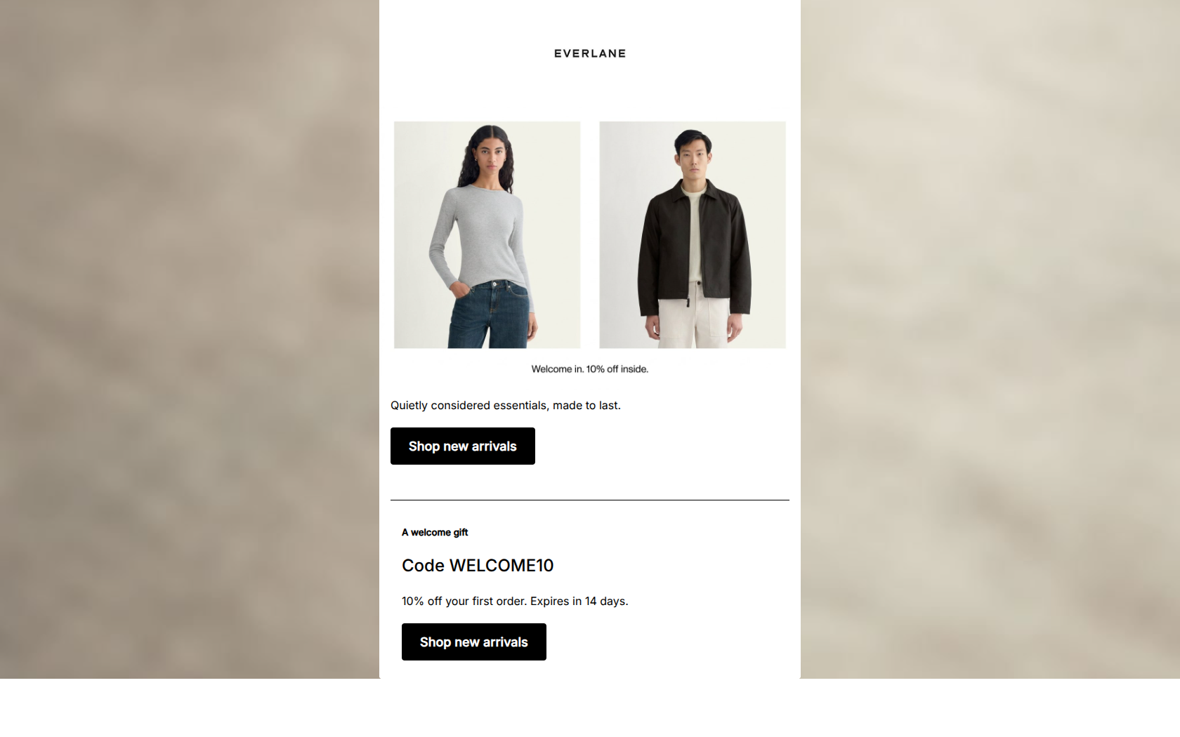
81/100This welcome email successfully captures Everlane's minimalist, high-quality brand identity. The photography, generous whitespace, and stark typography create an immediate premium feel that resonates with their conscious, style-focused demographic. However, the email suffers from a disjointed hierarchy: the primary conversion driver (the 10% welcome discount) is buried beneath the fold and visually separated from the hero section. Additionally, there is a critical disconnect between the dual-gender imagery and the hard-coded CTA destinations that point exclusively to the women's collection.
Create Your Own
Generate professional email designs like this one in seconds with Kopi AI.
Email Details
- Subject Line
- Welcome to Everlane.
- Brand
- Everlane
- Industry
- Fashion & Apparel
- Email Type
- Welcome
- Created
- May 7, 2026
Brand Colors
Email Copy
Quietly considered essentials, made to last.
→ Shop new arrivals
A welcome gift
Code WELCOME10
10% off your first order. Expires in 14 days.
→ Shop new arrivals
Why This Email Works
This welcome email successfully captures Everlane's minimalist, high-quality brand identity. The photography, generous whitespace, and stark typography create an immediate premium feel that resonates with their conscious, style-focused demographic. However, the email suffers from a disjointed hierarchy: the primary conversion driver (the 10% welcome discount) is buried beneath the fold and visually separated from the hero section. Additionally, there is a critical disconnect between the dual-gender imagery and the hard-coded CTA destinations that point exclusively to the women's collection.
Hero Impact
72/100- Excellent brand-aligned imagery featuring both men's and women's styles.
- Clean, distraction-free visual environment.
Content Structure & Flow
82/100- Simple, single-column layout focuses the reader's attention.
- Logical progression of information from 'who we are' to 'here is your gift'.
Visual Hierarchy & Layout
68/100- Left-aligned text creates a strong, readable vertical axis.
- Excellent use of whitespace prevents the email from feeling cluttered.
Call-to-Action Strength
95/100- Zero ambiguity about what the user should do next.
- Strong black-and-white contrast makes the buttons unmissable.
- Repetition of the exact same verb and destination reinforces the primary goal.
Message Clarity & Tone
88/100- Language perfectly matches the 'honest, knowledgeable friend' brand voice.
- Avoids cheap, fast-fashion urgency tactics.
Readability & Scannability
78/100- Left-aligned formatting aids fast, effortless reading.
- Stark typography against a pure white background ensures maximum legibility.
Offer & Value Proposition
85/100- Clear, unambiguous discount amount.
- Explicit expiration date drives immediate action.
Personalization & Audience Fit
60/100- Imagery appeals broadly to the target demographic's aesthetic sensibilities.
Copy Conciseness & Word Economy
96/100- Ruthless editing ensures high impact per word.
- Punchy, highly scannable sentences.
Quick Wins
- Swap the heading levels in the second section: make '10% Off Your First Order' the large H2 and 'Code: WELCOME10' the smaller supporting text.
- Delete the microscopic 'Welcome in. 10% off inside.' text floating under the image.
- Move the 10% off mention into the primary hero text so the main incentive is visible immediately without scrolling.




Create Professional Email Designs
Generate beautiful, on-brand email designs in seconds. Just enter your brand URL and let AI do the rest.