Fashion & Apparel Welcome Email Template
“Welcome to Everlane. Enjoy 10% off.”
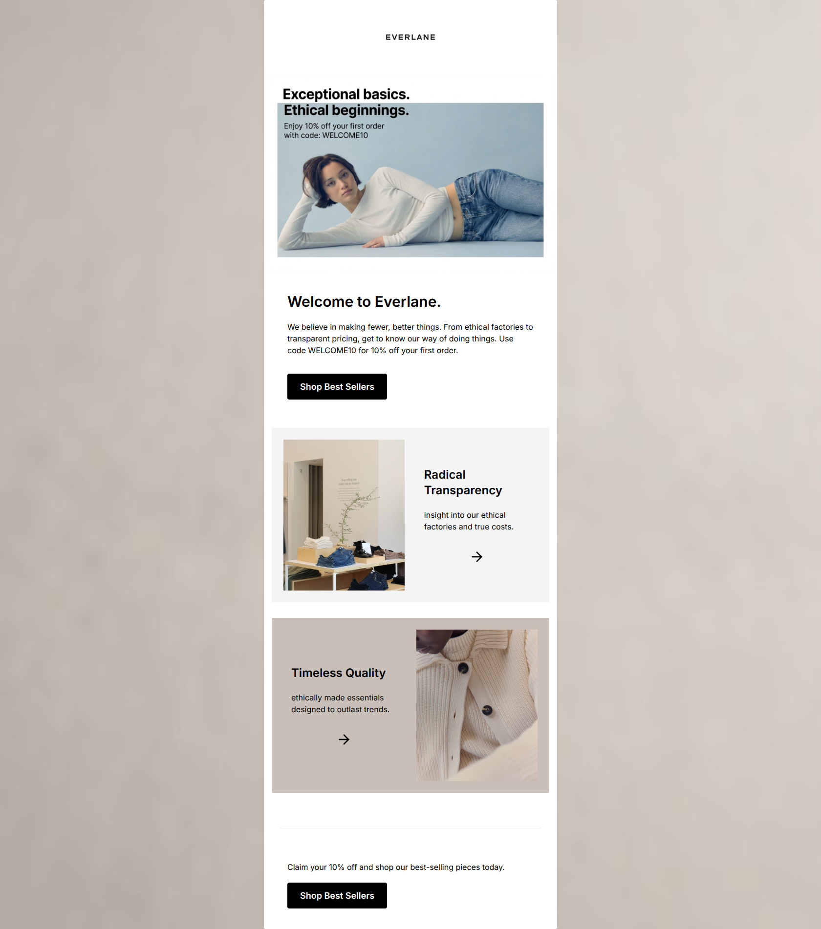
Design Score
82/100This welcome email effectively introduces the Everlane brand, blending a clear promotional offer with strong, value-driven messaging. The minimalist, editorial aesthetic perfectly aligns with the target audience's preferences for clean design and transparent practices. However, while the primary conversion path is obvious, the secondary engagement paths rely on vague iconography (arrows) rather than explicit calls-to-action, and minor copywriting inconsistencies detract from the otherwise premium feel. Addressing these friction points will tighten the conversion funnel and improve click-through rates on secondary content.
Create Your Own
Generate professional email designs like this one in seconds with Kopi AI.
Email Details
- Subject Line
- Welcome to Everlane. Enjoy 10% off.
- Brand
- Everlane [eval 2026-03-21]
- Industry
- Fashion & Apparel
- Email Type
- Welcome
- Created
- March 21, 2026
Brand Colors
Email Copy
Welcome to Everlane.
We believe in making fewer, better things. From ethical factories to transparent pricing, get to know our way of doing things. Use code WELCOME10 for 10% off your first order.
→ Shop Best Sellers
Radical Transparency
insight into our ethical factories and true costs.
Timeless Quality
ethically made essentials designed to outlast trends.
Claim your 10% off and shop our best-selling pieces today.
→ Shop Best Sellers
Why This Email Works
This welcome email effectively introduces the Everlane brand, blending a clear promotional offer with strong, value-driven messaging. The minimalist, editorial aesthetic perfectly aligns with the target audience's preferences for clean design and transparent practices. However, while the primary conversion path is obvious, the secondary engagement paths rely on vague iconography (arrows) rather than explicit calls-to-action, and minor copywriting inconsistencies detract from the otherwise premium feel. Addressing these friction points will tighten the conversion funnel and improve click-through rates on secondary content.
Hero (top/initial part) Impact
85/100- Strong, succinct value proposition immediately visible.
- Clear, upfront presentation of the welcome offer (10% off).
- Imagery perfectly aligns with the brand's natural, unpretentious aesthetic.
Content Structure & Flow
82/100- Logical progression from primary offer to supporting brand pillars.
- Alternating Z-pattern layout in the secondary sections keeps the eye moving down the page.
- Clean, distinct sections prevent the content from feeling overwhelming.
Visual Hierarchy & Layout
88/100- Masterful use of whitespace to create an elevated, editorial feel.
- Stark color contrast ensures primary CTAs are impossible to miss.
- Background color blocking (#F4F4F4 and #C8C0B8) effectively delineates sections without clutter.
Call-to-Action Strength
70/100- Primary CTAs use action-oriented copy ('Shop Best Sellers').
- The primary CTA is strategically repeated at the bottom to catch users who have scrolled to the end.
- High contrast of primary buttons commands attention.
Message Clarity & Tone
75/100- Copy is succinct and avoids unnecessary marketing fluff.
- The 'fewer, better things' messaging perfectly encapsulates the brand ethos.
- Tone is direct and respectful of the reader's time.
Readability & Scannability
85/100- Excellent use of clear, bold headings to establish a scan path.
- Short, punchy paragraphs prevent reader fatigue.
- High contrast between text and background ensures legibility across all visible areas.
Offer & Value Proposition
85/100- Offer is prominent and easy to understand.
- The email successfully balances a promotional discount with strong brand-building value propositions.
- The offer is restated in the footer to catch scrollers.
Personalization & Audience Fit
80/100- Messaging directly addresses customer pain points regarding fast fashion (e.g., 'designed to outlast trends').
- Visuals align with the audience's preference for minimalism and authentic representation.
- Focus on 'ethical factories' hits a core value of the target demographic.
Quick Wins
- Capitalize the first letters of the descriptive text in the 'Radical Transparency' ('Insight...') and 'Timeless Quality' ('Ethically...') sections to maintain a polished, editorial standard.
- Add explicit instructions regarding the promo code next to the CTAs, such as 'Apply WELCOME10 at checkout' to reduce cognitive friction.
- Replace the standalone arrow icons in the secondary blocks with clear text links (e.g., 'Read Our Story ->') to set clear click expectations.




Create Professional Email Designs
Generate beautiful, on-brand email designs in seconds. Just enter your brand URL and let AI do the rest.