Fashion & Apparel Welcome Email Template
“Welcome to Everlane. Enjoy 10% off.”
Design Score
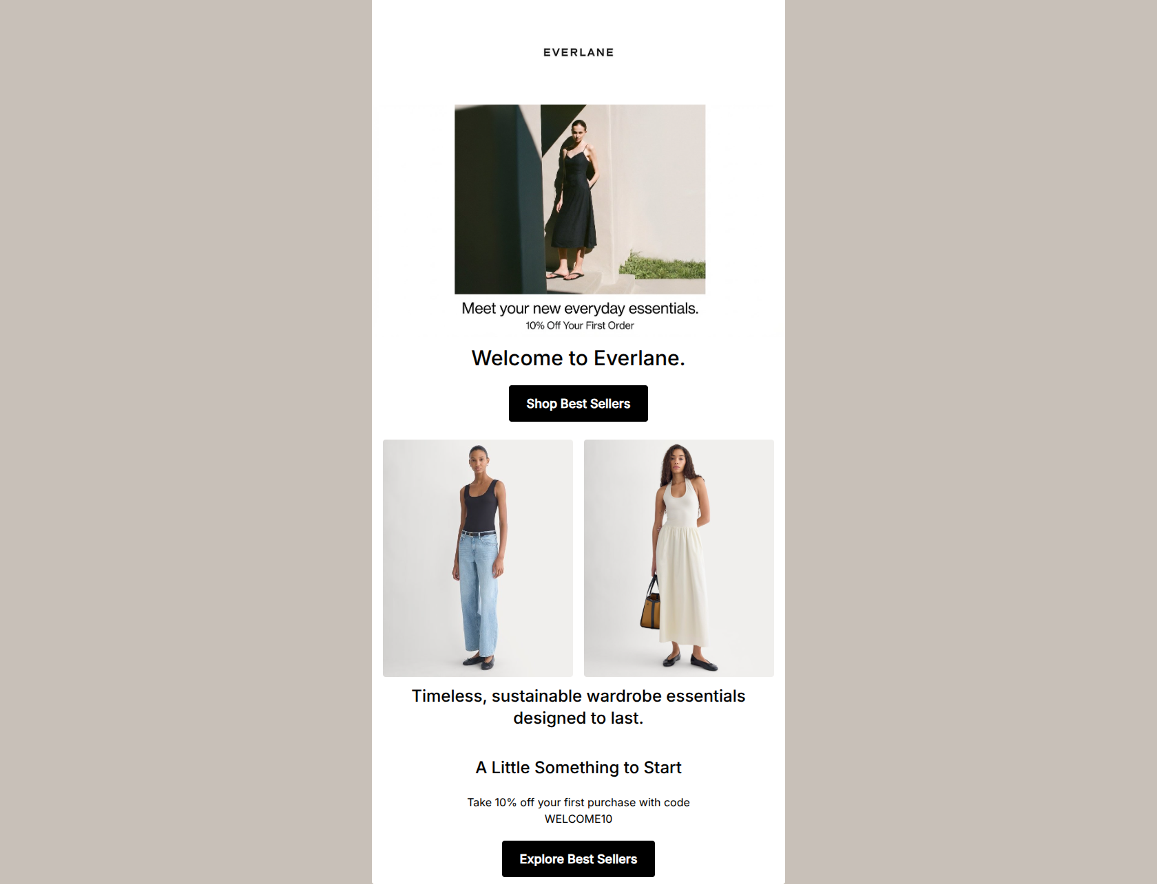
81/100This welcome email successfully establishes Everlane's minimalist, editorial visual identity and straightforward tone. It uses crisp, aspirational imagery and high-contrast layouts. However, it leaves money on the table by visually burying its strongest conversion lever—the 10% welcome discount. The tiny, disconnected offer text in the hero and the visually flat presentation of the promo code at the bottom reduce the immediate incentive to click. Elevating the offer's visual hierarchy and diversifying the CTA destinations will drive higher immediate engagement.
Create Your Own
Generate professional email designs like this one in seconds with Kopi AI.
Email Details
- Subject Line
- Welcome to Everlane. Enjoy 10% off.
- Brand
- Everlane [eval 2026-03-26]
- Industry
- Fashion & Apparel
- Email Type
- Welcome
- Created
- March 26, 2026
Brand Colors
Email Copy
Welcome to Everlane.
→ Shop Best Sellers
Timeless, sustainable wardrobe essentials designed to last.
A Little Something to Start
Take 10% off your first purchase with code WELCOME10
→ Explore Best Sellers
Why This Email Works
This welcome email successfully establishes Everlane's minimalist, editorial visual identity and straightforward tone. It uses crisp, aspirational imagery and high-contrast layouts. However, it leaves money on the table by visually burying its strongest conversion lever—the 10% welcome discount. The tiny, disconnected offer text in the hero and the visually flat presentation of the promo code at the bottom reduce the immediate incentive to click. Elevating the offer's visual hierarchy and diversifying the CTA destinations will drive higher immediate engagement.
Hero (top/initial part) Impact
75/100- Striking, on-brand hero image that establishes the minimal aesthetic.
- Clear, unpretentious 'Welcome to Everlane' H1 that immediately answers who the email is from.
- High-contrast, easy-to-tap primary CTA button.
Content Structure & Flow
80/100- Simple, linear single-column to two-column structure.
- Generous whitespace allows the photography to breathe, matching the brand's 'airy' guidelines.
Visual Hierarchy & Layout
78/100- Excellent use of high-contrast black buttons against the white canvas.
- Balanced two-column product image grid creates a pleasing rhythm.
Call-to-Action Strength
82/100- Excellent button contrast (black fill with white text) ensures they cannot be missed.
- Verbs ('Shop', 'Explore') provide clear direction to the user.
Message Clarity & Tone
85/100- Direct, jargon-free language.
- Perfectly captures the brand's focus on timelessness and sustainability in just a few words.
Readability & Scannability
88/100- No intimidating walls of text.
- High contrast typography (pure black on pure white) ensures excellent legibility.
Offer & Value Proposition
72/100- The offer itself (10%) is clear and requires a simple code.
- The value proposition of the products (sustainable, designed to last) is clearly stated.
Personalization & Audience Fit
78/100- Imagery perfectly matches the target audience's desire for effortless elegance.
- Focus on 'essentials' aligns with the audience's pain point of overwhelming fashion trends.
Copy Conciseness & Word Economy
90/100- Zero filler words or fluffy adjectives.
- Highly distilled, confident messaging.
Quick Wins
- Format the 'WELCOME10' promo code with bold text and a subtle background highlight so it stands out immediately.
- Change the destination and copy of the bottom CTA to 'Shop New Arrivals' or 'Shop Essentials' to avoid redundancy with the hero CTA.
- Increase the font size of the '10% Off Your First Order' text in the hero, or integrate it directly into the main H1.




Create Professional Email Designs
Generate beautiful, on-brand email designs in seconds. Just enter your brand URL and let AI do the rest.