Fashion & Apparel Welcome Email Template
“Welcome to Everlane. Enjoy 10% off.”

Design Score
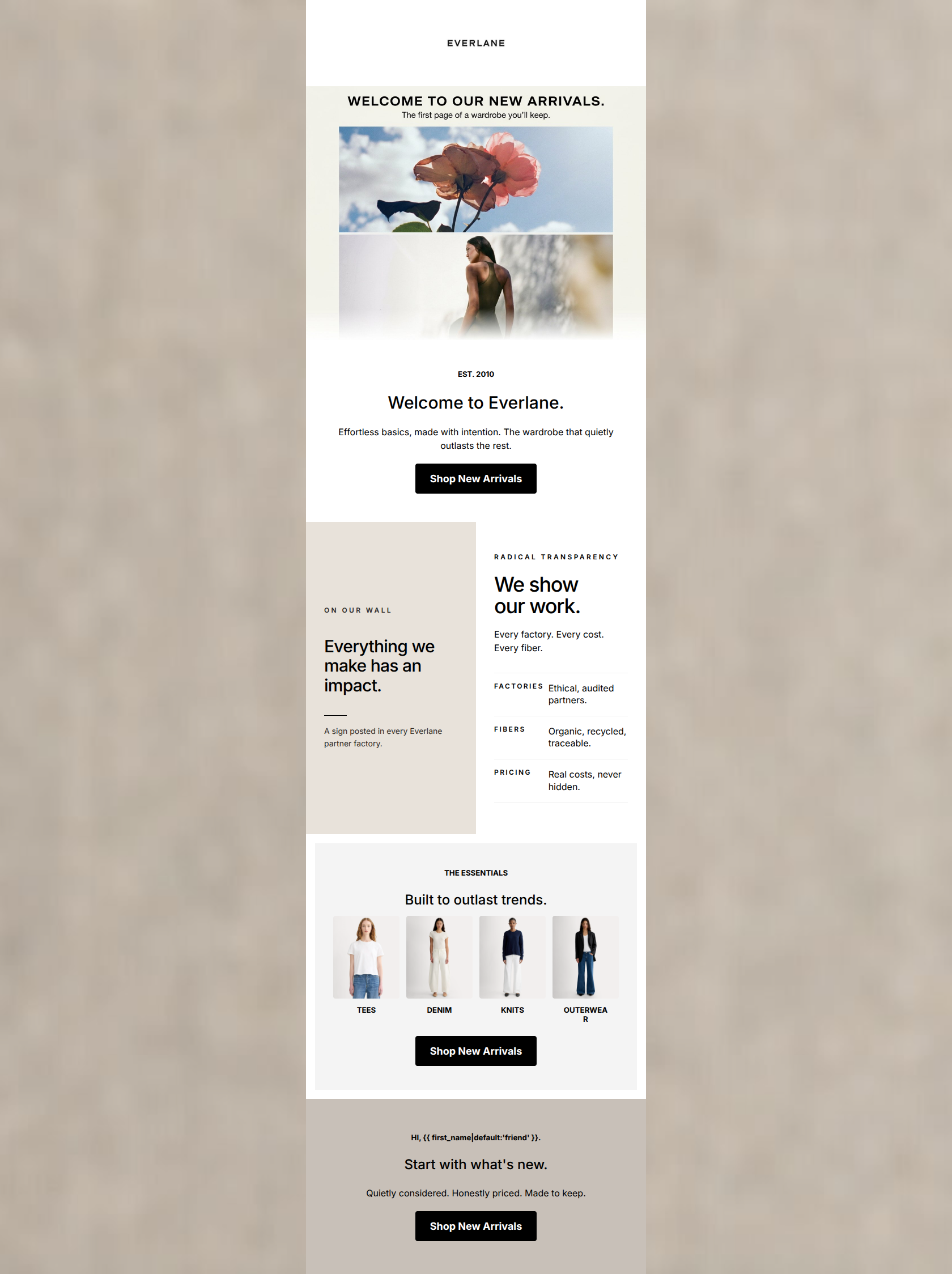
68/100This welcome email successfully captures Everlane's clean, minimalist visual identity but creates unnecessary friction in the conversion path. The primary issue is structural: the incentive ('10% Off') is introduced in the hero image, but the actual promo code ('WELCOME10') is buried at the bottom of the email. This forces users who want to use the discount to scroll past the brand messaging, creating a disjointed experience. Additionally, the live text in the hero relies on filler ('We're glad you're here') rather than reinforcing the offer. To improve conversion, the offer and its mechanics must be consolidated at the top of the email.
Create Your Own
Generate professional email designs like this one in seconds with Kopi AI.
Email Details
- Subject Line
- Welcome to Everlane. Enjoy 10% off.
- Brand
- Everlane [eval 2026-03-25]
- Industry
- Fashion & Apparel
- Email Type
- Welcome
- Created
- March 25, 2026
Brand Colors
Email Copy
Welcome To Everlane.
We're glad you're here, friend.
→ Shop Best Sellers
Radical Transparency.
We partner with ethical factories and source premium materials. You always know the true cost of what you wear.
→ Our Ethical Approach
Your welcome offer.
Apply code WELCOME10 at checkout for your everyday essentials. Expires in 14 days.
→ Shop Best Sellers
Why This Email Works
This welcome email successfully captures Everlane's clean, minimalist visual identity but creates unnecessary friction in the conversion path. The primary issue is structural: the incentive ('10% Off') is introduced in the hero image, but the actual promo code ('WELCOME10') is buried at the bottom of the email. This forces users who want to use the discount to scroll past the brand messaging, creating a disjointed experience. Additionally, the live text in the hero relies on filler ('We're glad you're here') rather than reinforcing the offer. To improve conversion, the offer and its mechanics must be consolidated at the top of the email.
Hero (top/initial part) Impact
60/100- The hero image is on-brand, clean, and immediately introduces a tangible incentive.
- Clear, high-contrast primary CTA button.
Content Structure & Flow
55/100- The shift from a single-column hero to a two-column feature block creates a clear visual break.
- The flow logically moves from welcome -> brand values -> specific offer details, even if the execution creates friction.
Visual Hierarchy & Layout
68/100- Excellent use of negative space throughout the body.
- The stark contrast of the bottom block ensures the promo code is unmissable once the user scrolls to it.
Call-to-Action Strength
60/100- Buttons are high contrast and easy to identify.
- Verbs are clear and direct ('Shop', 'Our').
Message Clarity & Tone
75/100- The articulation of the value proposition ('ethical factories', 'premium materials', 'true cost') is sharp and concise.
- Avoids overused, hype-driven marketing jargon.
Readability & Scannability
85/100- Short, punchy sentences.
- High-contrast text on solid backgrounds.
- Clear hierarchy between H1, H2, and body copy.
Offer & Value Proposition
65/100- The offer is tangible and clearly stated in the hero image.
- The secondary value proposition (ethical manufacturing) is strongly positioned.
Personalization & Audience Fit
70/100- The messaging perfectly targets the 'conscious consumer' psychographic.
Copy Conciseness & Word Economy
78/100- Excellent brevity in the middle section.
- No unnecessary adjectives or fluff in the product descriptions.
Quick Wins
- Move the text 'Apply code WELCOME10 at checkout' directly under the hero H1.
- Remove the fallback word 'friend' from the intro copy.
- Update the top CTA copy to 'Shop With 10% Off' to connect the action to the incentive.



Create Professional Email Designs
Generate beautiful, on-brand email designs in seconds. Just enter your brand URL and let AI do the rest.