Fashion & Apparel Welcome Email Template
“Welcome to Everlane.”
Design Score
86/100This is a strong, highly on-brand welcome email that effectively communicates Everlane's core value propositions: minimalist aesthetics, high-quality basics, and 'Radical Transparency.' The execution is clean, utilizing ample whitespace and striking typography to create an editorial feel that perfectly aligns with the target audience's desire for 'quiet luxury.' The repetition of a single, clear primary CTA ('Shop/Explore New Arrivals') is excellent for driving clicks. To push this from strong to outstanding, the hero section could lead with a more compelling value-driven headline rather than a generic greeting, and a low-friction introductory offer or benefit (like free shipping thresholds) could be introduced to incentivize that crucial first click.
Create Your Own
Generate professional email designs like this one in seconds with Kopi AI.
Email Details
- Subject Line
- Welcome to Everlane.
- Brand
- Everlane
- Industry
- Fashion & Apparel
- Email Type
- Welcome
- Created
- May 6, 2026
Brand Colors
Email Copy
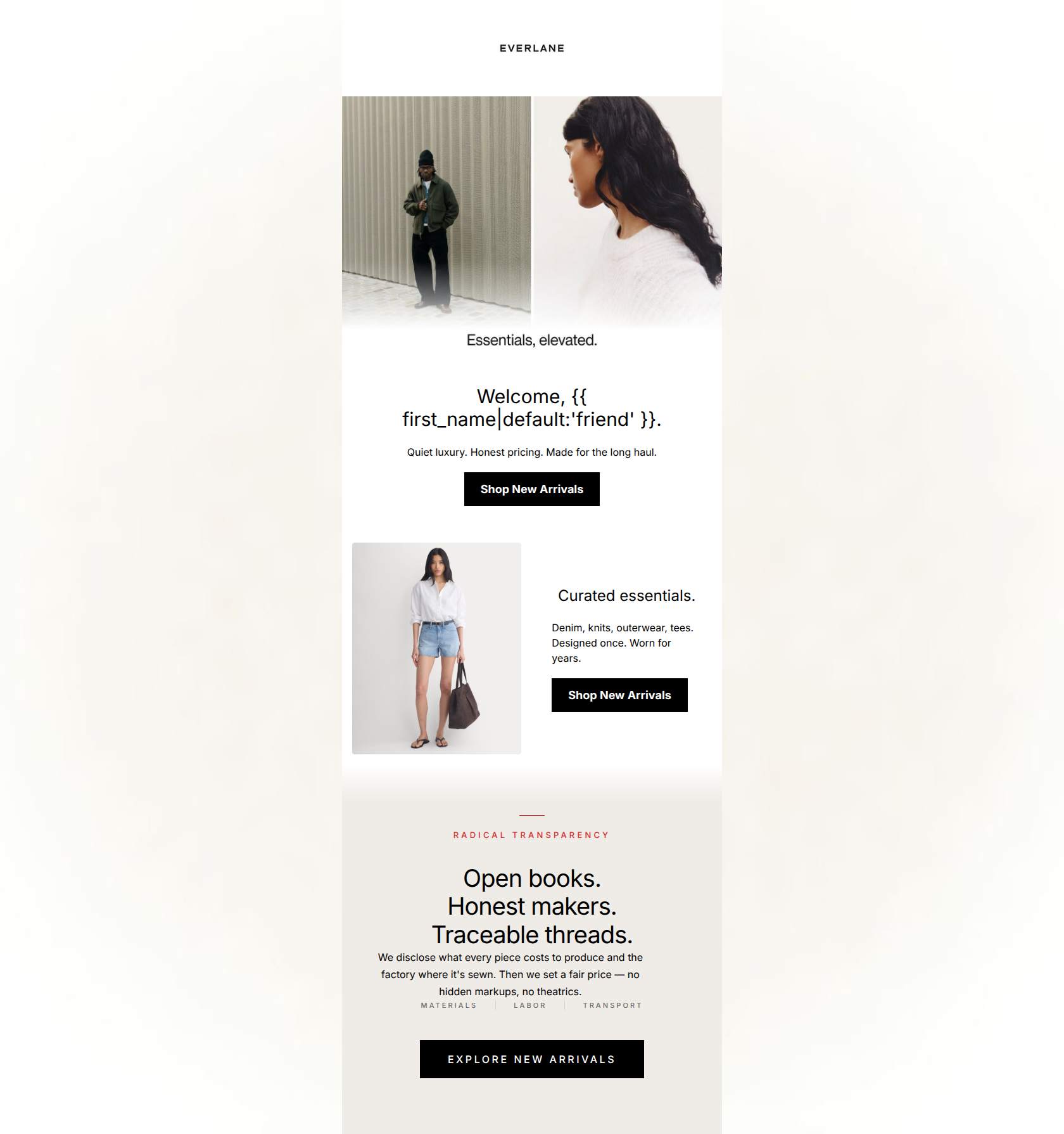
Welcome, friend.
Quiet luxury. Honest pricing. Made for the long haul.
→ Shop New Arrivals
Curated essentials.
Denim, knits, outerwear, tees. Designed once. Worn for years.
→ Shop New Arrivals
Why This Email Works
This is a strong, highly on-brand welcome email that effectively communicates Everlane's core value propositions: minimalist aesthetics, high-quality basics, and 'Radical Transparency.' The execution is clean, utilizing ample whitespace and striking typography to create an editorial feel that perfectly aligns with the target audience's desire for 'quiet luxury.' The repetition of a single, clear primary CTA ('Shop/Explore New Arrivals') is excellent for driving clicks. To push this from strong to outstanding, the hero section could lead with a more compelling value-driven headline rather than a generic greeting, and a low-friction introductory offer or benefit (like free shipping thresholds) could be introduced to incentivize that crucial first click.
Hero Impact
80/100- High-quality editorial photography sets an immediate premium tone.
- Subhead copy is incredibly tight and hits all three major brand pillars in just eight words.
- CTA is highly visible and immediately accessible above the fold.
Content Structure & Flow
88/100- Logical progression from brand introduction to product curation to core differentiators.
- Distinct background colors (white to warm stone) effectively break the email into digestible visual chapters.
Visual Hierarchy & Layout
88/100- Exceptional use of negative space to create an editorial, premium feel.
- Clear distinction between headings, body text, and secondary elements like the red kicker.
- Photography is given prominence without overwhelming the surrounding messaging.
Call-to-Action Strength
96/100- Zero competition for the user's click; every path leads to the same desired destination.
- High-contrast black buttons against white/stone backgrounds stand out immediately.
- Button copy is action-oriented and clear.
Message Clarity & Tone
92/100- Nails the 'understated elegance' voice with zero gimmicks or forced urgency.
- Translates a complex supply-chain philosophy into easily digestible, punchy statements.
Readability & Scannability
85/100- Ample line height and short line lengths make reading effortless.
- Headings do the heavy lifting, allowing skim-readers to get the full story.
Offer & Value Proposition
78/100- Clearly articulates 'why Everlane' rather than just showing products.
- Effectively leverages the 'Radical Transparency' angle as a core value driver.
Personalization & Audience Fit
82/100- Aesthetic and messaging are perfectly calibrated for urban millennials seeking quiet luxury.
- Addresses the customer pain point of fast-fashion guilt head-on with transparent messaging.
Copy Conciseness & Word Economy
96/100- Every sentence adds unique value.
- Uses short, punchy fragments effectively to convey confidence.
Quick Wins
- Increase the font weight or darken the color of the 'MATERIALS | LABOR | TRANSPORT' text so it passes the squint test against the stone background.
- Remove the redundant 'Essentials, elevated' text if it sits directly beneath the image, allowing the stronger subhead to shine.
- Ensure the product categories listed in the second text block ('Denim, knits...') closely match or relate to the adjacent image.




Create Professional Email Designs
Generate beautiful, on-brand email designs in seconds. Just enter your brand URL and let AI do the rest.