Fashion & Apparel Welcome Email Template
“Welcome to Everlane.”
Design Score
88/100This is a highly effective welcome email that confidently executes Everlane's brand pillars. It leans heavily into a clean, minimalist aesthetic and utilizes excellent word economy to communicate its value propositions ('Radical Transparency', 'Timeless Essentials'). The structural flow is highly scannable, and the relentless consistency of the primary CTA ('Shop essentials') across all sections is a textbook example of driving a single conversion goal. The main area for improvement lies in the hero section, which feels slightly disconnected and relies on a generic greeting rather than leading with a strong, immediate value proposition.
Create Your Own
Generate professional email designs like this one in seconds with Kopi AI.
Email Details
- Subject Line
- Welcome to Everlane.
- Brand
- Everlane [eval-prod 2026-05-22]
- Industry
- Fashion & Apparel
- Email Type
- Welcome
- Created
- May 22, 2026
Brand Colors
Email Copy
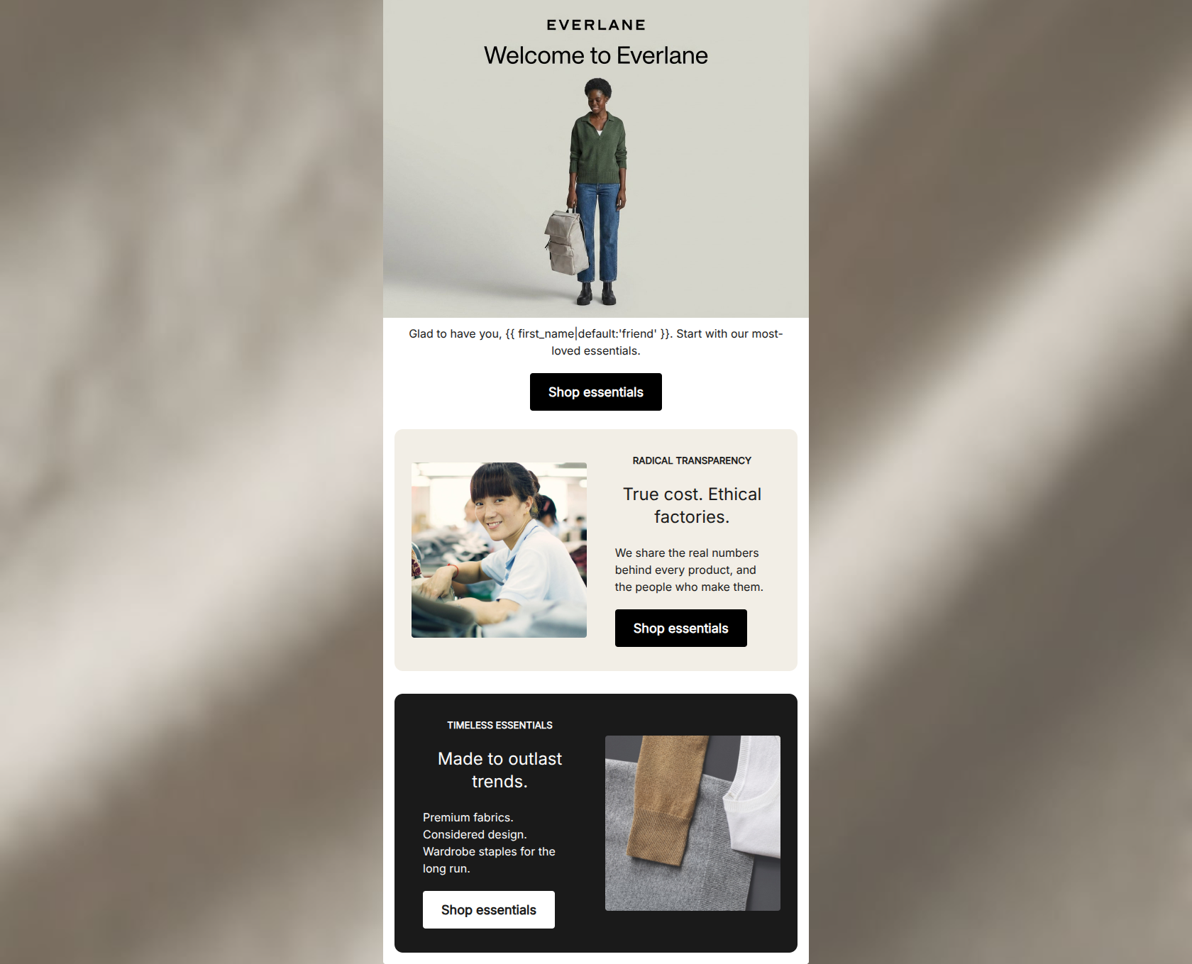
Glad to have you, friend. Start with our most-loved essentials.
→ Shop essentials
RADICAL TRANSPARENCY
True cost. Ethical factories.
We share the real numbers behind every product, and the people who make them.
→ Shop essentials
TIMELESS ESSENTIALS
Made to outlast trends.
Premium fabrics. Considered design. Wardrobe staples for the long run.
→ Shop essentials
Why This Email Works
This is a highly effective welcome email that confidently executes Everlane's brand pillars. It leans heavily into a clean, minimalist aesthetic and utilizes excellent word economy to communicate its value propositions ('Radical Transparency', 'Timeless Essentials'). The structural flow is highly scannable, and the relentless consistency of the primary CTA ('Shop essentials') across all sections is a textbook example of driving a single conversion goal. The main area for improvement lies in the hero section, which feels slightly disconnected and relies on a generic greeting rather than leading with a strong, immediate value proposition.
Hero (top/initial part) Impact
75/100- Clear brand identification immediately upon opening.
- Lifestyle image sets the correct aesthetic tone for the brand.
Content Structure & Flow
88/100- Alternating layout prevents visual fatigue and keeps the reader engaged.
- Logical narrative flow supporting the main conversion goal.
Visual Hierarchy & Layout
85/100- Distinct content blocks created through intelligent use of background colors.
- Clear typographic hierarchy (kicker -> header -> body -> button).
Call-to-Action Strength
98/100- Relentless repetition of a single, clear primary action.
- Excellent color contrast for all buttons against their respective backgrounds.
Message Clarity & Tone
90/100- Strong, confident, and hype-free brand voice.
- Core value propositions are communicated clearly and directly.
Readability & Scannability
92/100- Bite-sized copy blocks tailored for skim-reading.
- Excellent use of white space (and dark space) to let the text breathe.
Offer & Value Proposition
82/100- Successfully sells the brand ethos rather than relying on margin-eroding discounts.
- Value props are clearly separated into distinct, digestible pillars.
Personalization & Audience Fit
85/100- Imagery and messaging directly address the target audience's desire for ethical, transparent fashion.
- Use of a real factory partner image builds immediate trust.
Copy Conciseness & Word Economy
95/100- Zero fluff or filler text.
- Highly distilled, punchy sentences that respect the reader's time.
Quick Wins
- Rephrase the hero's fallback personalization to avoid the slightly awkward 'friend' default if the user's name is unknown.
- Slightly reduce the vertical spacing between the hero section and the first 'Radical Transparency' card to create a tighter visual flow.




Create Professional Email Designs
Generate beautiful, on-brand email designs in seconds. Just enter your brand URL and let AI do the rest.