Fashion & Apparel Welcome Email Template
“Welcome to Everlane.”
Design Score
83/100This welcome email effectively establishes Everlane's 'quiet luxury' aesthetic and core brand pillars of transparency and ethical manufacturing. The visual hierarchy is clean, and the copy is highly concise, respecting the reader's time. However, as a conversion mechanism, it leaves money on the table by omitting a clear incentive (offer) for the first purchase and relying on slightly disjointed hero messaging. The repetition of the primary CTA is strong, though minor text drift introduces slight friction.
Create Your Own
Generate professional email designs like this one in seconds with Kopi AI.
Email Details
- Subject Line
- Welcome to Everlane.
- Brand
- Everlane [eval-prod 2026-05-22]
- Industry
- Fashion & Apparel
- Email Type
- Welcome
- Created
- May 22, 2026
Brand Colors
Email Copy
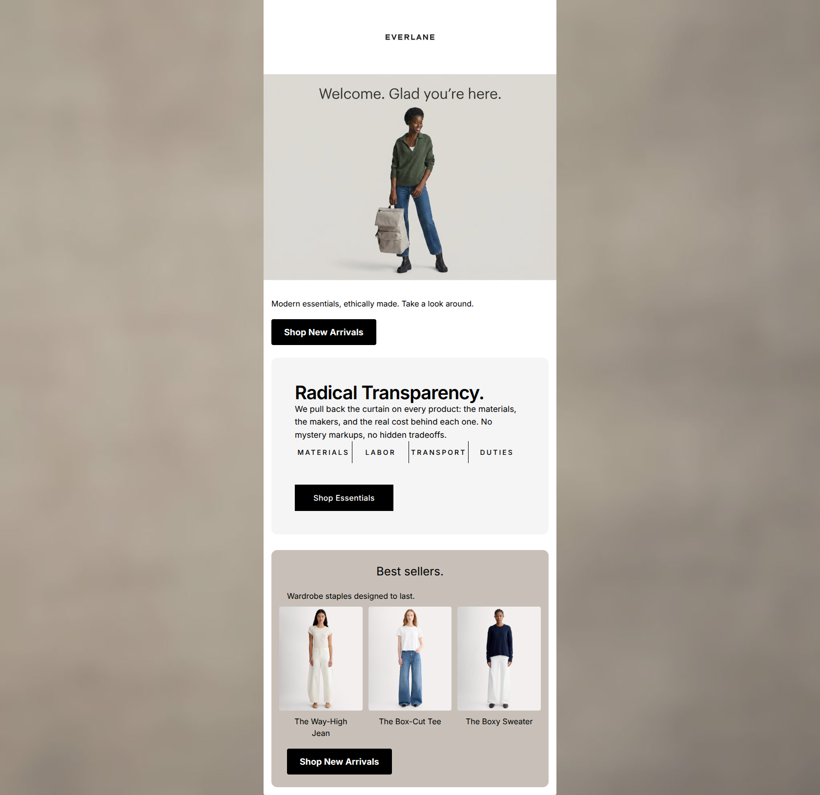
Modern essentials, ethically made. Take a look around.
→ Shop New Arrivals
Best sellers.
Wardrobe staples designed to last.
The Way-High Jean
The Box-Cut Tee
The Boxy Sweater
→ Shop New Arrivals
Why This Email Works
This welcome email effectively establishes Everlane's 'quiet luxury' aesthetic and core brand pillars of transparency and ethical manufacturing. The visual hierarchy is clean, and the copy is highly concise, respecting the reader's time. However, as a conversion mechanism, it leaves money on the table by omitting a clear incentive (offer) for the first purchase and relying on slightly disjointed hero messaging. The repetition of the primary CTA is strong, though minor text drift introduces slight friction.
Hero (top/initial part) Impact
75/100- High-quality, on-brand imagery that immediately communicates the 'quiet luxury' aesthetic.
- Clean, uncluttered top section that draws the eye downward.
Content Structure & Flow
82/100- Logical top-to-bottom funnel from brand introduction to product consideration.
- Distinct visual blocks prevent the content from blending together.
Visual Hierarchy & Layout
80/100- Generous whitespace reinforces the premium positioning of the brand.
- The three-column product layout is well-proportioned and easy to scan.
Call-to-Action Strength
85/100- Excellent repetition of the primary destination, reinforcing the single goal of the email.
- High-contrast black buttons stand out sharply against the muted backgrounds.
Message Clarity & Tone
88/100- Avoids marketing fluff and hyperbole, sticking to clear, factual statements.
- Nails the 'effortlessly cool' and informed brand personality.
Readability & Scannability
90/100- Excellent use of varied font weights to guide the eye.
- Short, punchy sentences that cater to skimming behavior.
Offer & Value Proposition
70/100- The core brand differentiators (ethics, transparency) are front and center.
Personalization & Audience Fit
85/100- Directly addresses the target audience's pain points regarding fast fashion and opacity.
- Visuals match the demographic's preference for unretouched, natural photography.
Copy Conciseness & Word Economy
95/100- Zero filler words or throat-clearing openers.
- Concepts are distilled into their most impactful, briefest forms.
Quick Wins
- Center all CTA buttons to improve visual balance and create a stronger focal point below the content blocks.
- Standardize the CTA copy to 'Shop New Arrivals' across all buttons to ensure expectations match the destination URL.
- Increase the font size of the text immediately below the hero image to improve readability.




Create Professional Email Designs
Generate beautiful, on-brand email designs in seconds. Just enter your brand URL and let AI do the rest.