Fashion & Apparel Welcome Email Template
“Welcome to Everlane.”
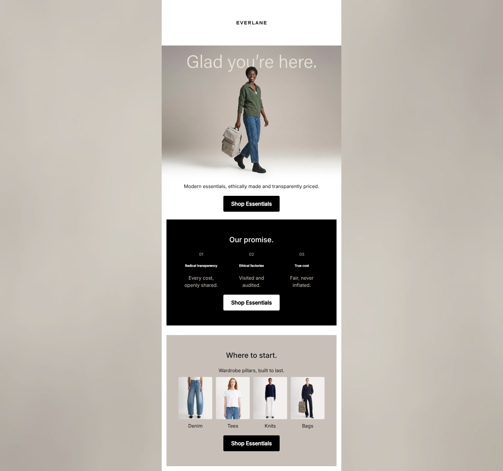
Design Score
83/100This welcome email is a strong visual and tonal representation of Everlane's 'quiet luxury' and radical transparency positioning. It excels in word economy, visual hierarchy, and CTA consistency. However, it leaves significant money on the table by failing to provide an immediate acquisition incentive for first-time buyers and by utilizing a 'one-size-fits-all' URL strategy that dumps all category intent (like clicking on 'Denim' or 'Men') into a generic Women's Best Sellers page. Fixing these friction points will lift the click-to-conversion rate considerably.
Create Your Own
Generate professional email designs like this one in seconds with Kopi AI.
Email Details
- Subject Line
- Welcome to Everlane.
- Brand
- Everlane [eval-prod 2026-05-22]
- Industry
- Fashion & Apparel
- Email Type
- Welcome
- Created
- May 22, 2026
Brand Colors
Email Copy
Modern essentials, ethically made and transparently priced.
→ Shop Essentials
Our promise.
01
Radical transparency
Every cost, openly shared.
02
Ethical factories
Visited and audited.
03
True cost
Fair, never inflated.
→ Shop Essentials
Where to start.
Wardrobe pillars, built to last.
Denim
Tees
Knits
Bags
→ Shop Essentials
Why This Email Works
This welcome email is a strong visual and tonal representation of Everlane's 'quiet luxury' and radical transparency positioning. It excels in word economy, visual hierarchy, and CTA consistency. However, it leaves significant money on the table by failing to provide an immediate acquisition incentive for first-time buyers and by utilizing a 'one-size-fits-all' URL strategy that dumps all category intent (like clicking on 'Denim' or 'Men') into a generic Women's Best Sellers page. Fixing these friction points will lift the click-to-conversion rate considerably.
Hero (top/initial part) Impact
75/100- Direct, no-nonsense subtext perfectly matches the brand voice.
- Photography styling clearly communicates the 'quiet luxury' aesthetic.
Content Structure & Flow
80/100- Logical progression from brand introduction to product discovery.
- Clear delineation of sections prevents the email from feeling overwhelming.
Visual Hierarchy & Layout
88/100- Excellent use of background color changes to demarcate different sections.
- Minimalist aesthetic perfectly supports the product rather than distracting from it.
Call-to-Action Strength
98/100- Single, unambiguous primary action repeated strategically.
- High-contrast buttons (black on light backgrounds, white on dark backgrounds) draw the eye immediately.
Message Clarity & Tone
88/100- Zero marketing fluff or throat-clearing sentences.
- Effectively communicates complex ideas (supply chain, pricing) simply.
Readability & Scannability
82/100- Bite-sized copy blocks make the email effortless to skim.
- Strong use of typographic hierarchy (H2s down to body text).
Offer & Value Proposition
70/100- The brand's inherent value (ethical, transparent pricing) is front and center.
Personalization & Audience Fit
75/100- Speaks directly to the audience's desire for quality and ethical production.
Copy Conciseness & Word Economy
95/100- Extremely tight, punchy sentences.
- Communicates maximum value with minimal reading effort.
Quick Wins
- Fix the hrefs on the category images (Denim, Tees, Knits, Bags) so they actually link to those specific collections instead of the generic best sellers page.
- Improve the contrast of the 'Glad you're here.' overlay text in the hero image so it is easily legible.
- Lighten the grey numbers (01, 02, 03) in the 'Our promise' section to increase contrast against the black background.




Create Professional Email Designs
Generate beautiful, on-brand email designs in seconds. Just enter your brand URL and let AI do the rest.