Fashion & Apparel Welcome Email Template
“Welcome to Everlane.”
Design Score
82/100This welcome email excellently captures Everlane's minimalist, premium aesthetic and distills its core brand promises into easily scannable content. The visual hierarchy is strong, and the strict adherence to a single primary CTA destination is commendable. However, the email fundamentally misprioritizes its content by burying the primary conversion lever—the 10% welcome offer—at the very bottom. Reordering the sections to lead with the offer while maintaining the clean aesthetic will significantly improve click-through rates.
Create Your Own
Generate professional email designs like this one in seconds with Kopi AI.
Email Details
- Subject Line
- Welcome to Everlane.
- Brand
- Everlane [eval-prod 2026-05-07]
- Industry
- Fashion & Apparel
- Email Type
- Welcome
- Created
- May 7, 2026
Brand Colors
Email Copy
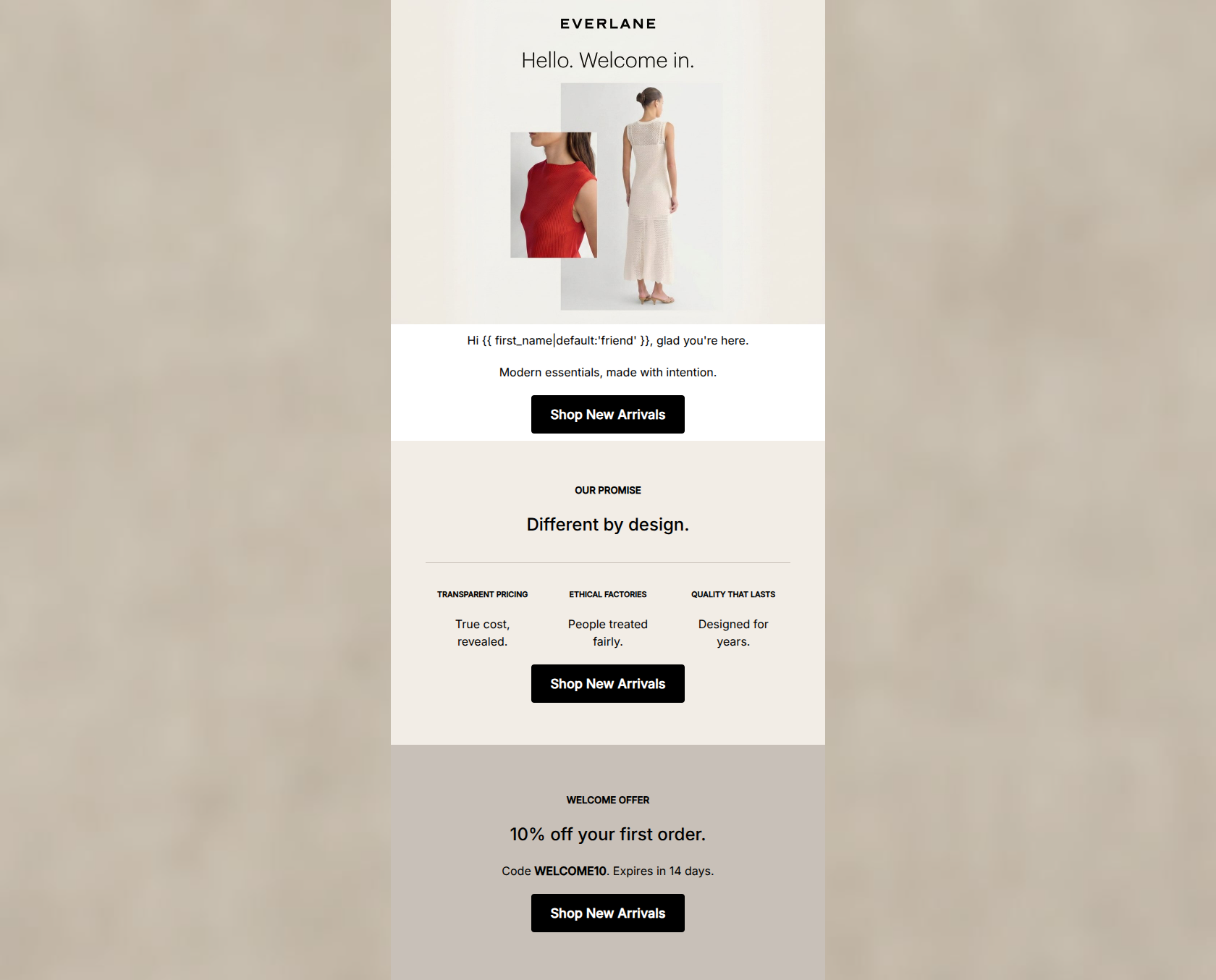
Hi friend, glad you're here.
Modern essentials, made with intention.
→ Shop New Arrivals
OUR PROMISE
Different by design.
TRANSPARENT PRICING
True cost, revealed.
ETHICAL FACTORIES
People treated fairly.
QUALITY THAT LASTS
Designed for years.
→ Shop New Arrivals
WELCOME OFFER
10% off your first order.
Code WELCOME10. Expires in 14 days.
→ Shop New Arrivals
Why This Email Works
This welcome email excellently captures Everlane's minimalist, premium aesthetic and distills its core brand promises into easily scannable content. The visual hierarchy is strong, and the strict adherence to a single primary CTA destination is commendable. However, the email fundamentally misprioritizes its content by burying the primary conversion lever—the 10% welcome offer—at the very bottom. Reordering the sections to lead with the offer while maintaining the clean aesthetic will significantly improve click-through rates.
Hero (top/initial part) Impact
75/100- High-quality, aspirational imagery that perfectly targets the Everlane demographic.
- Clean integration of typography into the hero image.
Content Structure & Flow
65/100- Clear, distinct sections separated by subtle background color shifts.
- Logical grouping of the three core brand pillars.
Visual Hierarchy & Layout
85/100- Excellent use of the brand's neutral color palette (#F2EDE6, #C8C0B8) to delineate sections without jarring the eye.
- The three-column layout for the value propositions is perfectly balanced and scannable.
Call-to-Action Strength
88/100- Flawless consistency in CTA destination.
- High-contrast black buttons stand out clearly against the lighter backgrounds.
Message Clarity & Tone
85/100- Uses strong, brand-aligned vocabulary ('Modern essentials', 'made with intention').
- Confident, understated tone that appeals to the conscious consumer.
Readability & Scannability
95/100- No walls of text; relies on punchy, benefit-driven statements.
- Center alignment works well for these very short text blocks.
Offer & Value Proposition
70/100- Clear statement of the discount value.
- Includes a concrete expiration timeframe to drive urgency.
Personalization & Audience Fit
85/100- Effective use of first-name personalization in the opening.
- Value propositions (Transparent Pricing, Ethical Factories) speak directly to customer pain points with traditional retail.
Copy Conciseness & Word Economy
92/100- Distills complex concepts ('Radical Transparency') into two-word phrases ('True cost, revealed').
- Zero filler adjectives.
Quick Wins
- Move the 10% welcome offer block from the bottom of the email to directly beneath the hero image.
- Make the promo code 'WELCOME10' bolder or slightly larger so it stands out immediately to scanners.
- Delete the text 'Hi {{ first_name }}, glad you're here' as it duplicates the sentiment already integrated into the hero graphic.




Create Professional Email Designs
Generate beautiful, on-brand email designs in seconds. Just enter your brand URL and let AI do the rest.