Electronics & Tech Welcome Email Template
“Welcome to ASUS! Your offer inside.”
Design Score
77/100Strong, clean welcome email with a clear value prop and easy paths into top categories. The discount is compelling but under-leveraged: the code naming conflicts with the stated 10% and the offer sits mid-email without urgency or auto-application, creating friction. Tightening the offer presentation, standardizing CTAs, and adding light personalization will lift clicks and first-purchase conversion.
Create Your Own
Generate professional email designs like this one in seconds with Kopi AI.
Email Details
- Subject Line
- Welcome to ASUS! Your offer inside.
- Brand
- ASUS
- Industry
- Electronics & Tech
- Email Type
- Welcome
- Created
- November 15, 2025
Brand Colors
Email Copy
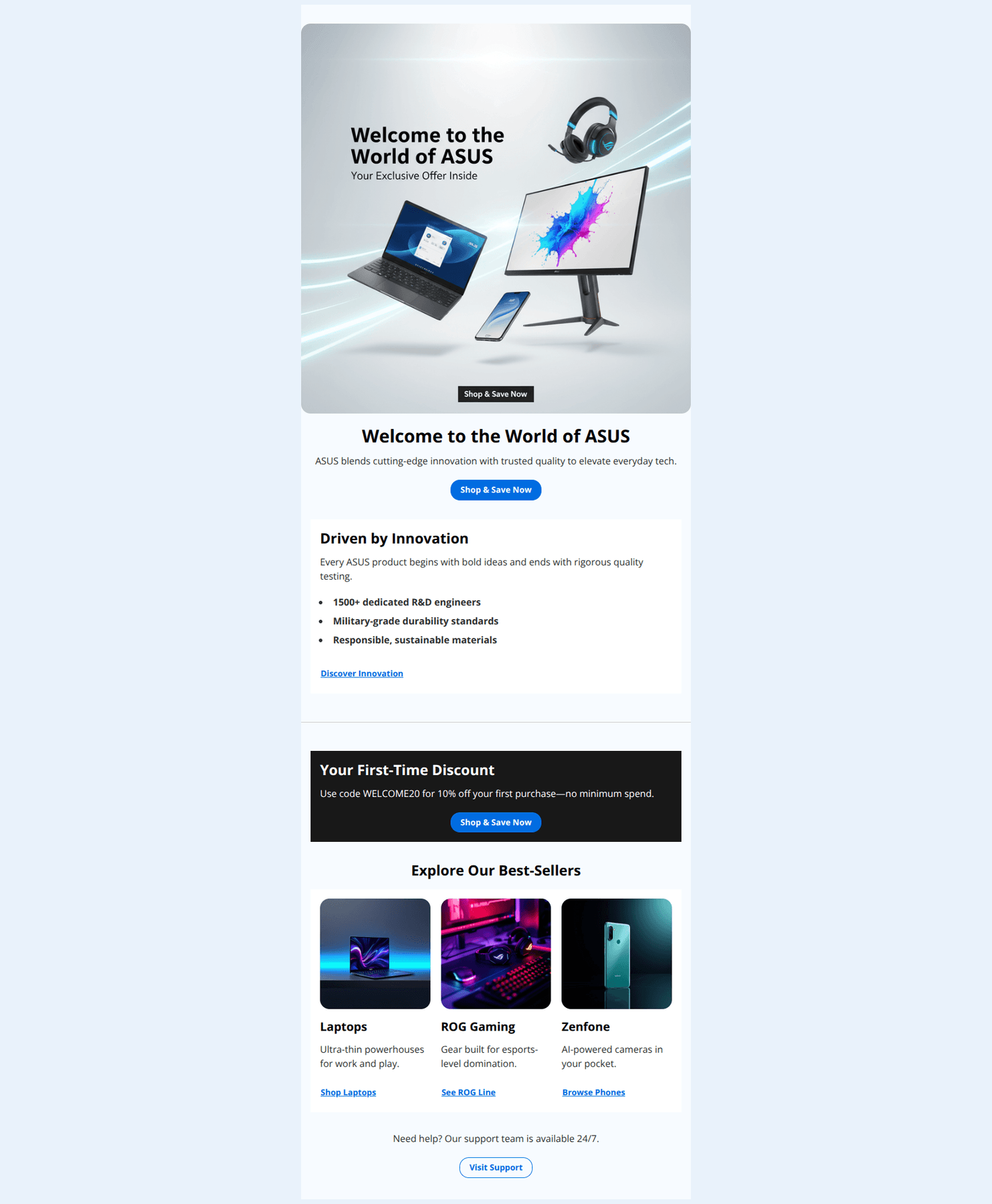
Welcome to the World of ASUS
ASUS blends cutting-edge innovation with trusted quality to elevate everyday tech.
→ Shop & Save Now
Driven by Innovation
Every ASUS product begins with bold ideas and ends with rigorous quality testing.
- 1500+ dedicated R&D engineers
- Military-grade durability standards
- Responsible, sustainable materials
Discover Innovation
Your First-Time Discount
Use code WELCOME20 for 10% off your first purchase—no minimum spend.
→ Shop & Save Now
Explore Our Best-Sellers
Laptops
Ultra-thin powerhouses for work and play.
Shop Laptops
ROG Gaming
Gear built for esports-level domination.
See ROG Line
Zenfone
AI-powered cameras in your pocket.
Browse Phones
Need help? Our support team is available 24/7.
→ Visit Support
Why This Email Works
Strong, clean welcome email with a clear value prop and easy paths into top categories. The discount is compelling but under-leveraged: the code naming conflicts with the stated 10% and the offer sits mid-email without urgency or auto-application, creating friction. Tightening the offer presentation, standardizing CTAs, and adding light personalization will lift clicks and first-purchase conversion.
Hero (top/initial part) Impact
78/100- High-quality, aspirational hero visual featuring multiple product lines.
- Immediate, centered primary CTA supports fast scanning and action.
Content Structure & Flow
82/100- Clear progression from brand credibility to shopping areas.
- Support module at the end reassures new customers.
Visual Hierarchy & Layout
85/100- Offer card stands out due to dark background and centered CTA.
- Consistent square imagery and concise headlines aid quick comprehension.
Call-to-Action Strength
74/100- Primary and secondary CTAs are frequent and easy to find.
- Category CTAs map correctly to the corresponding destinations.
Message Clarity & Tone
80/100- Concise, plain-language copy that’s easy to read.
- Solid proof points (“1500+ dedicated R&D engineers,” “Military-grade durability”).
Readability & Scannability
88/100- Bulleted innovation points improve scan depth.
- Clear section headers segment content effectively.
Offer & Value Proposition
70/100- Clear first-time incentive that aligns with a welcome journey.
- Dark promo card visually elevates the offer.
Personalization & Audience Fit
60/100- Includes three major paths (Laptops, ROG, Zenfone) to cover key interests.
- Support CTA helps all segments regardless of purchase intent.
Quick Wins
- Fix the code/offer mismatch: change the code name or the offer text so they align.
- Move the “Your First-Time Discount” block directly under the hero or echo the offer in the hero subhead.
- Standardize category CTAs to stronger verbs: “Shop ROG” instead of “See ROG Line.”
- Add an end date to the offer to create urgency.
- Reference the code under key CTAs: “Use code WELCOME20 at checkout.”




Create Professional Email Designs
Generate beautiful, on-brand email designs in seconds. Just enter your brand URL and let AI do the rest.