Fashion & Apparel Welcome Email Template
“Welcome. Know what you're wearing.”
Design Score
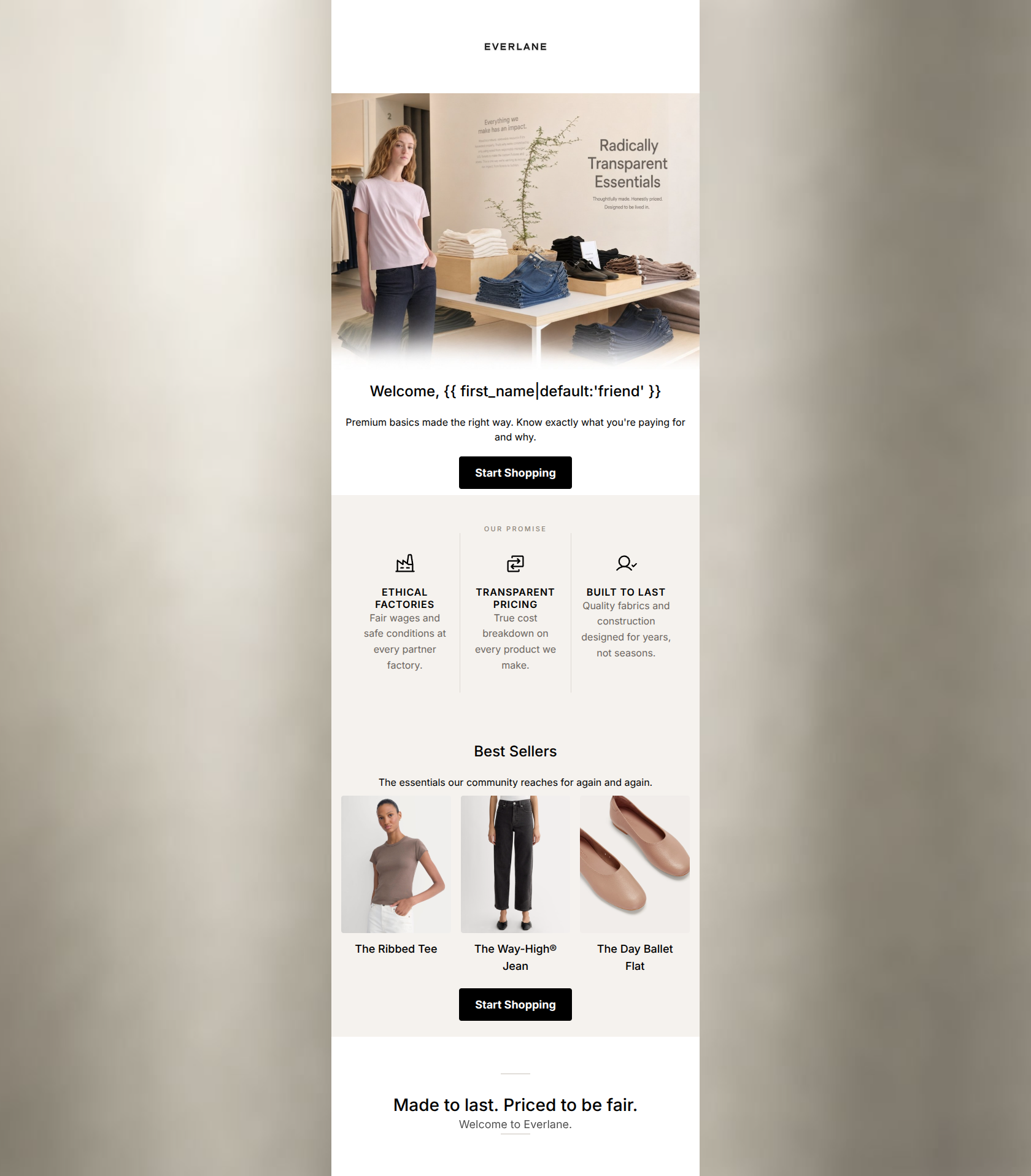
88/100This is a highly effective, beautifully designed welcome email that perfectly encapsulates Everlane's brand identity. The minimalist layout, strong use of whitespace, and clear enunciation of the 'Radical Transparency' value proposition build immediate trust. The email follows a logical, inverted pyramid structure leading down to high-contrast, consistent CTAs. To push this from an 88 to a 95+, the focus should shift to optimizing the hero graphic (removing embedded text) and ensuring the product recommendations dynamically match the subscriber's gender or preferences.
Create Your Own
Generate professional email designs like this one in seconds with Kopi AI.
Email Details
- Subject Line
- Welcome. Know what you're wearing.
- Brand
- Everlane [eval 2026-03-25]
- Industry
- Fashion & Apparel
- Email Type
- Welcome
- Created
- April 24, 2026
Brand Colors
Email Copy
Welcome, friend
Premium basics made the right way. Know exactly what you're paying for and why.
→ Start Shopping
Best Sellers
The essentials our community reaches for again and again.
The Ribbed Tee
The Way-High® Jean
The Day Ballet Flat
→ Start Shopping
Why This Email Works
This is a highly effective, beautifully designed welcome email that perfectly encapsulates Everlane's brand identity. The minimalist layout, strong use of whitespace, and clear enunciation of the 'Radical Transparency' value proposition build immediate trust. The email follows a logical, inverted pyramid structure leading down to high-contrast, consistent CTAs. To push this from an 88 to a 95+, the focus should shift to optimizing the hero graphic (removing embedded text) and ensuring the product recommendations dynamically match the subscriber's gender or preferences.
Hero (top/initial part) Impact
85/100- Strong, authentic lifestyle imagery that sets the brand mood immediately.
- Clear, prominent statement of the core 'Radical Transparency' value proposition.
- Clean integration of personalization in the heading.
Content Structure & Flow
90/100- Excellent use of the inverted pyramid model, funneling attention toward the CTAs.
- Distinct sections created through subtle background color changes (#F5F2EE vs #FFFFFF).
- Strong concluding statement that reinforces the brand's core pillars.
Visual Hierarchy & Layout
95/100- The black CTA buttons provide perfect contrast and immediately draw the eye.
- The clean, geometric layout aligns perfectly with Everlane's minimalist brand identity.
- Images are uniformly sized, creating a cohesive and organized product grid.
Call-to-Action Strength
92/100- Consistent primary action across the entire email.
- High visual prominence using the primary brand black against light backgrounds.
- Correct repetition of the CTA to capture clicks at different scroll depths.
Message Clarity & Tone
90/100- Lack of jargon or overly promotional language builds trust.
- The 'Made to last. Priced to be fair.' sign-off is a powerful, memorable closing statement.
- Focus on 'why' the products matter (transparency, ethical factories) resonates deeply with the target audience.
Readability & Scannability
88/100- Iconography in the 'Our Promise' section makes the value propositions instantly scannable.
- Short, punchy product names under the images reduce cognitive load.
- High contrast between the black text and the off-white/white backgrounds.
Offer & Value Proposition
82/100- The 'True cost breakdown' and 'Fair wages' pillars clearly differentiate the brand from fast fashion competitors.
- The focus on quality and longevity ('designed for years, not seasons') effectively addresses customer pain points regarding durability.
Personalization & Audience Fit
82/100- The visual aesthetic perfectly targets the millennial/Gen Z conscious consumer.
- The messaging aligns directly with the target audience's desire for ethical, transparent fashion.
Copy Conciseness & Word Economy
92/100- Zero throat-clearing in the introductory text.
- The 'Our Promise' section distills complex supply chain concepts into three concise, impactful sentences.
- Product descriptions are limited to exactly what is needed to generate interest.
Quick Wins
- Remove the small, hard-to-read descriptive paragraph embedded directly within the hero image asset.
- Update the CTA copy from the generic 'Start Shopping' to 'Shop New Arrivals' to clearly match the destination URL.
- Ensure the vertical spacing above and below the 'Our Promise' icons is perfectly uniform to maintain the elevated, minimalist aesthetic.




Create Professional Email Designs
Generate beautiful, on-brand email designs in seconds. Just enter your brand URL and let AI do the rest.