Fashion & Apparel Welcome Email Template
“Welcome. Know what you're wearing.”
Design Score
84/100This welcome email executes Everlane's minimalist, ultra-transparent brand identity with high fidelity. The visual hierarchy is clean, the monochrome palette aligns perfectly with the brand, and the primary call-to-action is correctly repeated throughout the design to drive users toward a single goal. However, while the brand storytelling is strong, the conversion architecture buries the primary financial incentive (the 10% welcome offer) at the very bottom of the email. Additionally, minor copy misalignments create slight friction in the narrative flow. Elevating the offer and tightening the tone will push this from a strong brand piece to a highly effective conversion engine.
Create Your Own
Generate professional email designs like this one in seconds with Kopi AI.
Email Details
- Subject Line
- Welcome. Know what you're wearing.
- Brand
- Everlane [eval-prod 2026-04-10]
- Industry
- Fashion & Apparel
- Email Type
- Welcome
- Created
- April 10, 2026
Brand Colors
Email Copy
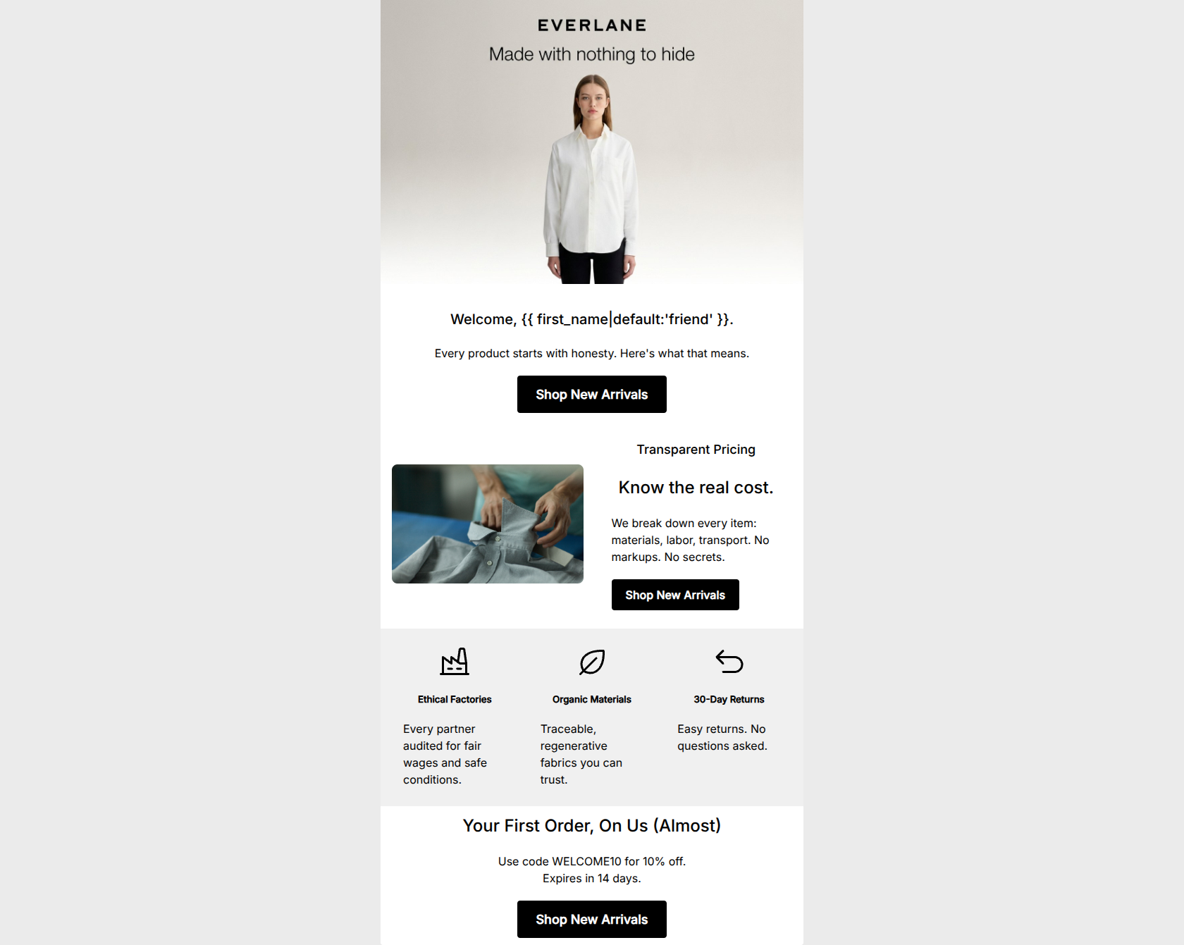
Welcome, friend.
Every product starts with honesty. Here's what that means.
→ Shop New Arrivals
Transparent Pricing
Know the real cost.
We break down every item: materials, labor, transport. No markups. No secrets.
→ Shop New Arrivals
Ethical Factories
Every partner audited for fair wages and safe conditions.
Organic Materials
Traceable, regenerative fabrics you can trust.
30-Day Returns
Easy returns. No questions asked.
Your First Order, On Us (Almost)
Use code WELCOME10 for 10% off. Expires in 14 days.
→ Shop New Arrivals
Why This Email Works
This welcome email executes Everlane's minimalist, ultra-transparent brand identity with high fidelity. The visual hierarchy is clean, the monochrome palette aligns perfectly with the brand, and the primary call-to-action is correctly repeated throughout the design to drive users toward a single goal. However, while the brand storytelling is strong, the conversion architecture buries the primary financial incentive (the 10% welcome offer) at the very bottom of the email. Additionally, minor copy misalignments create slight friction in the narrative flow. Elevating the offer and tightening the tone will push this from a strong brand piece to a highly effective conversion engine.
Hero (top/initial part) Impact
80/100- Striking, brand-aligned minimalist visual presentation.
- Immediate introduction of the core value proposition.
Content Structure & Flow
75/100- Clear delineation between different content blocks.
- Strong use of whitespace to separate ideas.
Visual Hierarchy & Layout
85/100- Excellent use of contrasting backgrounds to define sections.
- Clean, grid-based layout that is easy to parse.
Call-to-Action Strength
95/100- Consistent CTA copy ('Shop New Arrivals') across all touchpoints.
- All buttons drive to a single, unified destination.
- High visual contrast (black button, white text) ensures the CTA pops against the layout.
Message Clarity & Tone
78/100- The 'Transparent Pricing' section copy is punchy, confident, and perfectly on-brand.
- Tone is generally calm and accessible.
Readability & Scannability
85/100- Excellent use of hierarchy (H2, H4, H5) to guide the reader's eye.
- High contrast text (black on white/light gray) ensures optimal legibility.
Offer & Value Proposition
82/100- Clear translation of brand features (audits, regenerative fabrics) into customer benefits (trust, fair wages).
- Directly addresses the audience's desire for sustainability and ethics.
Personalization & Audience Fit
85/100- Nails the psychographic profile by focusing heavily on transparency and ethics before pushing products.
- Use of the word 'you/your' in the lower sections connects the brand's actions to the reader's outcomes.
Copy Conciseness & Word Economy
90/100- Ruthless editing; every word serves a purpose.
- Short, punchy sentences create a confident, authoritative brand voice.
Quick Wins
- Rewrite the offer headline from 'Your First Order, On Us (Almost)' to 'Enjoy 10% Off Your First Order' to eliminate hyperbole.
- Remove 'Here's what that means.' from the hero text to eliminate the disjointed flow before the first CTA.
- Bold the promo code 'WELCOME10' to make it easier to spot while scanning.




Create Professional Email Designs
Generate beautiful, on-brand email designs in seconds. Just enter your brand URL and let AI do the rest.