Fashion & Apparel Welcome Email Template
“Welcome. Here's what we're about.”

Design Score
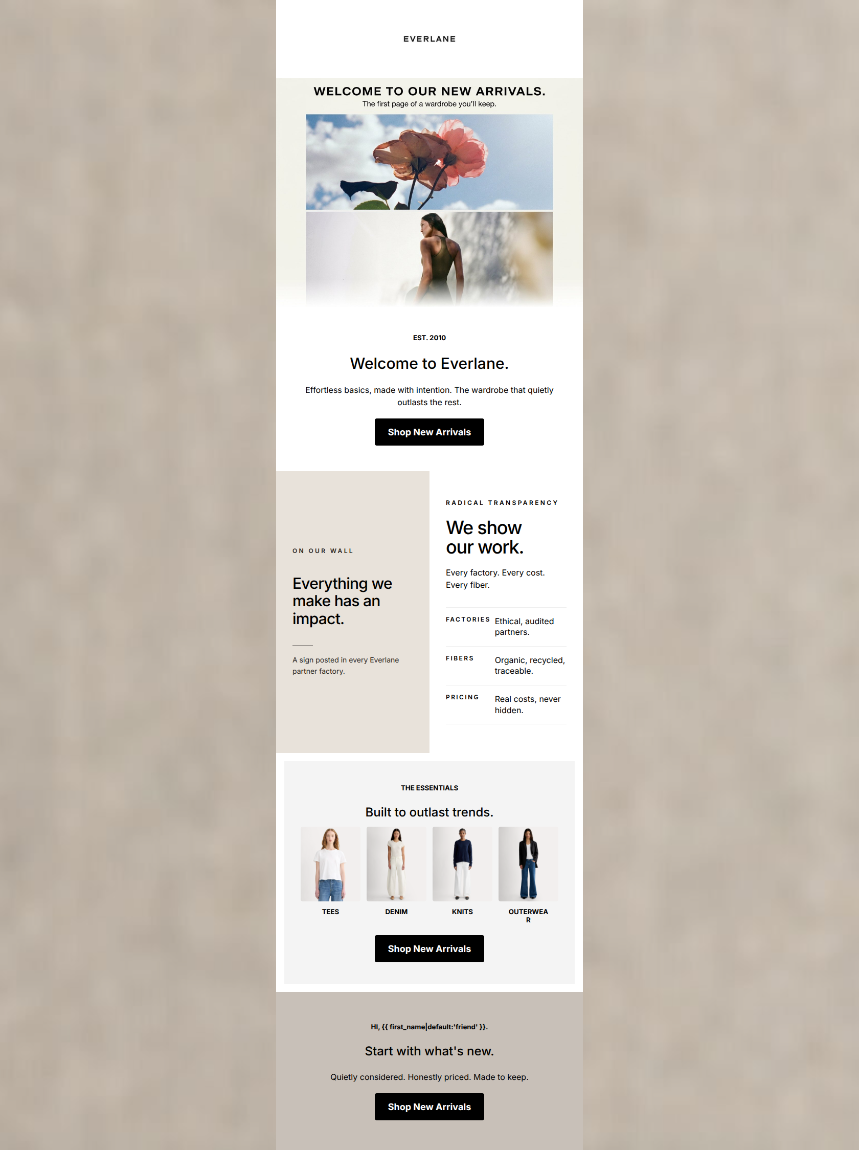
79/100A structurally sound and highly brand-aligned welcome email that clearly articulates Everlane's 'Radical Transparency' value proposition. The copy is notably tight, and the minimalist aesthetic matches the brand guidelines perfectly. However, the email leans heavily into being a brand manifesto at the expense of immediate conversion drivers. The hero section lacks a strong typographic anchor, and the absence of a tangible 'welcome' incentive or specific product highlights forces the user to do the heavy lifting to find something to buy.
Create Your Own
Generate professional email designs like this one in seconds with Kopi AI.
Email Details
- Subject Line
- Welcome. Here's what we're about.
- Brand
- Everlane [eval-prod 2026-04-08]
- Industry
- Fashion & Apparel
- Email Type
- Welcome
- Created
- April 8, 2026
Brand Colors
Email Copy
Welcome, friend. You deserve to know what your clothes cost and why.
→ Shop Best Sellers
No Markups. No Secrets.
We reveal the true cost of every product: materials, labor, transport. Then we cut out the middleman so you pay less for more.
Why This Email Works
A structurally sound and highly brand-aligned welcome email that clearly articulates Everlane's 'Radical Transparency' value proposition. The copy is notably tight, and the minimalist aesthetic matches the brand guidelines perfectly. However, the email leans heavily into being a brand manifesto at the expense of immediate conversion drivers. The hero section lacks a strong typographic anchor, and the absence of a tangible 'welcome' incentive or specific product highlights forces the user to do the heavy lifting to find something to buy.
Hero (top/initial part) Impact
65/100- Uses a brand-appropriate, warm lifestyle image.
- Introduces personalization immediately in the opening line.
Content Structure & Flow
75/100- Logical progression of information.
- Doesn't overwhelm the user with too many different sections.
Visual Hierarchy & Layout
80/100- Excellent use of whitespace to reduce cognitive load.
- The 'No Markups' section is effectively highlighted with a distinct background color.
Call-to-Action Strength
78/100- High contrast (black on white/gray) ensures the buttons are unmissable.
- Clear, direct command ('Shop').
Message Clarity & Tone
85/100- 'No Markups. No Secrets.' is a brilliant, concise encapsulation of the brand.
- Tone speaks directly to the intelligence of the conscious consumer.
Readability & Scannability
88/100- The three-pillar section is extremely easy to digest at a glance.
- High contrast text against background colors throughout.
Offer & Value Proposition
70/100- The brand value prop is front and center and clearly explained.
- Focuses on the 'why' behind the brand.
Personalization & Audience Fit
80/100- Uses a first-name merge tag to establish immediate rapport.
- The copy ('You deserve to know...') speaks directly to the customer's desires and pain points.
Copy Conciseness & Word Economy
92/100- 'Built to last, not to landfill' is punchy, memorable, and conveys maximum meaning with minimal words.
- Every sentence adds unique value to the narrative.
Quick Wins
- Add a strong, large H1 headline (e.g., 'Welcome to Radical Transparency') immediately below the hero image to anchor attention.
- Change the copy of the second CTA to 'Explore The Collection' to avoid repeating 'Shop Best Sellers'.
- Increase the font size of the initial welcome text block to improve readability and visual hierarchy.


Create Professional Email Designs
Generate beautiful, on-brand email designs in seconds. Just enter your brand URL and let AI do the rest.