Fashion & Apparel Welcome Email Template
“Welcome. Here's 10% off.”
Design Score
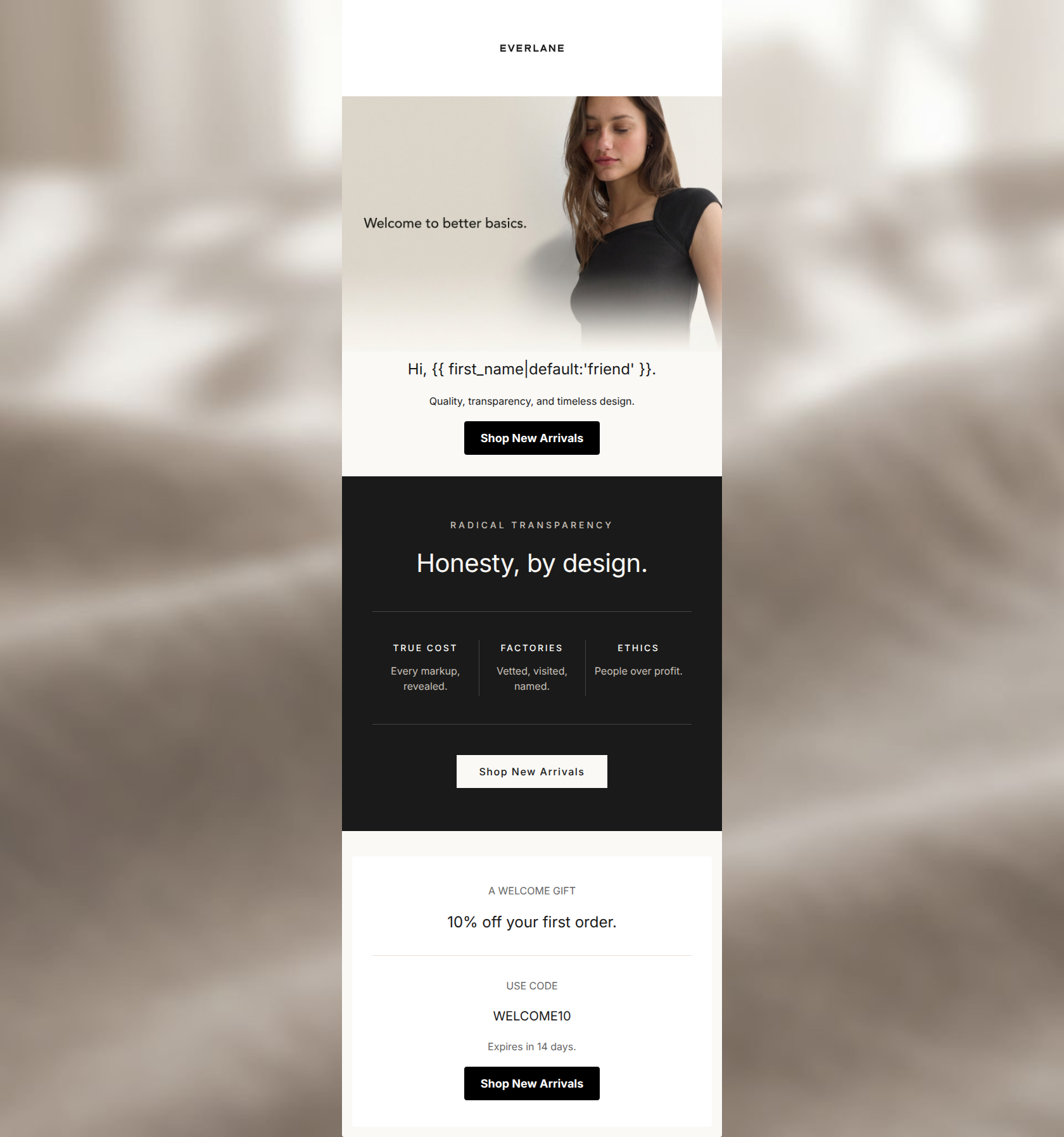
81/100This welcome email successfully captures Everlane's 'quiet luxury' aesthetic and clearly communicates the brand's core differentiator of radical transparency. The visual design is striking, and the copy is incredibly tight and on-brand. However, from a conversion standpoint, it makes a fundamental error: burying the primary financial incentive (10% off) at the very bottom of the email. To maximize clicks, the welcome offer must be visible without requiring the user to scroll past a brand manifesto.
Create Your Own
Generate professional email designs like this one in seconds with Kopi AI.
Email Details
- Subject Line
- Welcome. Here's 10% off.
- Brand
- Everlane [eval-prod 2026-05-06]
- Industry
- Fashion & Apparel
- Email Type
- Welcome
- Created
- May 6, 2026
Brand Colors
Email Copy
Hi, friend.
Quality, transparency, and timeless design.
→ Shop New Arrivals
A WELCOME GIFT
10% off your first order.
USE CODE
WELCOME10
Expires in 14 days.
→ Shop New Arrivals
Why This Email Works
This welcome email successfully captures Everlane's 'quiet luxury' aesthetic and clearly communicates the brand's core differentiator of radical transparency. The visual design is striking, and the copy is incredibly tight and on-brand. However, from a conversion standpoint, it makes a fundamental error: burying the primary financial incentive (10% off) at the very bottom of the email. To maximize clicks, the welcome offer must be visible without requiring the user to scroll past a brand manifesto.
Hero (top/initial part) Impact
72/100- The imagery perfectly aligns with the brand's minimalist, editorial aesthetic.
- The immediate introduction of 'better basics' clearly sets expectations for the product catalog.
Content Structure & Flow
65/100- Distinct visual banding (cream, black, white) cleanly separates the three core messages.
- The email is easy to scroll and digest linearly.
Visual Hierarchy & Layout
85/100- Excellent use of color blocking to guide the eye down the page.
- The three-column layout in the manifesto section breaks up the text beautifully and aids quick scanning.
Call-to-Action Strength
95/100- Flawless repetition: three identical buttons all pointing to the exact same destination ('Shop New Arrivals').
- High contrast styling (black on light backgrounds, cream on dark backgrounds) ensures the CTA never gets lost.
Message Clarity & Tone
88/100- The copy sounds confident and understated, perfectly matching the visual minimalism.
- The 'Radical Transparency' messaging is clear, specific, and memorable.
Readability & Scannability
85/100- Generous editorial whitespace makes the text feel light and approachable.
- The use of all-caps kicker labels (e.g., 'TRUE COST', 'FACTORIES') allows the reader to absorb the core themes in seconds.
Offer & Value Proposition
75/100- The expiration urgency ('Expires in 14 days') is a great addition to drive immediate action.
- The brand's value proposition is uniquely differentiated from competitors.
Personalization & Audience Fit
75/100- The messaging perfectly aligns with the target demographic's desire for 'conscious consumption'.
- The tone treats the reader intelligently, fitting the urban, educated audience profile.
Copy Conciseness & Word Economy
92/100- Zero filler phrases or 'throat-clearing' openers.
- The three-word descriptors ('Vetted, visited, named') are incredibly impactful and efficient.
Quick Wins
- Move the 10% off 'Welcome Gift' block immediately below the hero section so it is visible without scrolling.
- Remove the 'Hi, {{ first_name }}' greeting to pull the CTA and core messaging higher up.
- Increase the visual prominence of the 'WELCOME10' promo code.




Create Professional Email Designs
Generate beautiful, on-brand email designs in seconds. Just enter your brand URL and let AI do the rest.