Fashion & Apparel Welcome Email Template
“Welcome. Here's 10% off.”
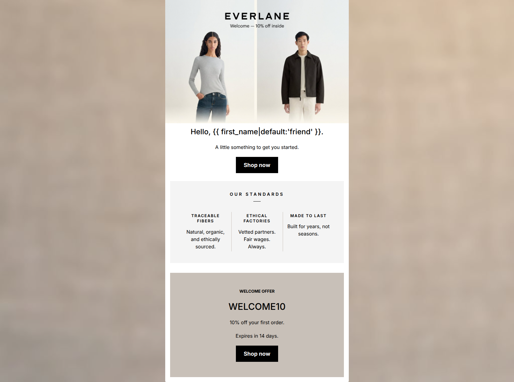
Design Score
86/100This is a strong, highly competent welcome email that thoroughly understands its brand identity. It leverages Everlane's minimalist aesthetic, transparent tone, and editorial styling to create a premium feel. The email follows a logical flow, building trust with brand pillars before presenting a clear offer. The calls-to-action are distinct, high-contrast, and appropriately consistent. While the execution is solid, the hero section could do a better job of pulling the specific offer forward into the live text to guarantee immediate impact for fast-scrollers.
Create Your Own
Generate professional email designs like this one in seconds with Kopi AI.
Email Details
- Subject Line
- Welcome. Here's 10% off.
- Brand
- Everlane
- Industry
- Fashion & Apparel
- Email Type
- Welcome
- Created
- May 7, 2026
Brand Colors
Email Copy
Hello, friend.
A little something to get you started.
→ Shop now
WELCOME OFFER
WELCOME10
10% off your first order.
Expires in 14 days.
→ Shop now
Why This Email Works
This is a strong, highly competent welcome email that thoroughly understands its brand identity. It leverages Everlane's minimalist aesthetic, transparent tone, and editorial styling to create a premium feel. The email follows a logical flow, building trust with brand pillars before presenting a clear offer. The calls-to-action are distinct, high-contrast, and appropriately consistent. While the execution is solid, the hero section could do a better job of pulling the specific offer forward into the live text to guarantee immediate impact for fast-scrollers.
Hero Impact
75/100- Clean, brand-aligned imagery that showcases the product style.
- Personalization token used in the main heading.
Content Structure & Flow
88/100- Logical progression from brand introduction to conversion event.
- Distinct visual blocks make the transition between topics obvious.
Visual Hierarchy & Layout
88/100- The off-white trust card with hairlines reads like a premium magazine insert.
- High contrast typography establishes clear reading order.
Call-to-Action Strength
95/100- Consistent action ('Shop now') and consistent destination.
- Excellent color contrast makes the buttons the most prominent elements on the screen.
Message Clarity & Tone
92/100- 'Built for years, not seasons' is a fantastic, punchy distillation of the brand's value proposition.
- The tone is confident and understated, avoiding aggressive sales language.
Readability & Scannability
90/100- The three-column layout for the standards makes complex ethical claims instantly digestible.
- No dense paragraphs or 'walls of text'.
Offer & Value Proposition
88/100- Clear, unambiguous discount amount.
- Includes a specific expiration timeframe to drive immediate action.
Copy Conciseness & Word Economy
90/100- Ruthless editing; no throat-clearing openers or redundant sentences.
- Punchy, memorable phrasing in the value pillars.
Quick Wins
- Update the subheadline below 'Hello' to explicitly state 'Enjoy 10% off your first order' so the offer is visible immediately in live text.
- Bold the '14 days' text in the expiration notice to increase urgency.




Create Professional Email Designs
Generate beautiful, on-brand email designs in seconds. Just enter your brand URL and let AI do the rest.