Fashion & Apparel Welcome Email Template
“Welcome. Here's 10% off.”
Design Score
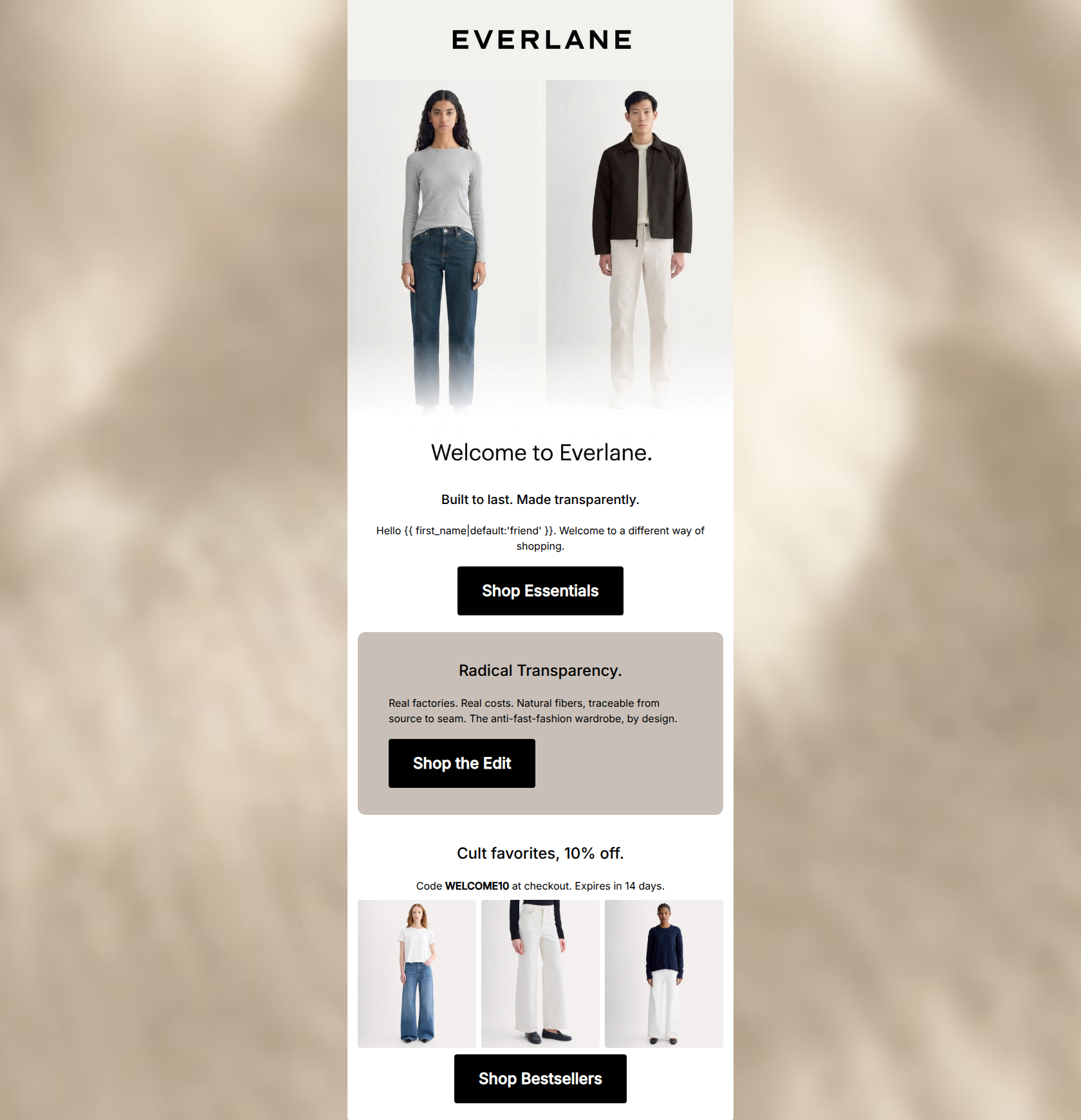
81/100This welcome email effectively establishes Everlane's minimalist aesthetic and 'Radical Transparency' value proposition with crisp, concise copy. The use of a consistent primary destination URL across all three CTAs is an excellent practice that focuses the user's attention. However, the email suffers from a structural flaw by burying the welcome discount at the bottom, and a significant audience-fit issue by featuring both genders in the hero but directing all traffic to women's products.
Create Your Own
Generate professional email designs like this one in seconds with Kopi AI.
Email Details
- Subject Line
- Welcome. Here's 10% off.
- Brand
- Everlane
- Industry
- Fashion & Apparel
- Email Type
- Welcome
- Created
- May 7, 2026
Brand Colors
Email Copy
Built to last. Made transparently.
Hello friend. Welcome to a different way of shopping.
→ Shop Essentials
Radical Transparency.
Real factories. Real costs. Natural fibers, traceable from source to seam. The anti-fast-fashion wardrobe, by design.
→ Shop the Edit
Cult favorites, 10% off.
Code WELCOME10 at checkout. Expires in 14 days.
→ Shop Bestsellers
Why This Email Works
This welcome email effectively establishes Everlane's minimalist aesthetic and 'Radical Transparency' value proposition with crisp, concise copy. The use of a consistent primary destination URL across all three CTAs is an excellent practice that focuses the user's attention. However, the email suffers from a structural flaw by burying the welcome discount at the bottom, and a significant audience-fit issue by featuring both genders in the hero but directing all traffic to women's products.
Hero (top/initial part) Impact
75/100- Immediate establishment of the brand's minimalist, high-quality aesthetic.
- Clear, benefit-driven subheadline ('Built to last. Made transparently.').
Content Structure & Flow
75/100- Clear demarcation between the brand mission and the product grid.
- The use of the taupe background block effectively groups the transparency message.
Visual Hierarchy & Layout
85/100- Excellent use of the brand's canvas background color (#C8C0B8) to highlight the central value proposition.
- Clean 3-column product grid that doesn't overwhelm the user.
Call-to-Action Strength
95/100- Flawless consistency in the href destination across the entire email.
- High-contrast black buttons stand out sharply against the white and taupe backgrounds.
- CTA copy is action-oriented and unambiguous.
Message Clarity & Tone
90/100- Tone is perfectly aligned with the target audience's desire for no-nonsense, honest marketing.
- Focus on tangible benefits ('traceable from source to seam').
Readability & Scannability
88/100- Excellent ratio of text to whitespace.
- Headings are distinct and effectively summarize the text below them.
Offer & Value Proposition
75/100- Clear, easy-to-understand discount.
- Creates urgency with the 14-day expiration notice.
- Strong brand differentiator clearly explained.
Personalization & Audience Fit
55/100- The imagery reflects the demographic's desired aesthetic perfectly.
- The messaging speaks directly to conscious consumer pain points.
Copy Conciseness & Word Economy
92/100- The 'Radical Transparency' section distills a complex business model into four punchy phrases.
- No throat-clearing openers or filler adjectives.
Quick Wins
- Move the 'WELCOME10' promo code block directly beneath the hero image so users immediately see their incentive upon opening.
- Style the promo code inside a visual callout box or give it a light background fill so it pops against the white canvas.
- Remove the 'friend' fallback from the greeting to maintain the brand's elevated, understated tone.




Create Professional Email Designs
Generate beautiful, on-brand email designs in seconds. Just enter your brand URL and let AI do the rest.