Fashion & Apparel Welcome Email Template
“Welcome. Better clothes start here.”
Design Score
65/100This welcome email establishes Everlane's clean, minimalist aesthetic and clearly communicates its core value proposition of 'Radical Transparency.' However, it suffers from severe structural redundancy and copy bloat. It essentially restarts its own narrative halfway through with a second 'Welcome' section, and repeats the exact same messaging about transparent pricing and ethical factories in four different sections. This repetition dilutes the impact, increases cognitive load, and wastes valuable real estate that could be used to showcase products or guide the user to specific categories. The email feels less like a cohesive conversion journey and more like a collection of brand statements stitched together.
Create Your Own
Generate professional email designs like this one in seconds with Kopi AI.
Email Details
- Subject Line
- Welcome. Better clothes start here.
- Brand
- Everlane [eval 2026-03-26]
- Industry
- Fashion & Apparel
- Email Type
- Welcome
- Created
- March 26, 2026
Brand Colors
Email Copy
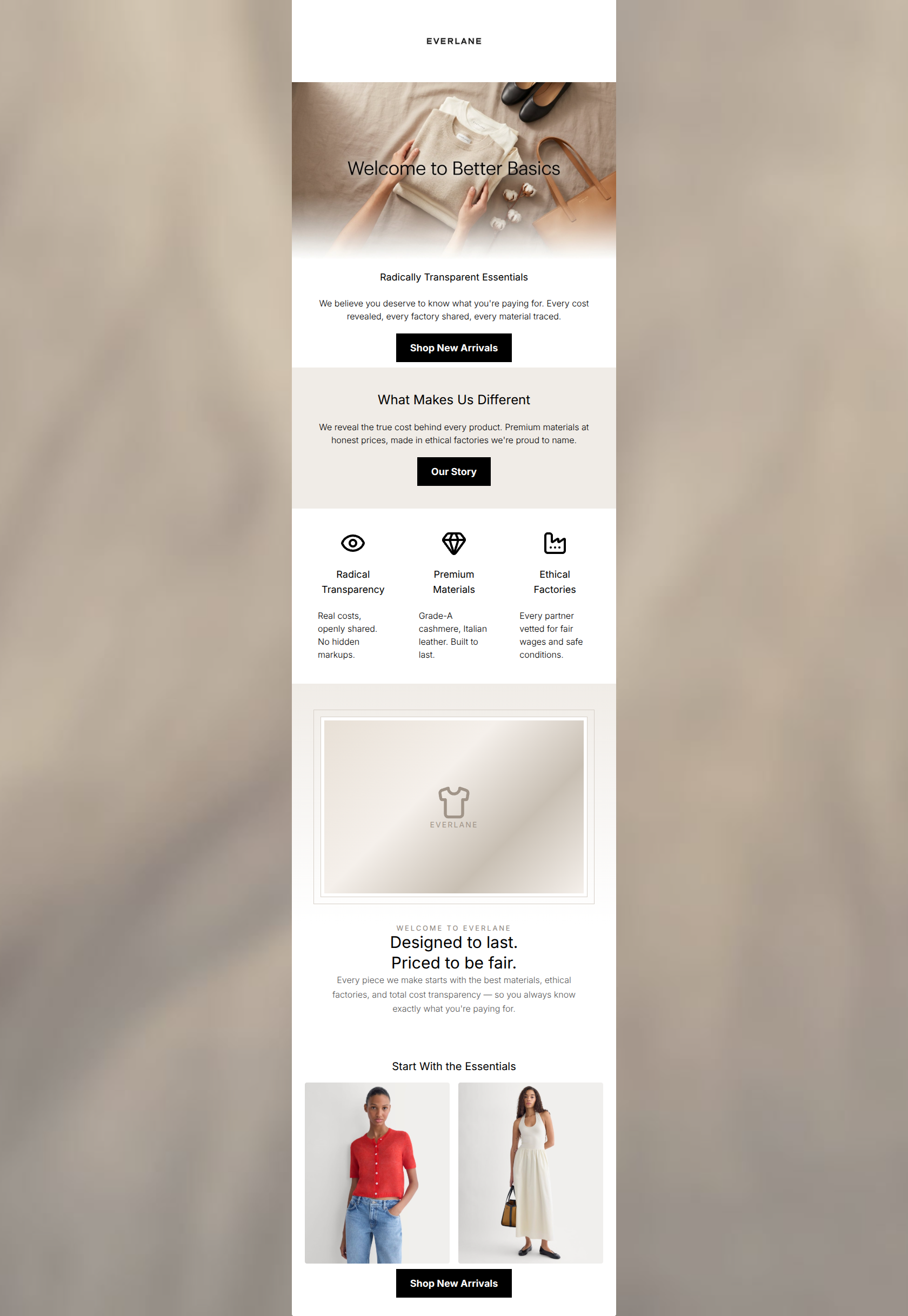
Radically Transparent Essentials
We believe you deserve to know what you're paying for. Every cost revealed, every factory shared, every material traced.
→ Shop New Arrivals
What Makes Us Different
We reveal the true cost behind every product. Premium materials at honest prices, made in ethical factories we're proud to name.
→ Our Story
Radical Transparency
Real costs, openly shared. No hidden markups.
Premium Materials
Grade-A cashmere, Italian leather. Built to last.
Ethical Factories
Every partner vetted for fair wages and safe conditions.
Start With the Essentials
→ Shop New Arrivals
Why This Email Works
This welcome email establishes Everlane's clean, minimalist aesthetic and clearly communicates its core value proposition of 'Radical Transparency.' However, it suffers from severe structural redundancy and copy bloat. It essentially restarts its own narrative halfway through with a second 'Welcome' section, and repeats the exact same messaging about transparent pricing and ethical factories in four different sections. This repetition dilutes the impact, increases cognitive load, and wastes valuable real estate that could be used to showcase products or guide the user to specific categories. The email feels less like a cohesive conversion journey and more like a collection of brand statements stitched together.
Hero (top/initial part) Impact
75/100- Strong, aspirational lifestyle imagery that fits the brand identity perfectly.
- Immediate establishment of the 'Better Basics' positioning.
Content Structure & Flow
55/100- The use of a 3-column icon grid effectively breaks up the vertical stacking and creates visual interest.
Visual Hierarchy & Layout
68/100- Excellent use of negative space to prevent the email from feeling cluttered.
- Clean, consistent alignment in the icon grid section.
Call-to-Action Strength
70/100- High-contrast button design ensures CTAs stand out in the 'squint test'.
- Buttons have clear, legible text.
Message Clarity & Tone
80/100- Perfectly captures the brand's intelligent, straightforward voice.
- Leaves zero ambiguity about what makes the brand unique.
Readability & Scannability
75/100- Copy is broken into easily digestible chunks.
- Icons serve as excellent visual anchors for the text.
Offer & Value Proposition
70/100- The overarching brand value proposition is hammered home relentlessly.
Personalization & Audience Fit
75/100- Deep alignment with the values and aesthetic preferences of the target audience.
Copy Conciseness & Word Economy
45/100- Individual sentences are relatively short and punchy, even if the overall message is repeated.
Quick Wins
- Delete the entire second 'Welcome to Everlane' section block to instantly fix flow and reduce repetition.
- Change the primary hero CTA from 'Shop New Arrivals' to 'Shop Best Sellers'.
- Left-align the paragraph text under the 'What Makes Us Different' heading.




Create Professional Email Designs
Generate beautiful, on-brand email designs in seconds. Just enter your brand URL and let AI do the rest.