Fashion & Apparel Welcome Email Template
“WELCOME BABE! Take 20% Off Everything 💖”
Design Score
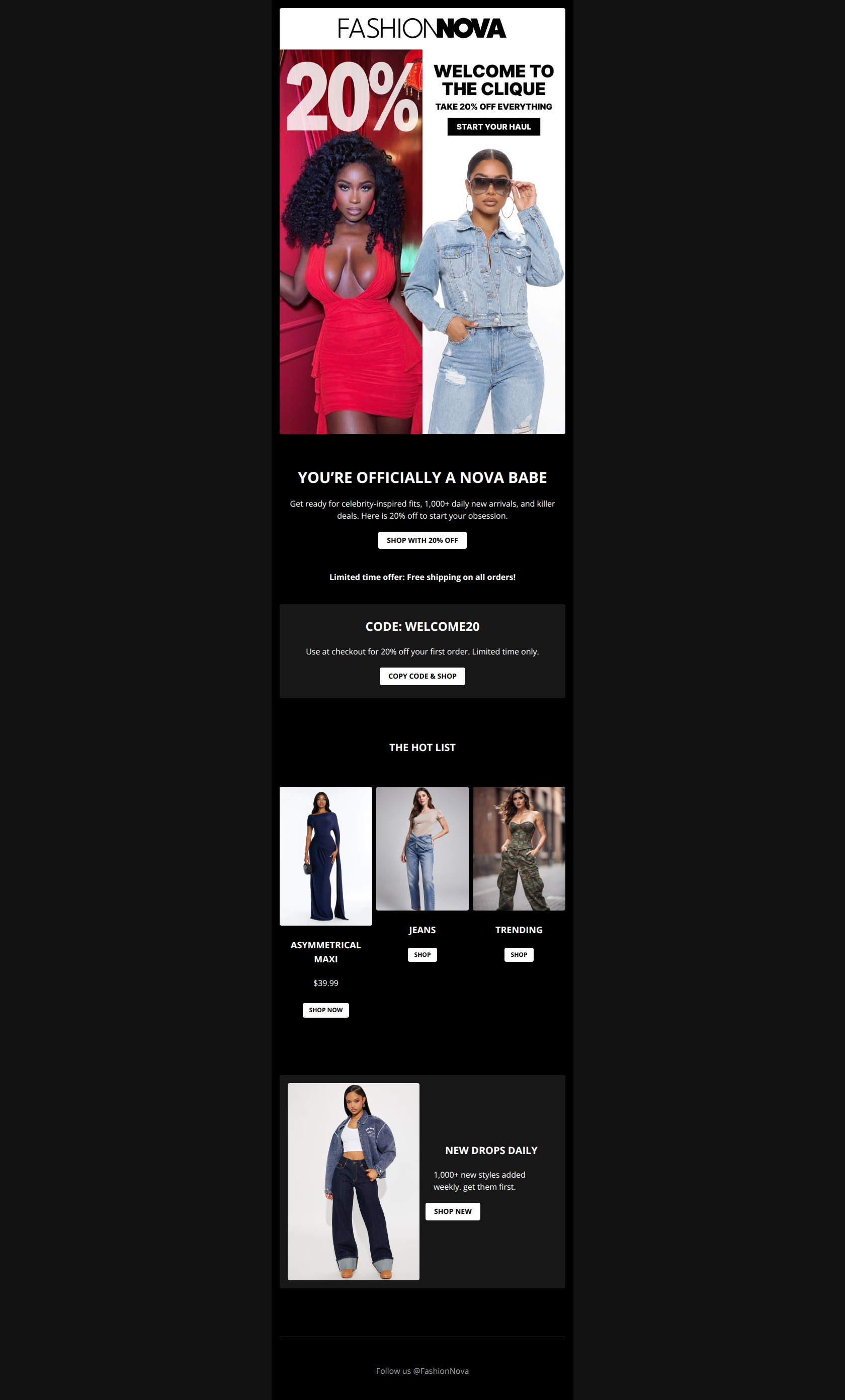
87/100This is a high-performing welcome email that perfectly executes the brand's 'fast, trendy, and affordable' identity. The visual hierarchy effectively anchors the user with a massive discount offer immediately, followed by a logical flow into categories. The primary weakness lies in the redundancy between the hero image and the text immediately below it, and the relatively small tap targets for the category grid buttons.
Create Your Own
Generate professional email designs like this one in seconds with Kopi AI.
Email Details
- Subject Line
- WELCOME BABE! Take 20% Off Everything 💖
- Brand
- Fashion Nova
- Industry
- Fashion & Apparel
- Email Type
- Welcome
- Created
- January 18, 2026
Brand Colors
Email Copy
YOU’RE OFFICIALLY A NOVA BABE
Get ready for celebrity-inspired fits, 1,000+ daily new arrivals, and killer deals. Here is 20% off to start your obsession.
→ SHOP WITH 20% OFF
Limited time offer: Free shipping on all orders!
CODE: WELCOME20
Use at checkout for 20% off your first order. Limited time only.
→ COPY CODE & SHOP
THE HOT LIST
ASYMMETRICAL MAXI
$39.99
→ SHOP NOW
JEANS
→ SHOP
TRENDING
→ SHOP
NEW DROPS DAILY
1,000+ new styles added weekly. get them first.
→ SHOP NEW
Follow us @FashionNova
Why This Email Works
This is a high-performing welcome email that perfectly executes the brand's 'fast, trendy, and affordable' identity. The visual hierarchy effectively anchors the user with a massive discount offer immediately, followed by a logical flow into categories. The primary weakness lies in the redundancy between the hero image and the text immediately below it, and the relatively small tap targets for the category grid buttons.
Hero (top/initial part) Impact
90/100- The split imagery (glam vs. denim) effectively showcases the breadth of the catalog in a single view.
- The 'Start Your Haul' CTA copy is excellent—it speaks directly to the 'shopping spree' behavior of this specific audience.
Content Structure & Flow
85/100- The black 'Code' banner acts as a strong visual 'section break' that resets the reader's attention.
- Ending with 'We Drop Newness Daily' reinforces the retention value prop (come back often) after the initial sale pitch.
Visual Hierarchy & Layout
85/100- Excellent use of white space around the 'Hot List' header makes the transition to the product grid very clear.
- The dark mode aesthetic of the 'Code' section makes it pop against the light gray background.
Call-to-Action Strength
80/100- 'Copy Code & Shop' is a functional, friction-reducing CTA that tells the user exactly what to do.
- The button colors (black on white / white on black) effectively reverse out to create hierarchy.
Message Clarity & Tone
95/100- Words like 'Haul', 'Obsession', and 'Fits' show deep understanding of the customer's vocabulary.
- The value proposition '1,000+ daily new arrivals' is communicated clearly and quickly.
Readability & Scannability
90/100- Headings are bold and uppercase, making them effective 'scan stoppers'.
- The copy is punchy—no walls of text.
Offer & Value Proposition
90/100- '20% Off Everything' is a powerful, low-cognitive-load offer.
- The code 'WELCOME20' is easy to remember and type.
Personalization & Audience Fit
75/100- The 'Nova Babe' framing immediately welcomes the user into a specific lifestyle/community.
Quick Wins
- Make the entire card area in the 'Hot List' grid clickable, not just the small button.
- Increase the font size or button size of the 'SHOP' CTAs in the product grid.
- Change the secondary CTA 'Shop with 20% Off' to 'Shop New Arrivals' to differentiate it from the hero CTA.
- Add 'Expires Soon' or 'Valid for 48 Hours' to the discount banner to create urgency.




Create Professional Email Designs
Generate beautiful, on-brand email designs in seconds. Just enter your brand URL and let AI do the rest.