Design Score
82/100This is a strong, highly on-brand welcome email that perfectly captures Everlane's minimalist aesthetic and 'radical transparency' tone. The copy is exceptionally tight, and the visual scannability is top-tier. However, it makes a fundamental structural error for a welcome email: burying the incentive. Users signing up expect their discount immediately; forcing them to scroll past brand pillars to find it introduces unnecessary friction. Fixing the content hierarchy will elevate this from a good email to a great one.
Create Your Own
Generate professional email designs like this one in seconds with Kopi AI.
Email Details
- Subject Line
- Welcome.
- Brand
- Everlane
- Industry
- Fashion & Apparel
- Email Type
- Welcome
- Created
- May 7, 2026
Brand Colors
Email Copy
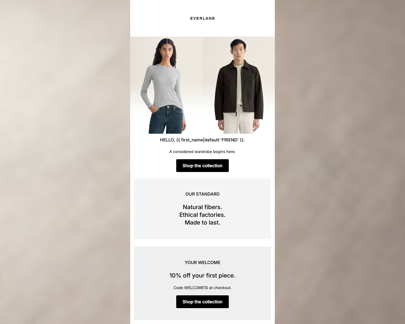
HELLO, FRIEND.
A considered wardrobe begins here.
→ Shop the collection
OUR STANDARD
Natural fibers. Ethical factories. Made to last.
YOUR WELCOME
10% off your first piece.
Code WELCOME10 at checkout.
→ Shop the collection
Why This Email Works
This is a strong, highly on-brand welcome email that perfectly captures Everlane's minimalist aesthetic and 'radical transparency' tone. The copy is exceptionally tight, and the visual scannability is top-tier. However, it makes a fundamental structural error for a welcome email: burying the incentive. Users signing up expect their discount immediately; forcing them to scroll past brand pillars to find it introduces unnecessary friction. Fixing the content hierarchy will elevate this from a good email to a great one.
Hero Impact
65/100- High-quality, on-brand lifestyle imagery.
- Effective use of personalization in the heading.
Content Structure & Flow
60/100- Clear delineation between sections using light grey backgrounds.
Visual Hierarchy & Layout
85/100- Excellent use of negative space to let the typography breathe.
- Strict adherence to a minimalist, high-contrast color palette.
Call-to-Action Strength
95/100- Perfect repetition of the primary goal.
- High visual contrast makes the buttons the most prominent elements on the page.
Message Clarity & Tone
95/100- Nails the 'no-nonsense' brand voice.
- Avoids marketing fluff and speaks directly to the conscious consumer's values.
Readability & Scannability
95/100- Short, punchy line lengths.
- Excellent contrast and sizing differentiation between headers and body copy.
Offer & Value Proposition
75/100- Clear, unambiguous discount code.
- Strong, succinct articulation of the brand's core differentiators.
Personalization & Audience Fit
85/100- Messaging aligns perfectly with the conscious consumer's pain points (lack of transparency, poor quality).
Copy Conciseness & Word Economy
100/100- Zero filler phrasing or throat-clearing.
- Transforms complex brand values into easily digestible, three-word statements.
Quick Wins
- Move the '10% off your first piece' mention into the hero section subcopy.
- Swap the positions of the 'OUR STANDARD' and 'YOUR WELCOME' blocks so the discount code is presented earlier in the scroll depth.




Create Professional Email Designs
Generate beautiful, on-brand email designs in seconds. Just enter your brand URL and let AI do the rest.