Nonprofit Promotional Email Template
“Webinar: The playbook for Capital Campaigns that a”
Design Score
81/100This email succeeds brilliantly at brand voice and narrative flow but stumbles on fundamental conversion mechanics and accessibility. The 'Coach' persona is distinct and engaging, driving a clear 'problem/solution' narrative. However, the lack of a coded CTA button above the fold and the use of low-contrast text colors in the agenda section prevent it from being a top-tier performer.
Create Your Own
Generate professional email designs like this one in seconds with Kopi AI.
Email Details
- Subject Line
- Webinar: The playbook for Capital Campaigns that a
- Brand
- Altruicity
- Industry
- Nonprofit
- Email Type
- Promotional
- Created
- February 12, 2026
Brand Colors
Email Copy
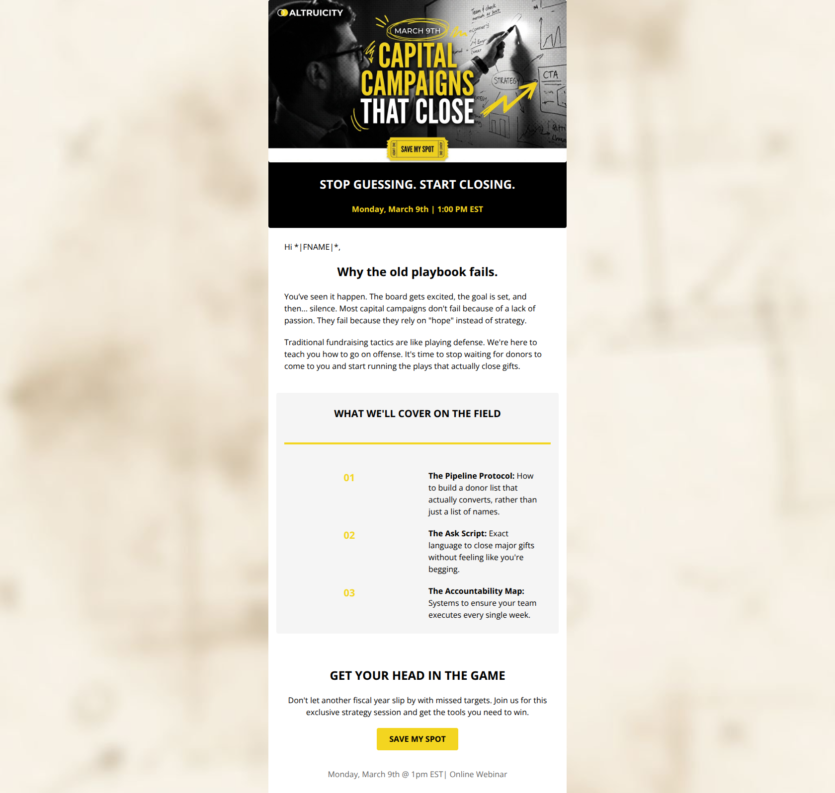
STOP GUESSING. START CLOSING.
Monday, March 9th | 1:00 PM EST
Hi *|FNAME|*,
Why the old playbook fails.
Hi [First Name], registration is now open! Capital campaigns don’t stall because the mission isn’t worthy. They stall because teams mismanage timing, messaging, and donor strategy at the exact moments that matter most. The result is predictable: lots of activity, plenty of “good conversations,” and not enough signed commitments. That’s what this session is about.
Capital Campaigns That Close: The Moves That Drive Six and Seven-Figure Gifts Monday, March 9th at 1:00 PM ET
In this tactical, real-world webinar, you’ll learn the moves that consistently drive six and seven-figure gifts and keep a campaign advancing toward the finish line, including:
01
What “closing” actually looks like in a capital campaign
02
The Ask Script: Exact language to close major gifts without feeling like you're begging.
03
The Accountability Map: Systems to ensure your team executes every single week.
GET YOUR HEAD IN THE GAME
Don't let another fiscal year slip by with missed targets. Join us for this exclusive strategy session and get the tools you need to win.
→ SAVE MY SPOT
Monday, March 9th @ 1pm EST| Online Webinar
Why This Email Works
This email succeeds brilliantly at brand voice and narrative flow but stumbles on fundamental conversion mechanics and accessibility. The 'Coach' persona is distinct and engaging, driving a clear 'problem/solution' narrative. However, the lack of a coded CTA button above the fold and the use of low-contrast text colors in the agenda section prevent it from being a top-tier performer.
Hero Impact
75/100- Strong, high-contrast headline ('Stop Guessing. Start Closing.') that immediately hooks the reader.
- The 'ticket' graphic in the hero image is a clever visual cue, even if it shouldn't be the only CTA.
Content Structure & Flow
90/100- The transition from 'Why the old playbook fails' (Problem) to 'What we'll cover' (Solution) is textbook conversion storytelling.
- Using a numbered list for the agenda makes the value proposition digestible.
Visual Hierarchy & Layout
75/100- The grey background card effectively groups the agenda items, separating them from the general body copy.
- Headings are clearly distinct from body text.
Call-to-Action Strength
70/100- The bottom CTA button (Black text on Yellow background) has excellent contrast and size.
- CTA copy is action-oriented rather than generic ('Submit').
Message Clarity & Tone
95/100- Use of sports metaphors ('defense', 'offense', 'on the field') perfectly aligns with the brand identity.
- The phrase 'Stop waiting for donors... start running the plays' is highly motivating and benefit-driven.
Readability & Scannability
85/100- The agenda section uses bolding ('The Pipeline Protocol') effectively to allow skimming.
Offer & Value Proposition
80/100- The agenda items promise specific, tangible tools ('The Ask Script', 'The Accountability Map') rather than vague concepts.
Personalization & Audience Fit
75/100- The copy demonstrates deep empathy for the 'starving non-profit' mindset, building instant rapport.
Quick Wins
- Add a visible HTML button to the black hero section (e.g., 'Save My Spot').
- Change the agenda numbers ('01', '02', '03') from Yellow to Black (or a dark grey) to fix the contrast issue against the light grey background.
- Bold the phrase 'rely on hope instead of strategy' in the first paragraph to catch skimmers.



Create Professional Email Designs
Generate beautiful, on-brand email designs in seconds. Just enter your brand URL and let AI do the rest.