Nonprofit Promotional Email Template
“Wear a Renaissance Masterpiece 🎨”
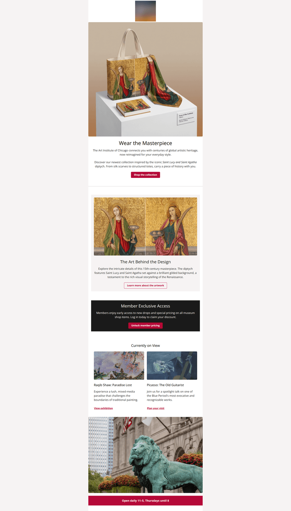
Design Score
86/100This is a polished, highly brand-aligned email that successfully balances commercial goals with the museum's educational mission. The visual hierarchy is clear, using high-quality imagery to elevate merchandise to the level of art, though the center-aligned text in longer paragraphs compromises readability slightly. The content flow logic—moving from product to art context to membership—is persuasive, though competing calls-to-action in the latter half could dilute the primary conversion goal.
Create Your Own
Generate professional email designs like this one in seconds with Kopi AI.
Email Details
- Subject Line
- Wear a Renaissance Masterpiece 🎨
- Brand
- Art Institute of Chicago
- Industry
- Nonprofit
- Email Type
- Promotional
- Created
- November 24, 2025
Brand Colors
Email Copy
Wear the Masterpiece
The Art Institute of Chicago connects you with centuries of global artistic heritage, now reimagined for your everyday style.
Discover our newest collection inspired by the iconic Saint Lucy and Saint Agatha diptych. From silk scarves to structured totes, carry a piece of history with you.
→ Shop the collection
The Art Behind the Design
Explore the intricate details of this 15th-century masterpiece. The diptych features Saint Lucy and Saint Agatha set against a brilliant gilded background, a testament to the rich visual storytelling of the Renaissance.
→ Learn more about the artwork
Member Exclusive Access
Members enjoy early access to new drops and special pricing on all museum shop items. Log in today to claim your discount.
→ Unlock member pricing
Currently on View
Raqib Shaw: Paradise Lost
Experience a lush, mixed-media paradise that challenges the boundaries of traditional painting.
View exhibition
Picasso: The Old Guitarist
Join us for a spotlight talk on one of the Blue Period's most evocative and recognizable works.
Plan your visit
Open daily 11–5, Thursdays until 8
Why This Email Works
This is a polished, highly brand-aligned email that successfully balances commercial goals with the museum's educational mission. The visual hierarchy is clear, using high-quality imagery to elevate merchandise to the level of art, though the center-aligned text in longer paragraphs compromises readability slightly. The content flow logic—moving from product to art context to membership—is persuasive, though competing calls-to-action in the latter half could dilute the primary conversion goal.
Hero (top/initial part) Impact
92/100- Strong product photography on a pedestal visually reinforces the 'masterpiece' concept.
- Headline 'Wear the Masterpiece' perfectly bridges the gap between museum authority and fashion retail.
Content Structure & Flow
88/100- The transition from merchandise to the original 15th-century diptych adds necessary provenance and storytelling that justifies the price point.
Visual Hierarchy & Layout
90/100- Excellent use of background color changes (White -> Light Gray -> Black -> White) to define distinct content blocks without needing heavy dividers.
Call-to-Action Strength
84/100- Good use of button hierarchy: Solid fill for primary actions, outline for secondary educational actions.
Message Clarity & Tone
95/100- The copy 'reimagined for your everyday style' effectively gives permission to wear art casually.
Readability & Scannability
78/100- High contrast text throughout ensures accessibility compliance (passing AA standards).
Offer & Value Proposition
85/100- Connecting the product to a specific '15th-century masterpiece' creates a unique value proposition that standard retailers cannot copy.
Personalization & Audience Fit
75/100- The content respects the audience's desire for intellectual stimulation alongside shopping.
Quick Wins
- Left-align the paragraph text in the 'Art Behind the Design' section to improve readability.
- Add specific percentage savings (e.g., 'Members save 10%') to the 'Member Exclusive Access' text to make the benefit concrete.
- Add a simple arrow (→) or underline to the text links in the 'Currently on View' section to make them more obviously clickable.
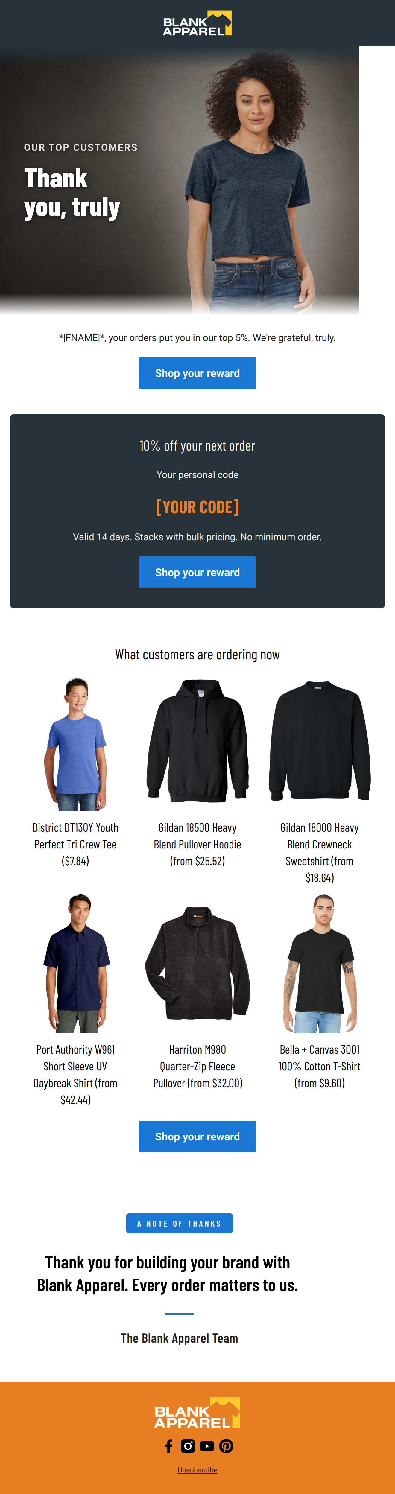



Create Professional Email Designs
Generate beautiful, on-brand email designs in seconds. Just enter your brand URL and let AI do the rest.