Kids & Baby Cart Abandonment Email Template
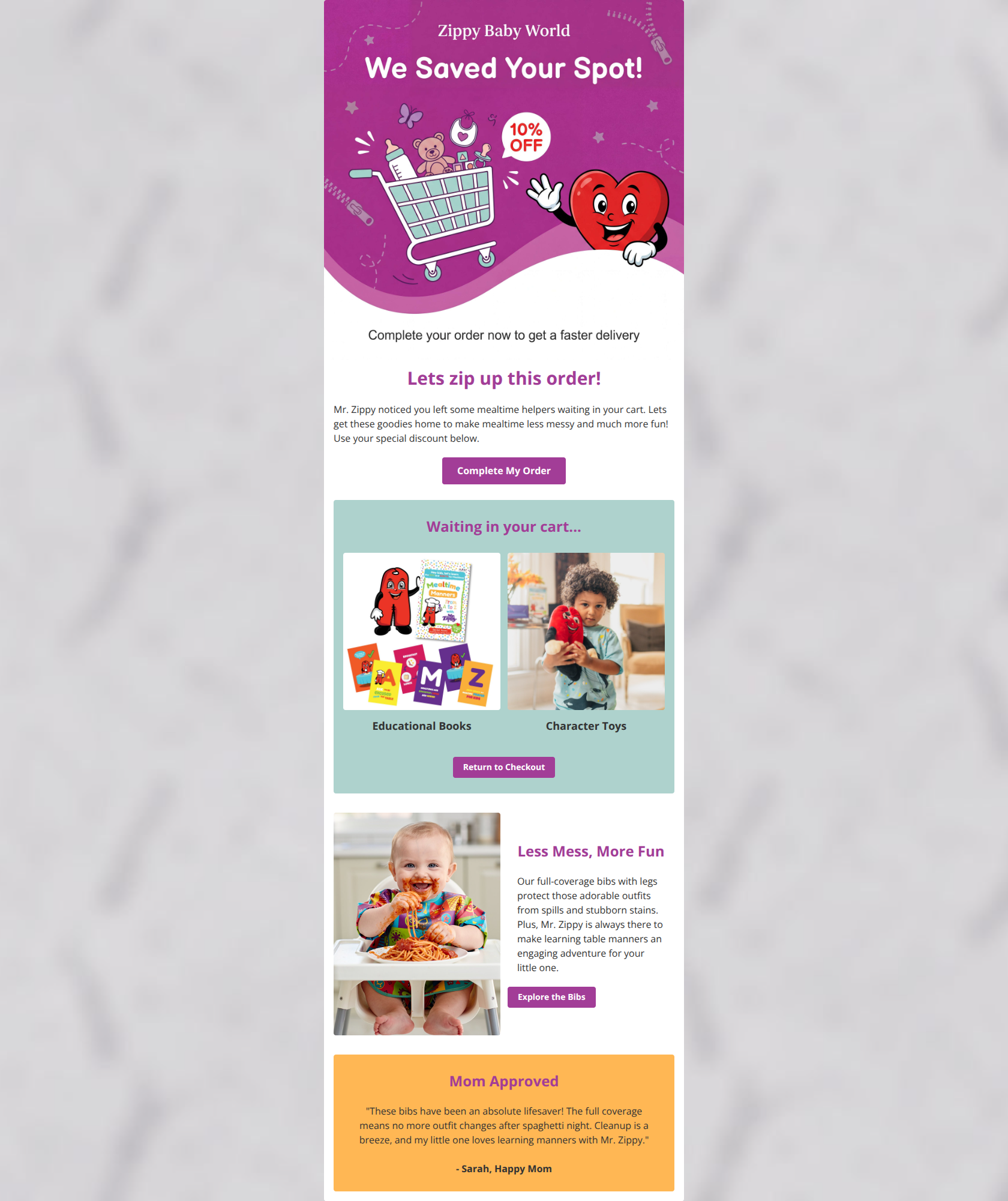
“We saved your spot! Here is 10% off your cart”

Design Score
68/100This cart abandonment email captures the playful, maternal tone of Zippy Baby World perfectly but falters on structural execution. While the urgency and offer are clear, the glaring broken image and lack of dynamic cart contents severely limit its ability to drive high-intent clicks.
Create Your Own
Generate professional email designs like this one in seconds with Kopi AI.
Email Details
- Subject Line
- We saved your spot! Here is 10% off your cart
- Brand
- Zippy Baby World
- Industry
- Kids & Baby
- Email Type
- Cart Abandonment
- Created
- March 1, 2026
Brand Colors
Email Copy
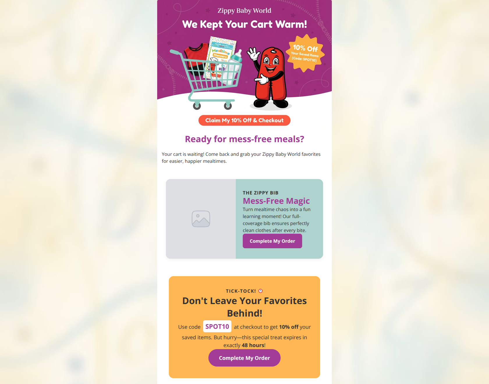
Ready for mess-free meals?
Your cart is waiting! Come back and grab your Zippy Baby World favorites for easier, happier mealtimes.
Why This Email Works
This cart abandonment email captures the playful, maternal tone of Zippy Baby World perfectly but falters on structural execution. While the urgency and offer are clear, the glaring broken image and lack of dynamic cart contents severely limit its ability to drive high-intent clicks.
Hero Impact
75/100- Instantly recognizable character and thematic headline ('We Kept Your Cart Warm!') establish context immediately.
- The primary offer (10% Off) is placed above the fold within the primary graphic.
Content Structure & Flow
60/100- Follows a logical persuasive sequence: reminder of abandonment -> benefit reinforcement -> urgency to act.
Visual Hierarchy & Layout
50/100- Distinct background colors (#AED2CD and #FFB754) successfully separate the email into digestible, easily scannable chunks.
- The final urgency block utilizes a strong warning color (orange) to draw attention to the deadline.
Call-to-Action Strength
70/100- Buttons use high-contrast colors (orange and purple) that pop clearly against their respective backgrounds.
- Copy is action-oriented and specific rather than generic 'Click Here'.
Message Clarity & Tone
85/100- Perfectly captures the brand's enthusiastic, maternal tone with phrases like 'Mess-Free Magic' and 'special treat'.
- Translates a product feature (full-coverage bib) directly into a parent-centric benefit ('perfectly clean clothes after every bite').
Readability & Scannability
80/100- Text blocks are brief and easily skimmable, avoiding walls of text.
- Excellent use of bold formatting on the promo code 'SPOT10' and '10% off' to guide the reader's eye.
Offer & Value Proposition
65/100- The 10% discount is explicit, and the promo code is impossible to miss.
- The 48-hour deadline creates genuine, clear urgency.
Personalization & Audience Fit
45/100- The messaging speaks directly to the target demographic's primary pain point (the chaos of messy mealtimes).
Quick Wins
- Fix the broken/missing image in the 'Mess-Free Magic' block immediately to restore visual trust.
- Move the topmost CTA button to sit beneath the introductory paragraph so the headline and text are read uninterrupted.
- Standardize the button border-radius across all three CTAs for a cohesive, professional look.
- Increase the font size of the 'THE ZIPPY BIB' kicker text so it doesn't get lost against the background color.
Create Professional Email Designs
Generate beautiful, on-brand email designs in seconds. Just enter your brand URL and let AI do the rest.