Pets Shipping Notification Email Template
“Votre commande Museau Malin est indiquée comme livrée”
Design Score
83/100This is a highly competent and visually cohesive transactional email. It excels in anticipating customer anxiety by including a proactively helpful 'missing package' section, which perfectly aligns with the brand's empathetic, serene positioning. The layout is clean and scannable. The primary areas for improvement are eliminating redundant copy at the top of the email and injecting a bit more of the brand's educational, 'pet-parent' voice into the standard transactional messaging.
Create Your Own
Generate professional email designs like this one in seconds with Kopi AI.
Email Details
- Subject Line
- Votre commande Museau Malin est indiquée comme livrée
- Brand
- Museau Malin
- Industry
- Pets
- Email Type
- Shipping Notification
- Created
- July 12, 2026
Brand Colors
Email Copy
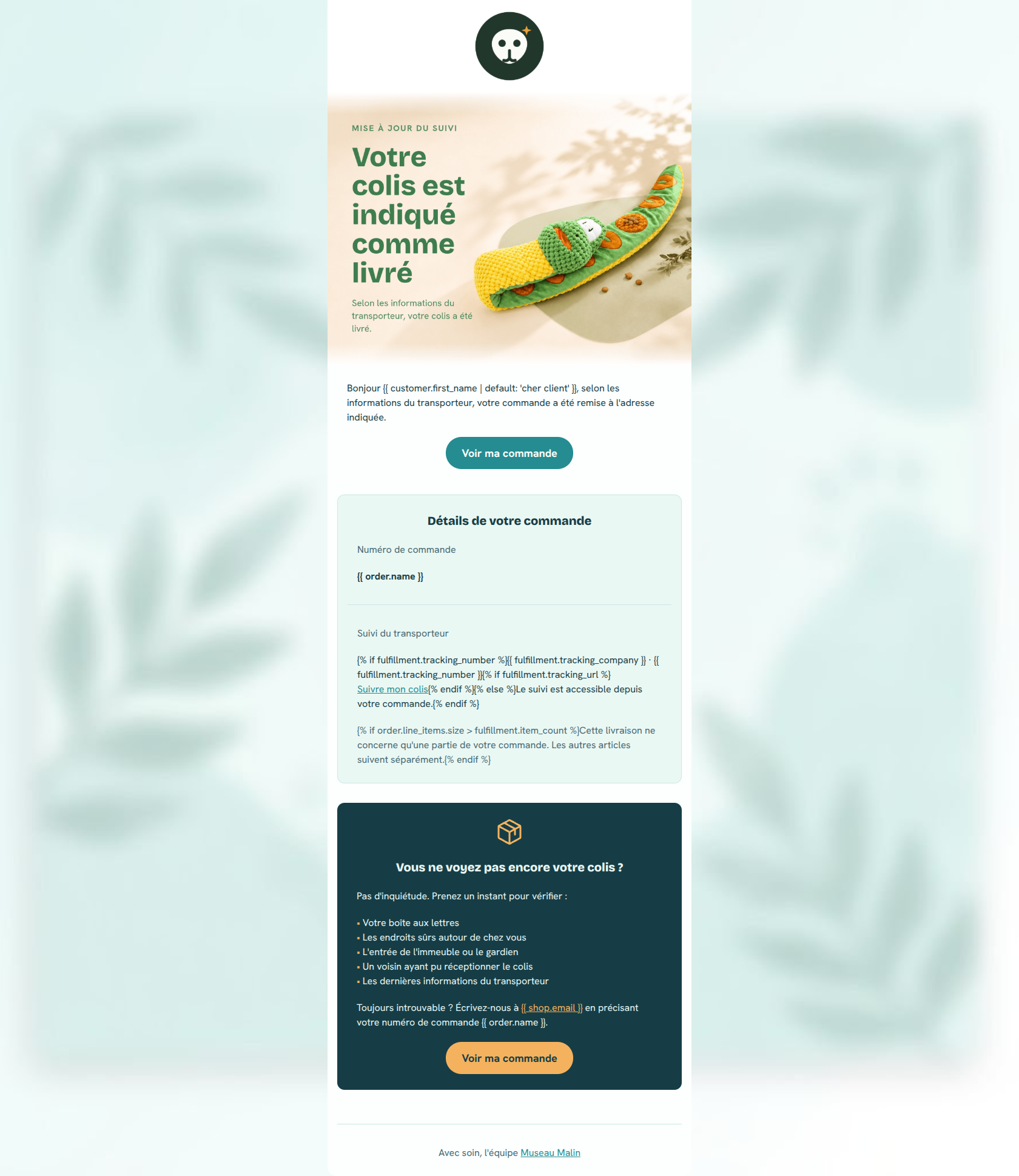
Bonjour cher client, selon les informations du transporteur, votre commande a été remise à l'adresse indiquée.
→ Voir ma commande
Détails de votre commande
Numéro de commande
Suivi du transporteur
· Suivre mon colisLe suivi est accessible depuis votre commande.
Cette livraison ne concerne qu'une partie de votre commande. Les autres articles suivent séparément.
Vous ne voyez pas encore votre colis ?
Pas d'inquiétude. Prenez un instant pour vérifier :
• Votre boîte aux lettres • Les endroits sûrs autour de chez vous • L'entrée de l'immeuble ou le gardien • Un voisin ayant pu réceptionner le colis • Les dernières informations du transporteur
Toujours introuvable ? Écrivez-nous à en précisant votre numéro de commande .
→ Voir ma commande
Avec soin, l'équipe Museau Malin
Why This Email Works
This is a highly competent and visually cohesive transactional email. It excels in anticipating customer anxiety by including a proactively helpful 'missing package' section, which perfectly aligns with the brand's empathetic, serene positioning. The layout is clean and scannable. The primary areas for improvement are eliminating redundant copy at the top of the email and injecting a bit more of the brand's educational, 'pet-parent' voice into the standard transactional messaging.
Hero (top/initial part) Impact
85/100- Immediate clarity on the email's purpose ('Votre colis est indiqué comme livré').
- Beautiful, texture-rich product photography that reinforces the premium, organic feel of the brand.
Content Structure & Flow
90/100- The inclusion of the 'Vous ne voyez pas encore votre colis ?' card is a brilliant structural choice that proactively handles a major customer support pain point.
- Clear demarcation of sections using bounded cards and contrasting background colors.
Visual Hierarchy & Layout
85/100- The dark background on the troubleshooting card provides excellent contrast, drawing the eye exactly where an anxious customer needs to look.
- Generous padding inside the 'Détails de votre commande' card prevents the technical data from feeling cramped.
Call-to-Action Strength
88/100- Perfect consistency in the CTA text ('Voir ma commande').
- Both buttons are visually prominent and have adequate contrast against their respective backgrounds.
Message Clarity & Tone
85/100- The troubleshooting steps are written in a calm, authoritative, and helpful manner.
- Avoids overly technical shipping jargon.
Readability & Scannability
85/100- The bulleted list makes the steps for finding a missing package instantly readable.
- Clear, bold headings ('Détails de votre commande') guide the eye naturally down the page.
Offer & Value Proposition
75/100- Delivers the expected transactional utility (tracking, order details) clearly.
Personalization & Audience Fit
80/100- The empathetic handling of potential delivery issues fits the 'nurturing' aspect of the brand's psychographics.
Copy Conciseness & Word Economy
70/100- The bullet points are tight, punchy, and devoid of filler words.
Quick Wins
- Delete or completely rewrite the introductory text block ('Bonjour {{ customer.first_name }}...') to eliminate the verbatim repetition of the hero image copy.
- Unify the CTA button colors. Make both buttons the brand's primary Forest Green to build a consistent visual habit for clicking.
Create Professional Email Designs
Generate beautiful, on-brand email designs in seconds. Just enter your brand URL and let AI do the rest.