Other Promotional Email Template
“Viral Stanleys: Boost Your Brand Visibility”
Design Score
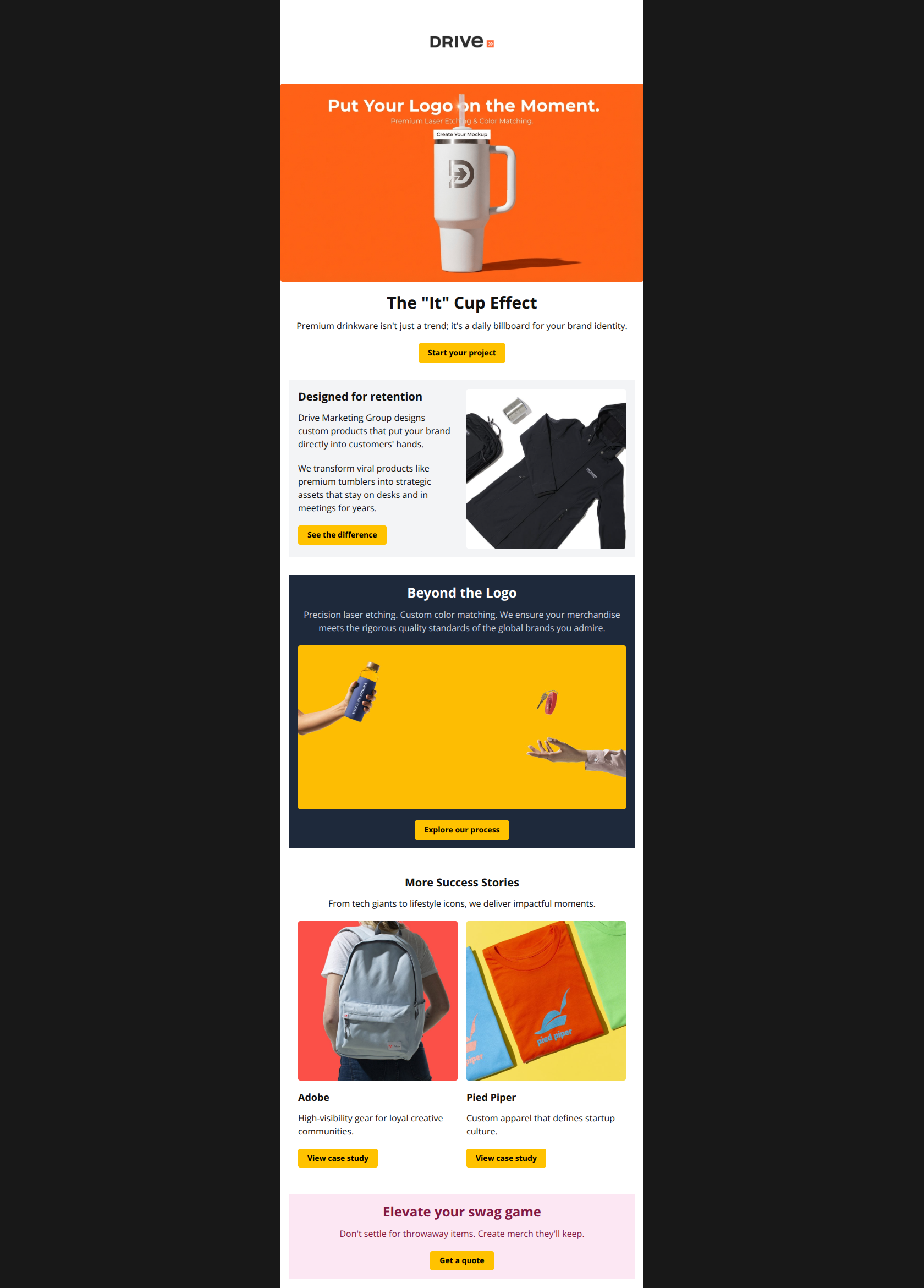
83/100This is a strong B2B agency email that effectively uses high-quality imagery and current trends (the 'It' cup) to capture attention. The visual hierarchy is generally clear, guiding the reader from a hook to value proposition and social proof. The main weakness is the lack of a low-friction entry point; the primary CTAs require significant commitment ('Start your project'), which may deter top-of-funnel prospects.
Create Your Own
Generate professional email designs like this one in seconds with Kopi AI.
Email Details
- Subject Line
- Viral Stanleys: Boost Your Brand Visibility
- Brand
- Drive Marketing Group
- Industry
- Other
- Email Type
- Promotional
- Created
- January 6, 2026
Brand Colors
Email Copy
The "It" Cup Effect
Stanleys aren't just a trend.
They're a daily billboard for your brand.
→ Start your project
Designed for retention
Drive Marketing Group designs custom products that put your brand directly into customers' hands.
We transform viral products like premium tumblers into strategic assets that stay on desks and in meetings for years.
→ See the difference
Beyond the Logo
Precision laser etching. Custom color matching. We ensure your merchandise meets the rigorous quality standards of the global brands you admire.
→ Explore our process
More Success Stories
From tech giants to lifestyle icons, we deliver impactful moments.
Adobe
High-visibility gear for loyal creative communities.
→ View case study
Pied Piper
Custom apparel that defines startup culture.
→ View case study
Elevate your swag game
Don't settle for throwaway items. Create merch they'll keep.
→ Get a quote
Why This Email Works
This is a strong B2B agency email that effectively uses high-quality imagery and current trends (the 'It' cup) to capture attention. The visual hierarchy is generally clear, guiding the reader from a hook to value proposition and social proof. The main weakness is the lack of a low-friction entry point; the primary CTAs require significant commitment ('Start your project'), which may deter top-of-funnel prospects.
Hero (top/initial part) Impact
85/100- Excellent use of a trend-jacking hook (the Stanley-style tumbler) to grab attention immediately.
- High-contrast visuals that clearly show the quality of the product.
Content Structure & Flow
85/100- Clear progression from emotional hook to rational proof.
- Alternating layout (Text-Image / Image-Text) keeps the eye moving down the page.
Visual Hierarchy & Layout
80/100- Effective use of background bands to create distinct visual chapters.
- Product photography is high-quality and well-styled, reinforcing the 'premium' claim.
Call-to-Action Strength
85/100- Primary CTA color (#FFC200) offers excellent contrast and button-like affordance.
- Buttons are placed consistently at the bottom of each logical section.
Message Clarity & Tone
90/100- Strong, confident voice that speaks directly to brand managers.
- Headline copy is punchy and benefit-driven ('daily billboard', 'impactful moments').
Readability & Scannability
85/100- Good balance of text to imagery; no walls of text.
- Headlines are distinct and guide the skimming eye.
Offer & Value Proposition
75/100- Clearly communicates the 'premium' angle, differentiating from cheap throwaway swag.
- The 'It Cup' hook acts as a pseudo-offer by implying availability of a hot item.
Personalization & Audience Fit
70/100- The selection of case studies (Adobe, Pied Piper) signals that they work with top-tier, tech-forward companies, fitting the likely target audience.
Quick Wins
- Change the footer background color from pink (#fce7f3) to the brand yellow (#FFC200) or neutral grey to fix the palette clash.
- Rename the vague CTA 'See the difference' to 'Browse Premium Merch'.
- Add a bulleted list in the 'Beyond the Logo' section to break up the centered text paragraph.
- Update the hero subhead to directly address the reader: 'Turn the year's hottest trend into your brand's daily billboard.'



Create Professional Email Designs
Generate beautiful, on-brand email designs in seconds. Just enter your brand URL and let AI do the rest.