Health & Wellness Newsletter Email Template
“Unlock Your Potential: Free Trial Inside!”
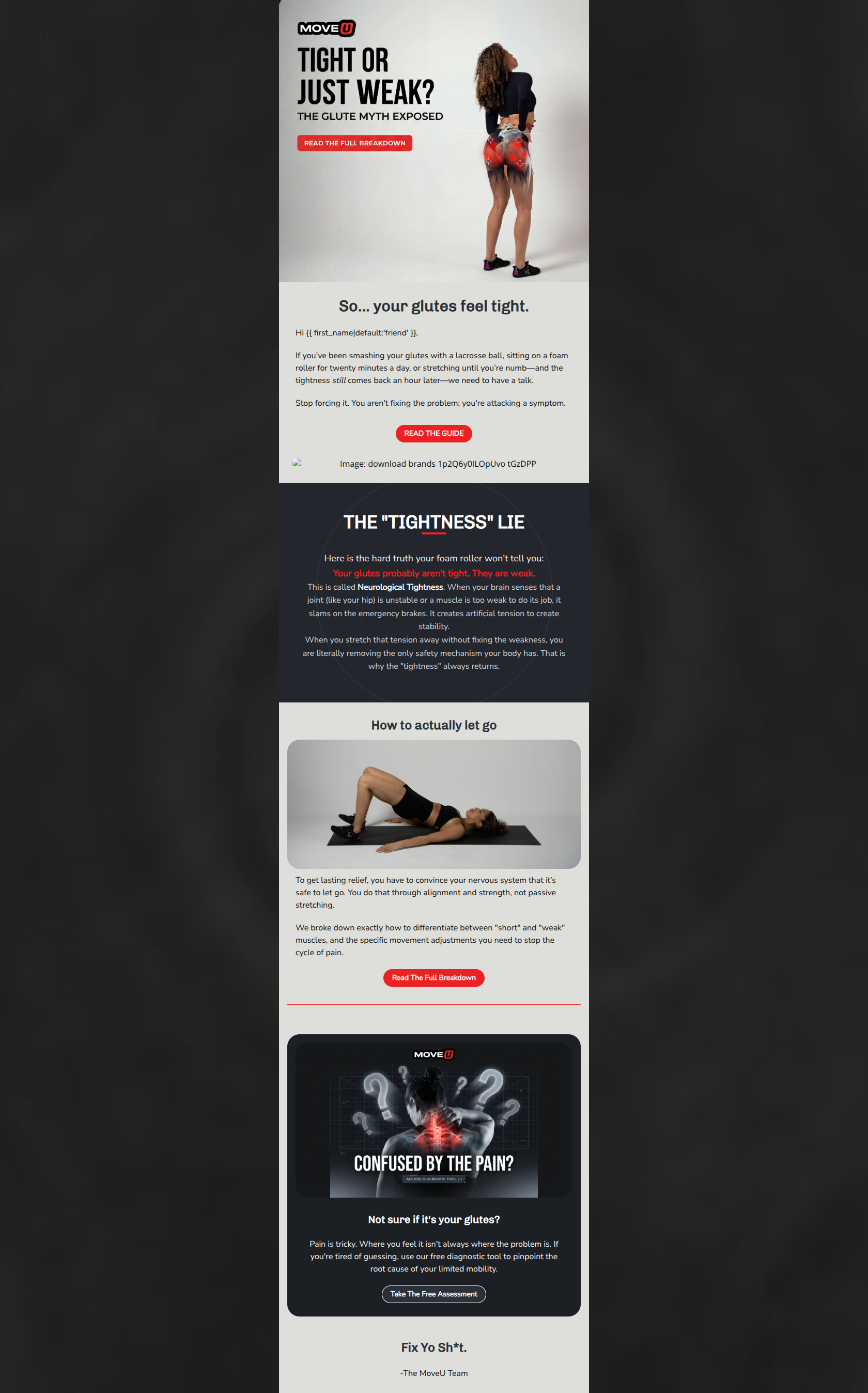
Design Score
80/100This email effectively uses the brand's authoritative, 'tough love' tone to challenge the reader's assumptions about their pain, creating a strong hook. However, the inconsistent visual design—mixing light backgrounds with dark blocks—and a prominent broken image distract from an otherwise compelling conversion path.
Create Your Own
Generate professional email designs like this one in seconds with Kopi AI.
Email Details
- Subject Line
- Unlock Your Potential: Free Trial Inside!
- Brand
- MoveU
- Industry
- Health & Wellness
- Email Type
- Newsletter
- Created
- February 25, 2026
Brand Colors
Email Copy
So... your glutes feel tight.
Hi friend,
If you’ve been smashing your glutes with a lacrosse ball, sitting on a foam roller for twenty minutes a day, or stretching until you’re numb—and the tightness still comes back an hour later—we need to have a talk.
Stop forcing it. You aren't fixing the problem; you're attacking a symptom.
→ READ THE GUIDE
How to actually let go
To get lasting relief, you have to convince your nervous system that it’s safe to let go. You do that through alignment and strength, not passive stretching.
We broke down exactly how to differentiate between "short" and "weak" muscles, and the specific movement adjustments you need to stop the cycle of pain.
→ Read The Full Breakdown
Not sure if it's your glutes?
Pain is tricky. Where you feel it isn't always where the problem is. If you're tired of guessing, use our free diagnostic tool to pinpoint the root cause of your limited mobility.
→ Take The Free Assessment
Fix Yo Sh*t.
-The MoveU Team
Why This Email Works
This email effectively uses the brand's authoritative, 'tough love' tone to challenge the reader's assumptions about their pain, creating a strong hook. However, the inconsistent visual design—mixing light backgrounds with dark blocks—and a prominent broken image distract from an otherwise compelling conversion path.
Hero Impact
75/100- The hero image features a bold, provocative headline ('TIGHT OR JUST WEAK?') that instantly addresses a core audience pain point.
- The anatomical graphic overlay (red targets on the glutes) perfectly aligns with the brand's clinical-yet-edgy visual identity.
Content Structure & Flow
82/100- The narrative arc is excellent: it hooks the reader with a common frustration, introduces a paradigm shift ('The Tightness Lie'), and offers a concrete solution.
- The inclusion of the diagnostic tool at the end acts as a perfect safety net for users who realize their pain might not be glute-related.
Visual Hierarchy & Layout
65/100- The custom dark HTML block ('The "Tightness" Lie') successfully commands attention and highlights the core educational pivot.
- The bottom card containing the diagnostic tool offer is well-contained and visually distinct from the article content.
Call-to-Action Strength
78/100- The primary CTAs use the high-contrast brand red (#EB2224), making them easily identifiable.
- The CTA copy is specific and action-oriented ('Read The Full Breakdown', 'Take The Free Assessment').
Message Clarity & Tone
90/100- The tone perfectly captures the brand's authoritative, 'tough love' persona (e.g., 'we need to have a talk', 'Fix Yo Sh*t').
- It successfully demystifies a complex concept ('Neurological Tightness') in simple, accessible language.
Readability & Scannability
85/100- Paragraphs are kept short, preventing visual fatigue and catering to skim-readers.
- Effective use of bold text in the dark block ensures the most critical takeaway is impossible to miss.
Offer & Value Proposition
88/100- The email provides immediate educational value by debunking a common myth, building immense trust.
- The pivot to the free diagnostic tool is a highly relevant, low-friction offer that advances the user down the funnel.
Personalization & Audience Fit
85/100- The opening perfectly targets the audience's specific, lived experiences and frustrations (using a lacrosse ball, stretching until numb).
- Uses basic name personalization in the salutation.
Quick Wins
- Delete the broken image icon located under the first 'READ THE GUIDE' button.
- Unify the primary CTA text so they all say 'Read The Full Breakdown'.
- Change the fallback name from 'friend' to something more aligned with the brand, like 'Mover'.
Create Professional Email Designs
Generate beautiful, on-brand email designs in seconds. Just enter your brand URL and let AI do the rest.