Media & Entertainment Promotional Email Template
“Tu próximo hogar empieza con Carolina”
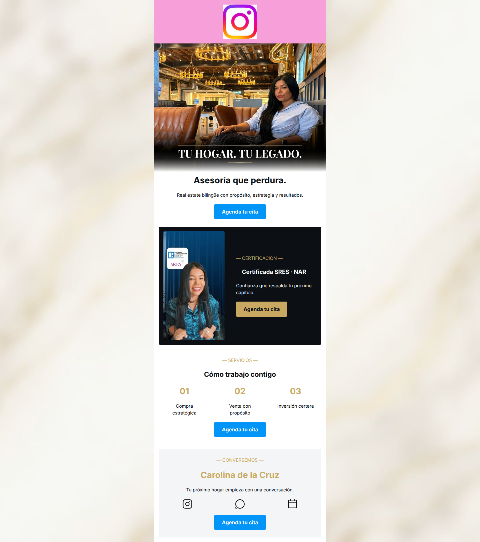
Design Score
80/100This email acts as a strong, concise digital business card for a real estate professional. It excels in structural flow, CTA consistency, and word economy, driving the user logically toward a single conversion goal: booking an appointment. However, the design suffers from aesthetic clashes—specifically the jarring pink header against the sophisticated gold/navy palette—and critical contrast issues with gold text on light backgrounds. By fixing the color contrast, unifying the button colors, and adding a touch more 'you-centric' benefit copy to the services section, this email can easily move from good to excellent.
Create Your Own
Generate professional email designs like this one in seconds with Kopi AI.
Email Details
- Subject Line
- Tu próximo hogar empieza con Carolina
- Brand
- Industry
- Media & Entertainment
- Email Type
- Promotional
- Created
- May 25, 2026
Brand Colors
Email Copy
Asesoría que perdura.
Real estate bilingüe con propósito, estrategia y resultados.
→ Agenda tu cita
— CERTIFICACIÓN —
Certificada SRES · NAR
Confianza que respalda tu próximo capítulo.
→ Agenda tu cita
— SERVICIOS —
Cómo trabajo contigo
01
Compra estratégica
02
Venta con propósito
03
Inversión certera
→ Agenda tu cita
— CONVERSEMOS —
Carolina de la Cruz
Tu próximo hogar empieza con una conversación.
→ Agenda tu cita
Why This Email Works
This email acts as a strong, concise digital business card for a real estate professional. It excels in structural flow, CTA consistency, and word economy, driving the user logically toward a single conversion goal: booking an appointment. However, the design suffers from aesthetic clashes—specifically the jarring pink header against the sophisticated gold/navy palette—and critical contrast issues with gold text on light backgrounds. By fixing the color contrast, unifying the button colors, and adding a touch more 'you-centric' benefit copy to the services section, this email can easily move from good to excellent.
Hero Impact
75/100- Professional, high-quality photography immediately builds trust.
- Text overlay on the image uses a dark gradient for perfect legibility.
- Clear H1 and subheadline immediately following the hero image.
Content Structure & Flow
85/100- Logical narrative arc (Who -> Why Trust Me -> What I Do -> Let's Talk).
- Excellent use of a dark background section to break up the visual flow and highlight the certification.
Visual Hierarchy & Layout
78/100- Clear compartmentalization of information.
- The dark section effectively commands attention and highlights the NAR certification.
- Balanced three-column grid for services and icons allows for easy scanning.
Call-to-Action Strength
95/100- Perfect CTA repetition with identical phrasing.
- Zero competing secondary actions to distract the user.
- Excellent use of the high-contrast bright blue brand color for the majority of the buttons.
Message Clarity & Tone
80/100- The bilingual value proposition is stated clearly and early.
- Authoritative but approachable tone ('Tu próximo hogar empieza con una conversación').
Readability & Scannability
65/100- Short, punchy sentences reduce cognitive load.
- Great use of numbered lists (01, 02, 03) to break down services.
- Adequate baseline font sizing.
Offer & Value Proposition
75/100- Strong leveraging of the SRES certification as a core trust-building value prop.
- Clear niche positioning (bilingual real estate).
Personalization & Audience Fit
78/100- Aesthetic and tone perfectly match a high-end or professional service offering.
- Explicit callout to bilingual capabilities directly speaks to a targeted demographic.
Copy Conciseness & Word Economy
88/100- Zero walls of text.
- Ruthless editing keeps the focus squarely on the conversion goal.
- Excellent use of short, impactful subheadlines.
Quick Wins
- Change all gold text (#C9A961) on the white and light gray backgrounds to the main dark text color (#0C1014) to pass contrast checks.
- Change the background of the top Instagram logo block from bright pink to white or light gray to prevent clashing with the hero image.
- Standardize all CTA buttons to the primary blue (#0095F6) to build a frictionless visual habit for the reader.


Create Professional Email Designs
Generate beautiful, on-brand email designs in seconds. Just enter your brand URL and let AI do the rest.