SaaS & Software Marketing Email Template
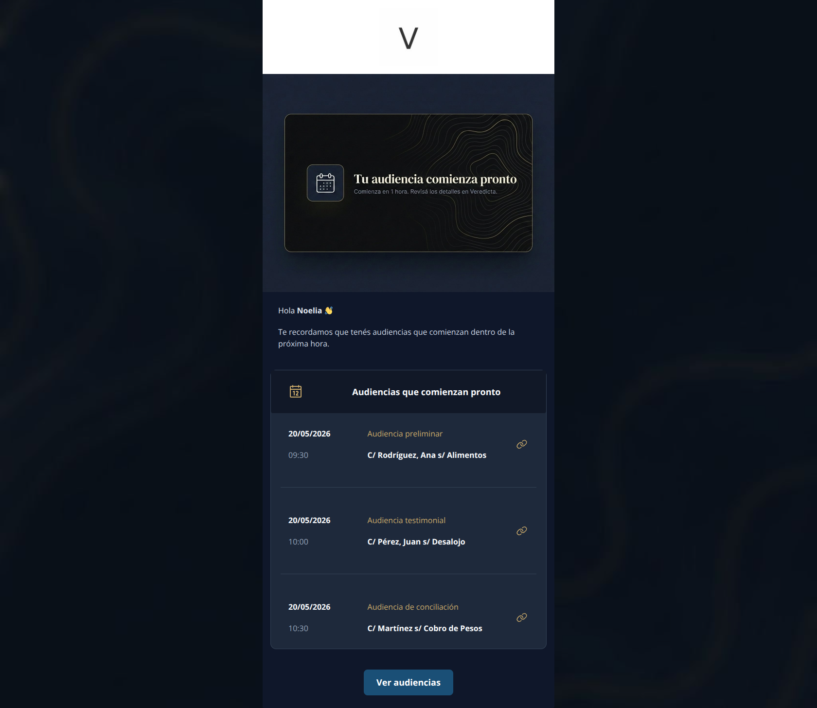
“Tu audiencia comienza pronto”
Design Score
81/100This is a structurally excellent, highly functional transactional email that respects the reader's time by getting straight to the point. The data presentation is highly scannable and the routing is perfectly consistent. However, the execution stumbles on brand tone—using a casual emoji for a formal, enterprise-level audience—and suffers from a critical contrast failure where the primary CTA button fades into the dark background. Fixing the contrast and tightening the repetitive copy will elevate this to a top-tier notification.
Create Your Own
Generate professional email designs like this one in seconds with Kopi AI.
Email Details
- Subject Line
- Tu audiencia comienza pronto
- Brand
- Veredicta
- Industry
- SaaS & Software
- Email Type
- Marketing
- Created
- May 27, 2026
Brand Colors
Email Copy
Hola Noelia 👋
Te recordamos que tenés audiencias que comienzan dentro de la próxima hora.
Audiencias que comienzan pronto
20/05/2026
09:30
Audiencia preliminar
C/ Rodríguez, Ana s/ Alimentos
20/05/2026
10:00
Audiencia testimonial
C/ Pérez, Juan s/ Desalojo
20/05/2026
10:30
Audiencia de conciliación
C/ Martínez s/ Cobro de Pesos
→ Ver audiencias
Why This Email Works
This is a structurally excellent, highly functional transactional email that respects the reader's time by getting straight to the point. The data presentation is highly scannable and the routing is perfectly consistent. However, the execution stumbles on brand tone—using a casual emoji for a formal, enterprise-level audience—and suffers from a critical contrast failure where the primary CTA button fades into the dark background. Fixing the contrast and tightening the repetitive copy will elevate this to a top-tier notification.
Content Structure & Flow
92/100- Perfect application of the inverted pyramid structure.
- Excellent use of a container card to group related dynamic data.
Visual Hierarchy & Layout
75/100- Strong structural separation of the list items using subtle dividers.
- Clean, minimalist aesthetic that aligns with the brand's 'intellect and order' positioning.
Call-to-Action Strength
85/100- Flawless execution of a single primary destination across multiple touchpoints.
- Button text ('Ver audiencias') is clear, unambiguous, and directly matches the user's expected next step.
Message Clarity & Tone
65/100- Zero jargon; the message is instantly understandable.
- Delivers the exact facts needed without unnecessary preamble.
Readability & Scannability
96/100- Exceptional use of text alignment and grid structure to organize complex information.
- Smart use of font weights to differentiate the case name from the hearing type.
Copy Conciseness & Word Economy
78/100- Sentences are short and direct.
- No filler adjectives or 'throat-clearing' marketing fluff.
Quick Wins
- Change the primary CTA button background color to your gold accent (#C9A96A) or white to fix the critical low-contrast issue.
- Delete the waving hand emoji (👋) to align with the formal, authoritative brand voice.
- Remove the redundant 'Audiencias que comienzan pronto' header from inside the #1E293B card.


Create Professional Email Designs
Generate beautiful, on-brand email designs in seconds. Just enter your brand URL and let AI do the rest.