Finance & Fintech Welcome Email Template
“Ton compte EstatOS est activé”
Design Score
76/100This welcome email effectively communicates the brand's clean, 'Soft Technical' aesthetic and provides a clear path to the dashboard. However, it relies on generic onboarding tropes ('Welcome aboard', 'You made the right choice') rather than driving immediate product value. The '3 actions' section is visually strong but functionally weak because the steps are not clickable deep links, creating unnecessary friction for users ready to engage.
Create Your Own
Generate professional email designs like this one in seconds with Kopi AI.
Email Details
- Subject Line
- Ton compte EstatOS est activé
- Brand
- EstatOS
- Industry
- Finance & Fintech
- Email Type
- Welcome
- Created
- February 23, 2026
Brand Colors
Email Copy
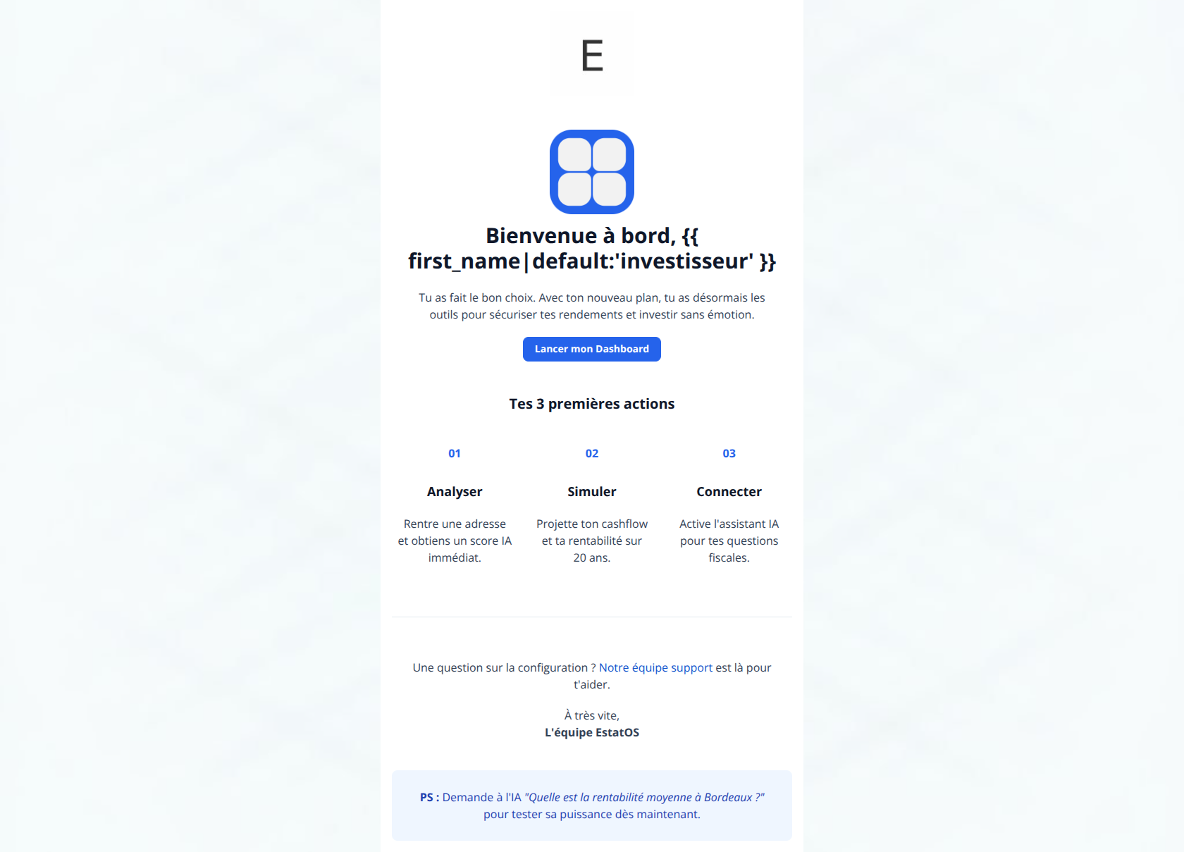
Bienvenue à bord, investisseur
Tu as fait le bon choix. Avec ton nouveau plan, tu as désormais les outils pour sécuriser tes rendements et investir sans émotion.
→ Lancer mon Dashboard
Tes 3 premières actions
01
Analyser
Rentre une adresse et obtiens un score IA immédiat.
02
Simuler
Projette ton cashflow et ta rentabilité sur 20 ans.
03
Connecter
Active l'assistant IA pour tes questions fiscales.
Une question sur la configuration ? Notre équipe support est là pour t'aider.
À très vite, L'équipe EstatOS
PS : Demande à l'IA "Quelle est la rentabilité moyenne à Bordeaux ?" pour tester sa puissance dès maintenant.
Why This Email Works
This welcome email effectively communicates the brand's clean, 'Soft Technical' aesthetic and provides a clear path to the dashboard. However, it relies on generic onboarding tropes ('Welcome aboard', 'You made the right choice') rather than driving immediate product value. The '3 actions' section is visually strong but functionally weak because the steps are not clickable deep links, creating unnecessary friction for users ready to engage.
Hero Impact
75/100- The blue logo icon centers the brand identity immediately.
- The 'Lancer mon Dashboard' button is high-contrast and easy to spot.
Content Structure & Flow
75/100- The clear separation of sections using whitespace and light gray backgrounds makes the content digestible.
- The inverted pyramid structure effectively leads the eye down the page.
Visual Hierarchy & Layout
82/100- Excellent use of the slate/white/blue palette to convey trust and precision.
- The card design for the '3 actions' effectively breaks up the text and organizes the onboarding process.
Call-to-Action Strength
70/100- The primary button color (#2563EB) stands out perfectly against the white background.
- The button has generous padding and rounded corners, making it look clickable and modern.
Message Clarity & Tone
78/100- The language avoids overly dense jargon, making the 'operating system' concept accessible.
- The instruction in the 'PS' section is a brilliant way to demonstrate value quickly.
Readability & Scannability
85/100- Short paragraphs and generous line height make reading effortless.
- High contrast between text (#0F172A/#64748B) and background ensures accessibility.
Offer & Value Proposition
72/100- The '3 actions' section clearly defines the scope of what the product does (Analyze, Simulate, Connect).
- The PS section offers a specific, low-friction way to experience the 'magic' of the product.
Personalization & Audience Fit
65/100- Addressing the user as 'investisseur' (investor) reinforces their identity and professional aspirations.
- The clean, data-centric design appeals to the analytical nature of the target audience.
Quick Wins
- Hyperlink the headers 'Analyser', 'Simuler', and 'Connecter' directly to those specific pages in the app.
- Change the headline from 'Bienvenue à bord' to 'Analysez votre premier bien dès maintenant'.
- Bold the key benefit in each of the three steps (e.g., **score IA**, **cashflow**, **fiscalité**) to improve skimmability.
- Remove the floating 'E' text at the very top of the email template.
- Add a 'Copy' link or button next to the PS prompt so users can one-click paste it into the AI tool.




Create Professional Email Designs
Generate beautiful, on-brand email designs in seconds. Just enter your brand URL and let AI do the rest.