Health & Wellness Promotional Email Template
“Three ways to begin your revival”
Design Score
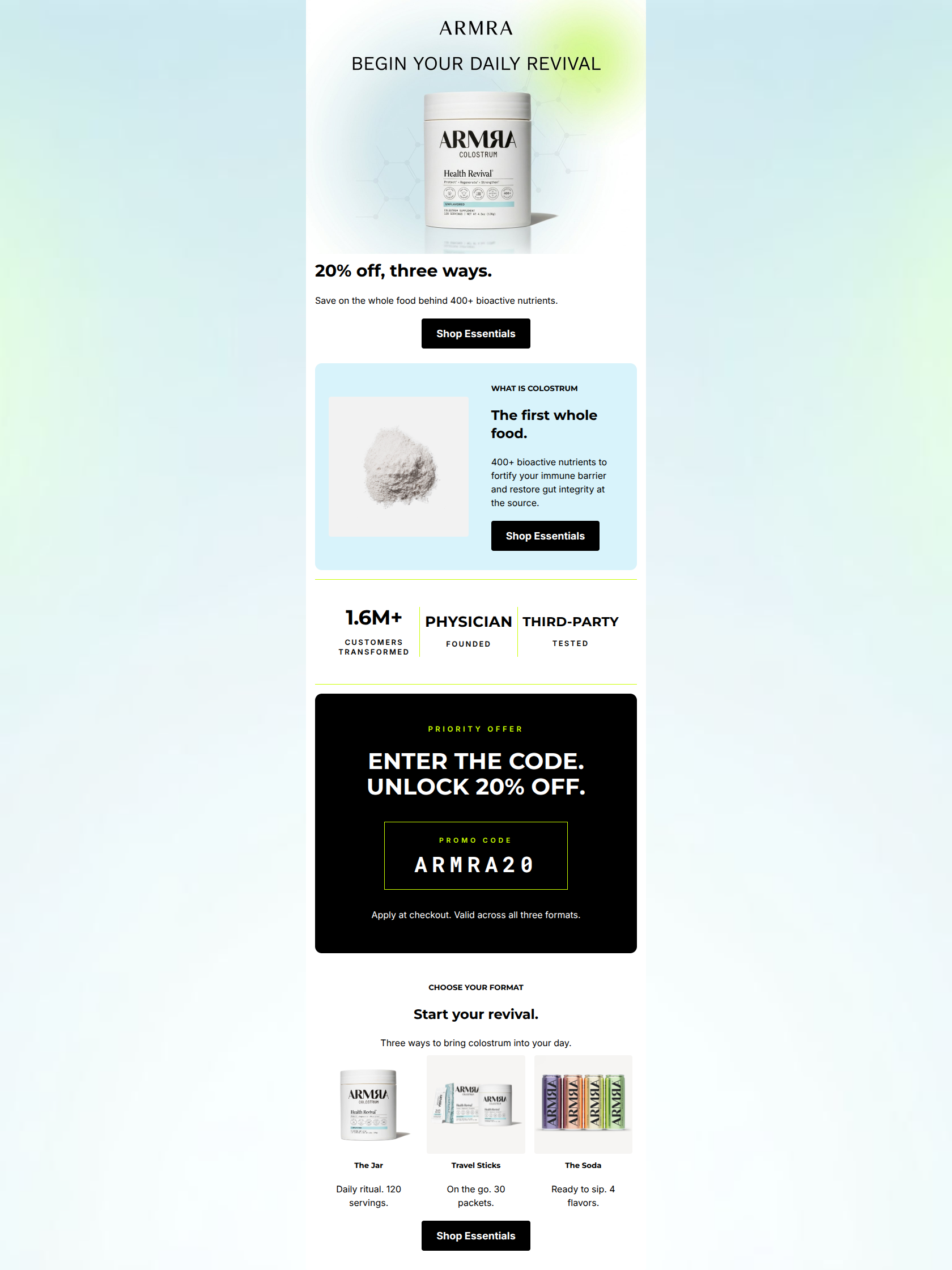
86/100This is a highly effective, premium promotional email that executes beautifully on ARMRA's clinical-luxe brand identity. The visual hierarchy is exceptional, utilizing distinct color blocks to guide the reader seamlessly from the offer to education, social proof, and finally product selection. The strict adherence to a single primary CTA destination ('Shop Essentials') eliminates decision fatigue and focuses the user entirely on conversion. The primary opportunity for improvement lies in reducing friction: the promo code itself is buried halfway down the email, meaning users who click the hero CTA might arrive at the site without the code they need to claim the 20% off.
Create Your Own
Generate professional email designs like this one in seconds with Kopi AI.
Email Details
- Subject Line
- Three ways to begin your revival
- Brand
- ARMRA
- Industry
- Health & Wellness
- Email Type
- Promotional
- Created
- May 20, 2026
Brand Colors
Email Copy
20% off, three ways.
Save on the whole food behind 400+ bioactive nutrients.
→ Shop Essentials
WHAT IS COLOSTRUM
The first whole food.
400+ bioactive nutrients to fortify your immune barrier and restore gut integrity at the source.
→ Shop Essentials
CHOOSE YOUR FORMAT
Start your revival.
Three ways to bring colostrum into your day.
The Jar
Daily ritual. 120 servings.
Travel Sticks
On the go. 30 packets.
The Soda
Ready to sip. 4 flavors.
→ Shop Essentials
Why This Email Works
This is a highly effective, premium promotional email that executes beautifully on ARMRA's clinical-luxe brand identity. The visual hierarchy is exceptional, utilizing distinct color blocks to guide the reader seamlessly from the offer to education, social proof, and finally product selection. The strict adherence to a single primary CTA destination ('Shop Essentials') eliminates decision fatigue and focuses the user entirely on conversion. The primary opportunity for improvement lies in reducing friction: the promo code itself is buried halfway down the email, meaning users who click the hero CTA might arrive at the site without the code they need to claim the 20% off.
1. Hero (top/initial part) Impact
85/100- Clear, unmissable statement of the offer ('20% off').
- High-quality product imagery that establishes instant brand recognition.
- Clean, distraction-free layout pushing immediately to the primary CTA.
2. Content Structure & Flow
85/100- Excellent pacing; breaking up the content with the trust metric strip and the dark promo card prevents the layout from feeling monotonous.
- The educational section smoothly bridges the gap between the discount offer and the underlying value of the product.
3. Visual Hierarchy & Layout
90/100- The black promo code block acts as a massive visual anchor that successfully stops the user's scroll.
- Generous padding and whitespace give the email a premium, uncluttered, 'clinical' feel.
- The horizontal trust metric strip is perfectly executed—compact yet impossible to miss.
4. Call-to-Action Strength
98/100- Absolute clarity of action: 'Shop Essentials' sets an exact expectation of what happens next.
- Perfect consistency in destination URLs across all primary buttons.
- High visual contrast: stark black buttons on white/light backgrounds pop effortlessly.
5. Message Clarity & Tone
88/100- Nails the 'bio-tech/clinical-luxe' voice without sounding overly complicated.
- Avoids desperation; the tone remains confident even while offering a discount.
- Clear, confident headers ('Start your revival', 'The first whole food').
6. Readability & Scannability
92/100- Excellent typographic hierarchy (Eyebrow -> H2 -> Body).
- Bite-sized copy blocks; no intimidating walls of text.
- The trust metric strip is highly scannable due to the clear 'Number/Label' stacking.
7. Offer & Value Proposition
82/100- The '20% off' is unambiguous and placed at the very top.
- The value proposition is clearly tied to physical benefits (immune barrier, gut integrity).
- The trust strip heavily validates the value proposition by showing massive adoption (1.6M+) and scientific backing (Physician Founded).
8. Personalization & Audience Fit
78/100- Perfectly targets the bio-hacker/premium wellness consumer with terms like 'bioactive' and 'gut integrity'.
- The clean, clinical design appeals to an audience that values scientific efficacy over flashy trends.
9. Copy Conciseness & Word Economy
90/100- No throat-clearing openers ('We are excited to announce...').
- Headers are punchy and economical ('The first whole food.').
- Product descriptions in the bottom row are wonderfully distilled ('On the go. 30 packets.').
Quick Wins
- Add the promo code 'ARMRA20' explicitly into the hero section subcopy so users have it before they click the first CTA.
- Remove the redundant 'Three ways to bring colostrum into your day' text in the bottom section, letting the 3-column visual do the talking.
- Add a direct benefit to the hero text (e.g., mention immunity or gut health right away instead of waiting for section 2).

Create Professional Email Designs
Generate beautiful, on-brand email designs in seconds. Just enter your brand URL and let AI do the rest.