Outdoor & Sports Promotional Email Template
“This Summer Upgrade Is Moving Fast.”
Design Score
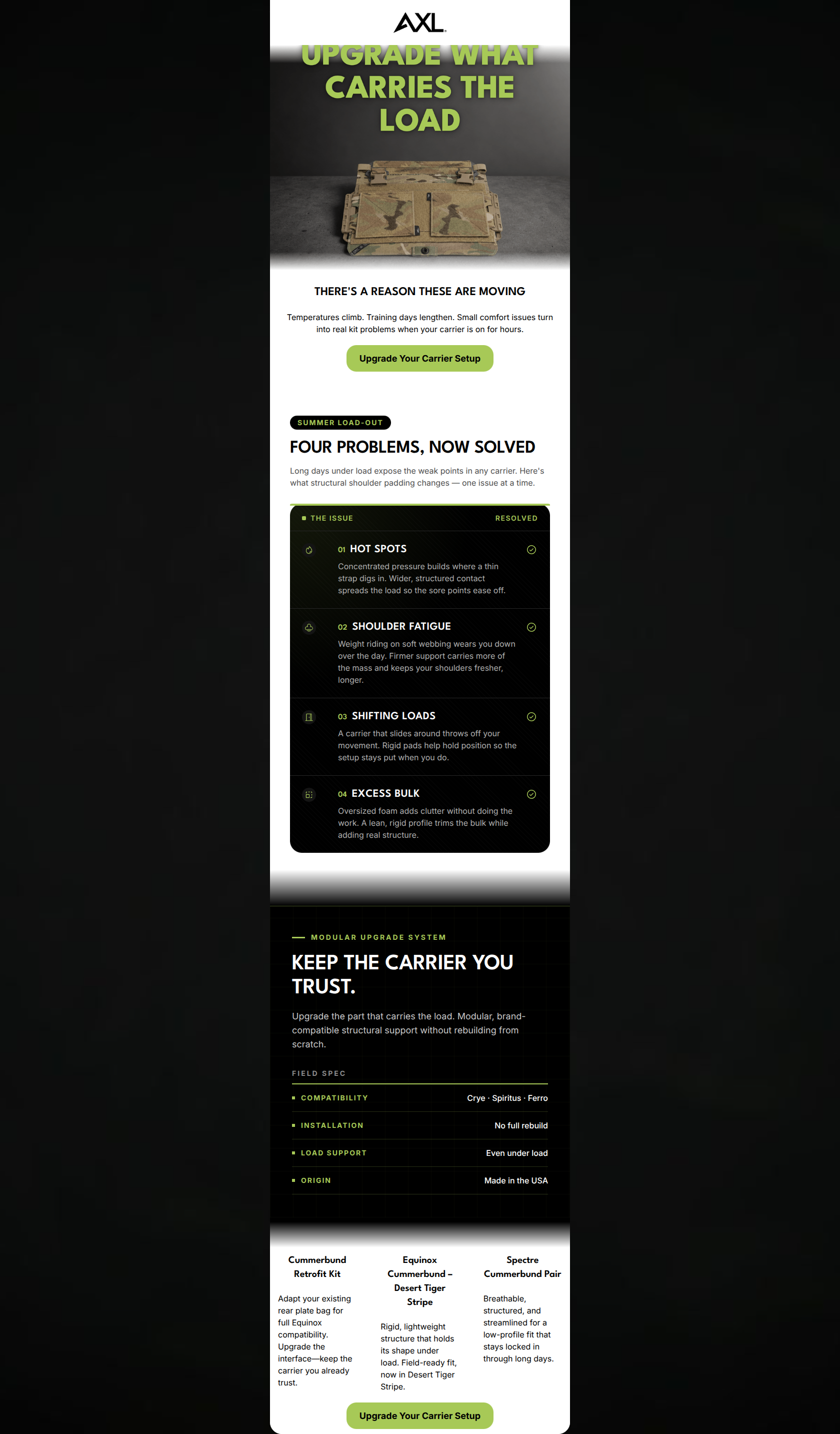
81/100AXL Advanced delivers a visually striking, on-brand email that perfectly captures the authoritative and technical tone required for its elite tactical audience. The use of high-contrast black, white, and neon green establishes a premium, mission-ready aesthetic that feels less like a marketing email and more like a tactical briefing. However, the email leaves conversions on the table by delaying the first call-to-action and creating a jarring narrative disconnect between the problem introduced (shoulder load) and the products showcased at the bottom (cummerbunds). **Color & Contrast Notes:** Excellent execution of the brand palette. The neon green (#A7C957) serves as a perfect, high-visibility accent against the #000000 canvas, making icons, dividers, and CTAs pop immediately. The 'spec panel' styling with white text on black backgrounds is both highly readable and thematically perfect.
Create Your Own
Generate professional email designs like this one in seconds with Kopi AI.
Email Details
- Subject Line
- This Summer Upgrade Is Moving Fast.
- Brand
- AXL Advanced
- Industry
- Outdoor & Sports
- Email Type
- Promotional
- Created
- July 13, 2026
Brand Colors
Email Copy
THERE'S A REASON THESE ARE MOVING
Temperatures climb. Training days lengthen. Small comfort issues turn into real kit problems when your carrier is on for hours.
→ Upgrade Your Carrier Setup
Cummerbund Retrofit Kit
Adapt your existing rear plate bag for full Equinox compatibility. Upgrade the interface—keep the carrier you already trust.
Equinox Cummerbund – Desert Tiger Stripe
Rigid, lightweight structure that holds its shape under load. Field-ready fit, now in Desert Tiger Stripe.
Spectre Cummerbund Pair
Breathable, structured, and streamlined for a low-profile fit that stays locked in through long days.
→ Upgrade Your Carrier Setup
Why This Email Works
AXL Advanced delivers a visually striking, on-brand email that perfectly captures the authoritative and technical tone required for its elite tactical audience. The use of high-contrast black, white, and neon green establishes a premium, mission-ready aesthetic that feels less like a marketing email and more like a tactical briefing. However, the email leaves conversions on the table by delaying the first call-to-action and creating a jarring narrative disconnect between the problem introduced (shoulder load) and the products showcased at the bottom (cummerbunds). **Color & Contrast Notes:** Excellent execution of the brand palette. The neon green (#A7C957) serves as a perfect, high-visibility accent against the #000000 canvas, making icons, dividers, and CTAs pop immediately. The 'spec panel' styling with white text on black backgrounds is both highly readable and thematically perfect.
Hero (top/initial part) Impact
75/100- The headline 'UPGRADE WHAT CARRIES THE LOAD' is powerful, relevant, and immediately addresses a core operator pain point.
- The stark, dark background makes the neon green typography highly impactful and draws the eye downward.
Content Structure & Flow
65/100- The 'Four Problems, Now Solved' section acts as a perfect bridge between recognizing a pain point and proving technical competence.
- The 'Field Spec' panel provides crucial compatibility information exactly when the user needs it to make a purchasing decision.
Visual Hierarchy & Layout
85/100- The black 'spec panels' with neon green hairline dividers create a highly sophisticated, engineered look.
- Information is chunked into distinct, easily digestible visual blocks, preventing the user from feeling overwhelmed.
Call-to-Action Strength
75/100- The neon green button color provides maximum contrast against the white and light grey backgrounds, passing the squint test with flying colors.
- The copy 'Upgrade Your Carrier Setup' is specific, consistent, and aligns perfectly with the brand's 'platform enhancement' positioning.
Message Clarity & Tone
82/100- Phrases like 'Small comfort issues turn into real kit problems' speak directly to the lived experience of the target audience.
- The tone in the 'Four Problems' section is clinical and diagnostic, perfectly matching the brand's engineered aesthetic.
Readability & Scannability
88/100- The use of numbered lists and icons in the 'Four Problems' section makes complex structural benefits effortless to read.
- The tabular format of the 'Field Spec' section allows for instant parsing of compatibility and installation data.
Offer & Value Proposition
85/100- The line 'Upgrade the part that carries the load. Modular, brand-compatible structural support without rebuilding from scratch' perfectly encapsulates the brand's core differentiator.
- Framing the value around 'solving problems' rather than just 'features' drives higher intent.
Personalization & Audience Fit
95/100- Explicitly listing compatibility with 'Crye · Spiritus · Ferro' acts as a massive trust signal for high-end operators.
- Addressing specific physical issues like 'Hot Spots' and 'Shoulder Fatigue' shows empathy for the physical toll of the job.
Copy Conciseness & Word Economy
85/100- The 'Four Problems' descriptions are perfectly distilled; 'Oversized foam adds clutter without doing the work' is an excellent, concise takedown of inferior gear.
- The Field Spec table relies on data points rather than sentences, minimizing cognitive load.
Quick Wins
- Move the first CTA button directly underneath the hero image, before the introductory text, to capture immediate high-intent clicks.
- Change the headline 'THERE'S A REASON THESE ARE MOVING' to a more authoritative, benefit-driven statement like 'ENDURANCE STARTS WITH STRUCTURE'.
- Convert the paragraph descriptions in the bottom product grid into concise bullet points for faster scanning.



Create Professional Email Designs
Generate beautiful, on-brand email designs in seconds. Just enter your brand URL and let AI do the rest.