Other Newsletter Email Template
“This Month's Digital Insights and BTB News”
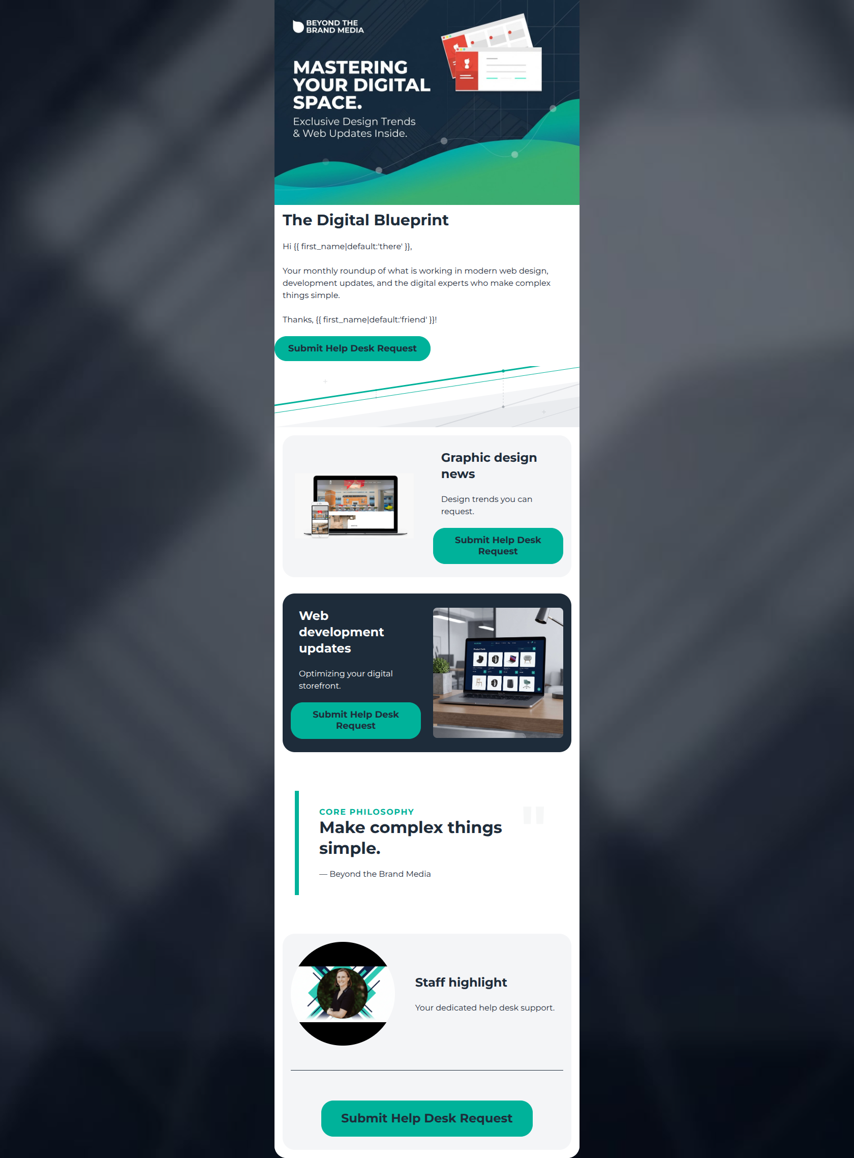
Design Score
39/100CRITICAL FAILURE: This email suffers from a severe identity crisis. It visually presents itself as a value-add newsletter ('Your monthly roundup', 'Graphic design news'), but every single Call-to-Action demands the user 'Submit Help Desk Request'. This bait-and-switch creates massive cognitive dissonance and will tank conversion rates. Note: The overall score has been capped at 50 due to this critical structural failure.
Create Your Own
Generate professional email designs like this one in seconds with Kopi AI.
Email Details
- Subject Line
- This Month's Digital Insights and BTB News
- Brand
- Beyond the Brand Media®
- Industry
- Other
- Email Type
- Newsletter
- Created
- March 10, 2026
Brand Colors
Email Copy
The Digital Blueprint
Hi there, Your monthly roundup of what is working in modern web design, development updates, and the digital experts who make complex things simple. Thanks, friend!
→ Submit Help Desk Request
Graphic design news
Design trends you can request.
→ Submit Help Desk Request
Web development updates
Optimizing your digital storefront.
→ Submit Help Desk Request
Staff highlight
Your dedicated help desk support.
→ Submit Help Desk Request
Why This Email Works
CRITICAL FAILURE: This email suffers from a severe identity crisis. It visually presents itself as a value-add newsletter ('Your monthly roundup', 'Graphic design news'), but every single Call-to-Action demands the user 'Submit Help Desk Request'. This bait-and-switch creates massive cognitive dissonance and will tank conversion rates. Note: The overall score has been capped at 50 due to this critical structural failure.
Hero (top/initial part) Impact
40/100- The hero graphic utilizes the brand's stark geometric diagonals and high-contrast color palette perfectly.
- The headline 'The Digital Blueprint' establishes a clear, authoritative name for the recurring communication.
Content Structure & Flow
35/100- The alternating card layout (light grey to navy) creates distinct, digestible visual blocks.
- The central pull quote acts as a great visual palate cleanser and reinforces the core brand positioning.
Visual Hierarchy & Layout
75/100- Excellent use of white space and padding. The email feels premium and uncluttered, matching the 'make complex things simple' ethos.
- Headings correctly dominate the visual hierarchy over the brief body text.
Call-to-Action Strength
10/100- The vibrant teal (#00B29A) against the varied backgrounds ensures the buttons are impossible to miss.
Message Clarity & Tone
25/100- The language used is free of dense technical jargon, adhering to the brand guidelines.
Readability & Scannability
80/100- Excellent contrast ratios across the board; the teal, white, and navy combination works perfectly for legibility.
- Paragraphs are exceptionally short, preventing any cognitive overload from 'walls of text'.
Offer & Value Proposition
20/100- The initial premise in the hero banner ('Your monthly roundup of what is working') is a strong, clear value proposition for the target audience.
Personalization & Audience Fit
30/100- The professional, clean aesthetic perfectly matches the expectations of a mid-range to premium commercial clientele.
Quick Wins
- Change all CTA copy. Replace 'Submit Help Desk Request' with context-appropriate phrases like 'Read the Article', 'See the Trends', or 'Talk to Our Team'.
- Remove the 'Thanks, {{ first_name }}!' sign-off from the hero section's introductory text block.
- Add 1-2 sentences of actual descriptive teaser copy to the 'Graphic design news' and 'Web development updates' cards so the user knows what they are clicking into.



Create Professional Email Designs
Generate beautiful, on-brand email designs in seconds. Just enter your brand URL and let AI do the rest.