SaaS & Software Newsletter Email Template
“The most productive thing looks unproductive”
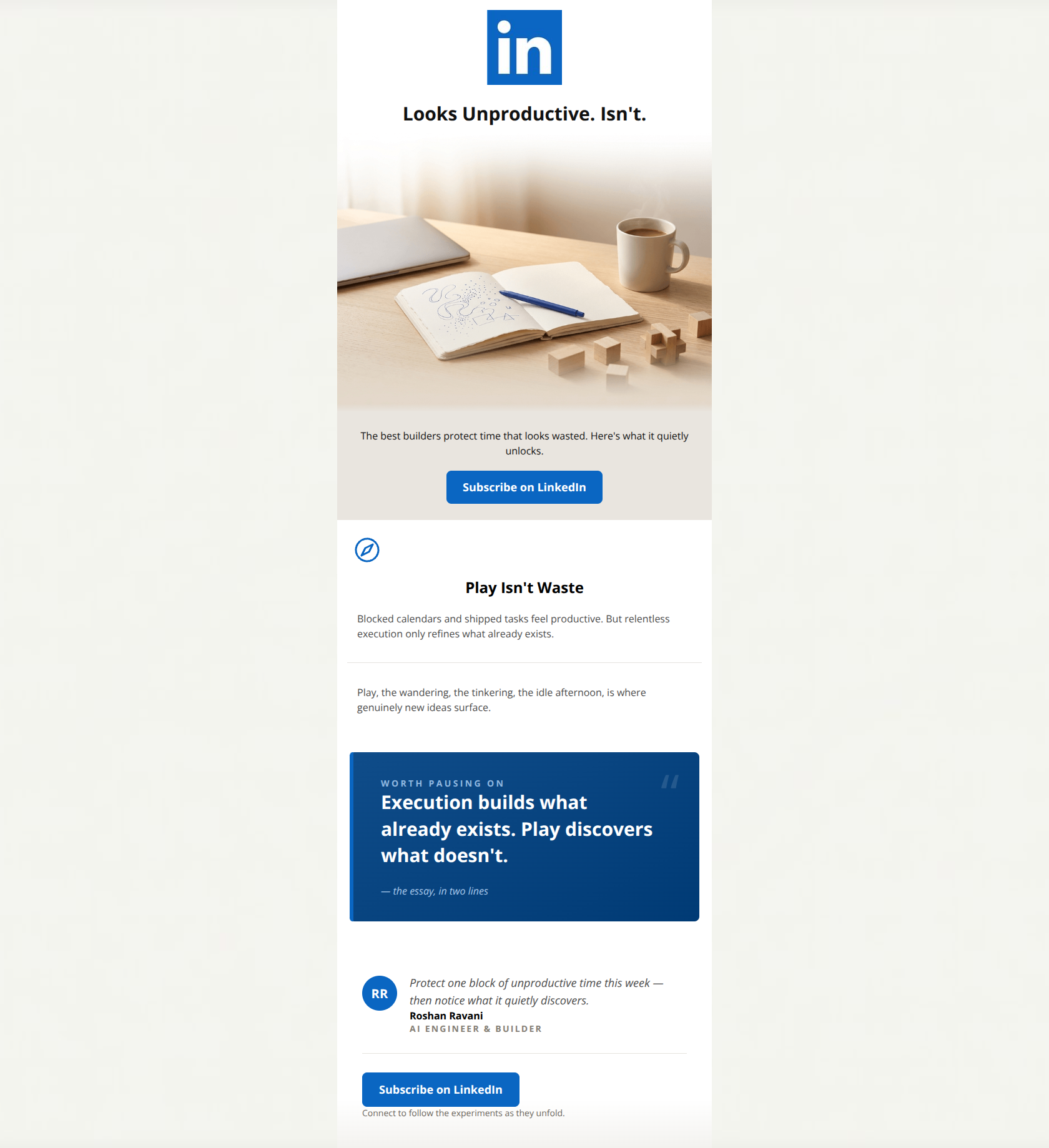
Design Score
88/100This is a highly effective, premium-feeling email that leverages a thought-provoking hook and clean, professional design to drive subscriptions. The visual hierarchy is superb, utilizing a custom pull-quote card to anchor the reader's attention. The primary weakness lies in a slight redundancy in the copy—the main body text and the stylized pull quote essentially say the exact same thing, missing an opportunity to introduce a concrete example that proves the thesis. Overall, it is a top-tier execution that respects the reader's time and aligns perfectly with the LinkedIn brand.
Create Your Own
Generate professional email designs like this one in seconds with Kopi AI.
Email Details
- Subject Line
- The most productive thing looks unproductive
- Brand
- Industry
- SaaS & Software
- Email Type
- Newsletter
- Created
- July 14, 2026
Brand Colors
Email Copy
Looks Unproductive. Isn't.
The best builders protect time that looks wasted. Here's what it quietly unlocks.
→ Subscribe on LinkedIn
Play Isn't Waste
Blocked calendars and shipped tasks feel productive. But relentless execution only refines what already exists.
Play, the wandering, the tinkering, the idle afternoon, is where genuinely new ideas surface.
Why This Email Works
This is a highly effective, premium-feeling email that leverages a thought-provoking hook and clean, professional design to drive subscriptions. The visual hierarchy is superb, utilizing a custom pull-quote card to anchor the reader's attention. The primary weakness lies in a slight redundancy in the copy—the main body text and the stylized pull quote essentially say the exact same thing, missing an opportunity to introduce a concrete example that proves the thesis. Overall, it is a top-tier execution that respects the reader's time and aligns perfectly with the LinkedIn brand.
Hero Impact
90/100- Excellent image-to-copy alignment.
- Generates immediate curiosity without feeling like clickbait.
- Clean, distraction-free header area.
Content Structure & Flow
85/100- Distinct visual bands (white to gray to white) effectively separate the intro from the core content.
- The author sign-off block provides a logical, satisfying conclusion to the reading experience.
Visual Hierarchy & Layout
95/100- Generous whitespace around text blocks reduces cognitive load.
- The dark blue card creates a necessary moment of contrast and pause.
- The footer gradient and circular avatar establish a premium, editorial feel.
Call-to-Action Strength
92/100- High-contrast button color ensures the CTA is impossible to miss.
- Clear, unambiguous verb ('Subscribe') sets precise expectations for the click.
- Consistent destination and messaging across all touchpoints.
Message Clarity & Tone
88/100- Language is sophisticated but highly accessible.
- Speaks directly to the psychographics of the target audience.
- Avoids corporate jargon entirely.
Readability & Scannability
94/100- Short, punchy sentences.
- Excellent use of font weights and sizes to differentiate headings, body, and quotes.
- High contrast typography throughout.
Offer & Value Proposition
82/100- Demonstrates value through actual content rather than just promising it.
- The author's credentials ('AI Engineer & Builder') add immediate authority to the offering.
Personalization & Audience Fit
90/100- Deeply resonant topic for the target demographic.
- Acknowledges the reality of modern white-collar workflows ('blocked calendars').
Copy Conciseness & Word Economy
78/100- No throat-clearing intro fluff; jumps straight into the narrative.
- Strong, active verbs used throughout.
Quick Wins
- Left-align the introductory text ('The best builders protect time...') to improve reading mechanics.
- Tweak the microcopy under the final CTA to be more benefit-driven (e.g., 'Join 5,000+ builders rethinking productivity').
- Align the compass icon perfectly with the H2 text for a cleaner grid.


Create Professional Email Designs
Generate beautiful, on-brand email designs in seconds. Just enter your brand URL and let AI do the rest.