Health & Wellness Newsletter Email Template
“This month: strengthen your foundation”
Design Score
81/100A highly effective, visually striking email that successfully translates ARMRA's clinical-luxe brand identity into a cohesive newsletter format. The structural pacing is excellent, using a strong alternating color palette to walk the user from an educational hook, to concrete clinical proof, and finally to a clear conversion point. While the visual execution is top-tier and the CTA strategy is flawless, the hero copy leans slightly too heavily on the 'meta' structure of the email rather than immediately hammering home the core product value proposition, leaving the strongest selling points (bioactive nutrients and clinical outcomes) further down the scroll.
Create Your Own
Generate professional email designs like this one in seconds with Kopi AI.
Email Details
- Subject Line
- This month: strengthen your foundation
- Brand
- ARMRA
- Industry
- Health & Wellness
- Email Type
- Newsletter
- Created
- May 7, 2026
Brand Colors
Email Copy
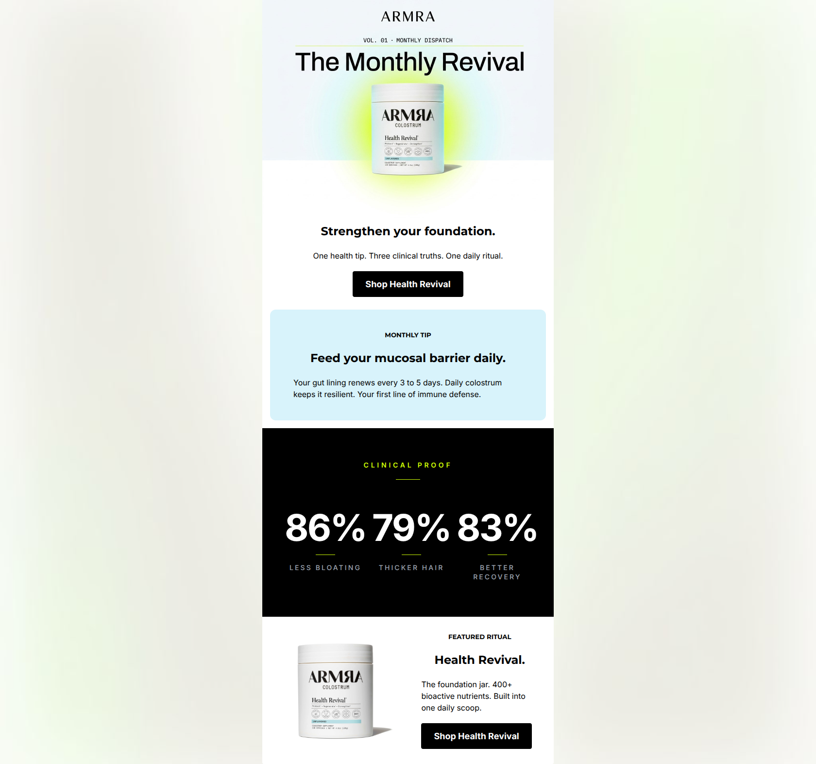
Strengthen your foundation.
One health tip. Three clinical truths. One daily ritual.
→ Shop Health Revival
MONTHLY TIP
Feed your mucosal barrier daily.
Your gut lining renews every 3 to 5 days. Daily colostrum keeps it resilient. Your first line of immune defense.
FEATURED RITUAL
Health Revival.
The foundation jar. 400+ bioactive nutrients. Built into one daily scoop.
→ Shop Health Revival
Why This Email Works
A highly effective, visually striking email that successfully translates ARMRA's clinical-luxe brand identity into a cohesive newsletter format. The structural pacing is excellent, using a strong alternating color palette to walk the user from an educational hook, to concrete clinical proof, and finally to a clear conversion point. While the visual execution is top-tier and the CTA strategy is flawless, the hero copy leans slightly too heavily on the 'meta' structure of the email rather than immediately hammering home the core product value proposition, leaving the strongest selling points (bioactive nutrients and clinical outcomes) further down the scroll.
Hero Impact
75/100- Excellent visual hierarchy and immediately identifiable product focus.
- High-contrast, prominent primary CTA positioned securely above the fold.
Content Structure & Flow
85/100- Flawless narrative pacing that educates before asking for the sale.
- Use of distinct background colors (white, light blue, black) to clearly demarcate different logical sections without confusing the eye.
Visual Hierarchy & Layout
82/100- The 'Clinical Proof' section is a brilliant use of contrast to highlight key data points.
- Generous padding and padding around text blocks reduces cognitive load and makes the email feel premium.
Call-to-Action Strength
90/100- Zero competition for the user's attention; only one action is requested.
- Consistent, repeated CTA copy reinforces the click path.
Message Clarity & Tone
80/100- Nails the 'clinical-luxe' brand voice without resorting to hyperbole.
- The educational tip is highly specific ('renews every 3 to 5 days') which builds immediate trust.
Readability & Scannability
85/100- Short, punchy paragraphs (maximum 3 sentences) that respect the reader's time.
- Excellent use of massive typography for the percentages (86%, 79%, 83%) to draw the scanning eye.
Offer & Value Proposition
72/100- The 'Clinical Proof' section brilliantly translates product features into tangible, desired outcomes for the customer.
Personalization & Audience Fit
75/100- Directly addresses customer pain points (bloating, recovery) with clinical solutions.
- Uses 'you/your' language ('Your gut lining', 'Feed your mucosal barrier') to center the reader.
Copy Conciseness & Word Economy
86/100- Zero throat-clearing in the body sections.
- Punchy, confident sentence structures that reinforce the brand's authoritative tone.
Quick Wins
- Replace the meta-subcopy in the hero ('One health tip...') with the '400+ bioactive nutrients' value proposition currently buried at the bottom.
- Brighten the muted gray text ('LESS BLOATING', etc.) in the black Clinical Proof block to ensure it passes strict contrast checks.
- Clarify in the hero that 'Health Revival' is the name of the unflavored colostrum jar.
Create Professional Email Designs
Generate beautiful, on-brand email designs in seconds. Just enter your brand URL and let AI do the rest.