Health & Wellness Announcement Email Template
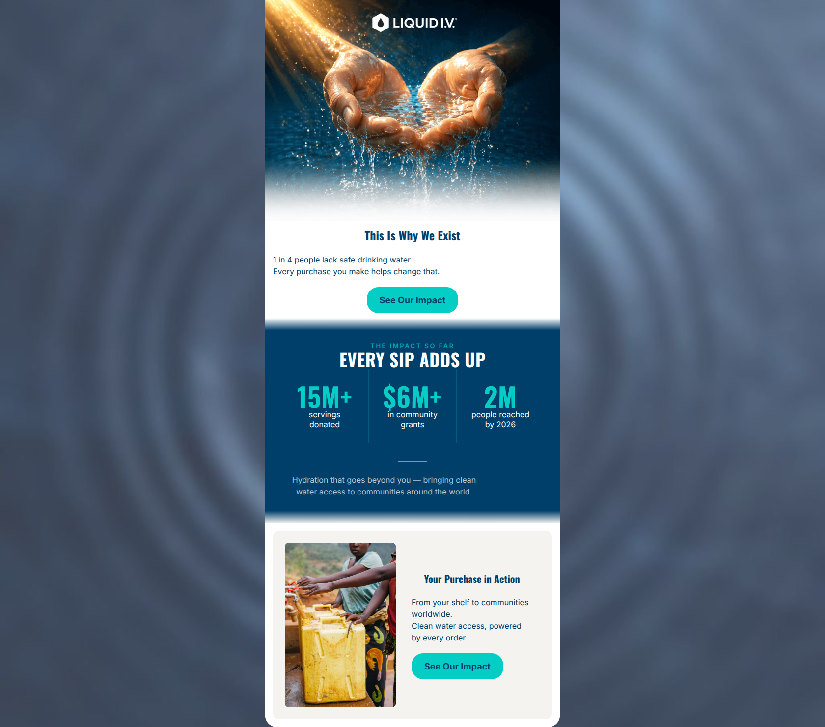
“This Is Why We Exist”
Design Score
83/100Liquid I.V. delivers a visually striking and emotionally resonant impact email that perfectly aligns with its purpose-driven brand voice. The email excels in visual hierarchy, utilizing a high-contrast palette and a highly scannable layout to guide the reader effortlessly toward a repeated, unambiguous call-to-action. By framing the customer as the catalyst for change ('Your Purchase in Action'), the copy successfully taps into the target audience's desire for ethical consumption. However, while the email is beautiful and conceptually sound, it lacks a compelling 'why now' factor. The narrative becomes slightly repetitive in the final section, and the absence of any tangible connection to a specific product or a timely milestone raises the barrier to actually clicking through. It is a very strong brand-building piece that could be optimized for higher click-through rates by introducing urgency and tighter narrative progression.
Create Your Own
Generate professional email designs like this one in seconds with Kopi AI.
Email Details
- Subject Line
- This Is Why We Exist
- Brand
- Liquid IV [eval 2026-03-26]
- Industry
- Health & Wellness
- Email Type
- Announcement
- Created
- April 24, 2026
Brand Colors
Email Copy
This Is Why We Exist
1 in 4 people lack safe drinking water. Every purchase you make helps change that.
→ See Our Impact
Your Purchase in Action
From your shelf to communities worldwide. Clean water access, powered by every order.
→ See Our Impact
Why This Email Works
Liquid I.V. delivers a visually striking and emotionally resonant impact email that perfectly aligns with its purpose-driven brand voice. The email excels in visual hierarchy, utilizing a high-contrast palette and a highly scannable layout to guide the reader effortlessly toward a repeated, unambiguous call-to-action. By framing the customer as the catalyst for change ('Your Purchase in Action'), the copy successfully taps into the target audience's desire for ethical consumption. However, while the email is beautiful and conceptually sound, it lacks a compelling 'why now' factor. The narrative becomes slightly repetitive in the final section, and the absence of any tangible connection to a specific product or a timely milestone raises the barrier to actually clicking through. It is a very strong brand-building piece that could be optimized for higher click-through rates by introducing urgency and tighter narrative progression.
Hero (top/initial part) Impact
85/100- Powerful, emotionally engaging imagery that instantly communicates the theme.
- Short, punchy headline that establishes the email's premise without fluff.
Content Structure & Flow
82/100- Excellent use of the inverted pyramid, funneling attention down to the first CTA.
- The dark stats block provides a strong visual break and shifts the tone effectively from emotional to factual.
Visual Hierarchy & Layout
88/100- High-contrast use of teal (#04CDC6) ensures key conversion elements and data points are unmissable.
- Clean, uncluttered layout with generous padding allows the message to breathe.
Call-to-Action Strength
90/100- Flawless repetition of the primary action, reinforcing the single goal of the email.
- Unbeatable color contrast for the buttons (teal background with navy text) against both white and beige section backgrounds.
Message Clarity & Tone
80/100- Avoids corporate jargon; uses stark, relatable facts ('1 in 4 people').
- Effectively frames the customer as the hero and catalyst for change ('Every purchase you make').
Readability & Scannability
85/100- Reliance on bold statistics and short text blocks caters perfectly to short attention spans.
- Clear typographical hierarchy separates headings from supporting context.
Offer & Value Proposition
75/100- Clearly articulates the brand's CSR mission, which is a major differentiator and value driver for their specific target audience.
Personalization & Audience Fit
80/100- Speaks directly to the values of a consumer who prioritizes corporate responsibility.
- Strong use of second-person pronouns shifts the focus from the brand's ego to the customer's contribution.
Copy Conciseness & Word Economy
85/100- No 'throat-clearing' intros. 'This Is Why We Exist' is a masterclass in brevity and intrigue.
- Data points are allowed to speak for themselves without being buried in paragraphs.
Quick Wins
- Revise the copy in the bottom 'Your Purchase in Action' card to introduce a specific, new detail rather than repeating the 'every purchase helps' sentiment already established in the hero.
- Increase the font weight of the descriptive labels (e.g., 'servings donated') under the large numerals in the stats block to ensure they remain legible on mobile screens.
- Remove the small, low-contrast text ('Hydration that goes beyond you...') at the bottom of the stats block to reduce visual clutter and tighten the section.

Create Professional Email Designs
Generate beautiful, on-brand email designs in seconds. Just enter your brand URL and let AI do the rest.