Fashion & Apparel Promotional Email Template
“The secret to all-day walking comfort”
Design Score
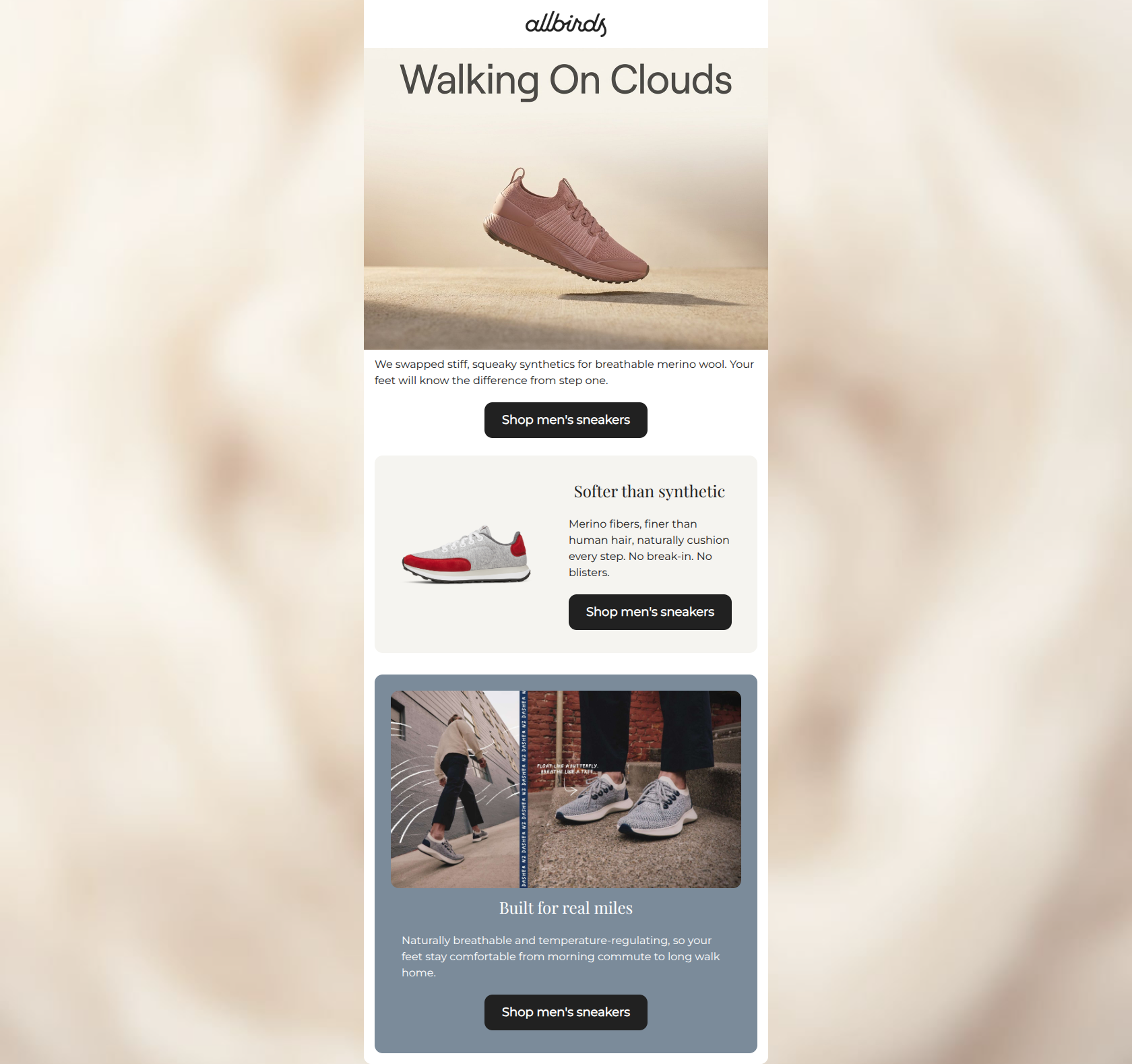
87/100This promotional email is a masterclass in concise, benefit-driven copywriting and strict adherence to conversion principles. By repeating the exact same primary CTA ('Shop men's sneakers') across three distinct sections, the email removes all ambiguity about the desired user action, significantly boosting the likelihood of a click. The tone perfectly captures the brand's unpretentious, innovative spirit. The primary areas holding the score back are structural: relying on embedded text in the hero image instead of live text, minor alignment inconsistencies, and a loss of CTA contrast in the final layout block.
Create Your Own
Generate professional email designs like this one in seconds with Kopi AI.
Email Details
- Subject Line
- The secret to all-day walking comfort
- Brand
- Kopi Agent Eval [2026-05-22]
- Industry
- Fashion & Apparel
- Email Type
- Promotional
- Created
- May 26, 2026
Brand Colors
Email Copy
We swapped stiff, squeaky synthetics for breathable merino wool. Your feet will know the difference from step one.
→ Shop men's sneakers
Softer than synthetic
Merino fibers, finer than human hair, naturally cushion every step. No break-in. No blisters.
→ Shop men's sneakers
Built for real miles
Naturally breathable and temperature-regulating, so your feet stay comfortable from morning commute to long walk home.
→ Shop men's sneakers
Why This Email Works
This promotional email is a masterclass in concise, benefit-driven copywriting and strict adherence to conversion principles. By repeating the exact same primary CTA ('Shop men's sneakers') across three distinct sections, the email removes all ambiguity about the desired user action, significantly boosting the likelihood of a click. The tone perfectly captures the brand's unpretentious, innovative spirit. The primary areas holding the score back are structural: relying on embedded text in the hero image instead of live text, minor alignment inconsistencies, and a loss of CTA contrast in the final layout block.
Hero Impact
75/100- High-quality imagery that visually demonstrates the 'lightness' value proposition.
- Immediate introduction of the primary CTA above the fold.
Content Structure & Flow
88/100- Clear progression of ideas that builds a compelling case for the product.
- Each section serves a distinct purpose without overlapping or repeating the previous block's message.
Visual Hierarchy & Layout
82/100- Excellent use of the brand's earthy color palette to differentiate content blocks.
- The layout successfully breaks up vertical monotony without becoming overly complex.
Call-to-Action Strength
96/100- Zero ambiguity: identical destination and copy across all buttons.
- Buttons are large, clear, and act as the definitive visual anchor for each section.
Message Clarity & Tone
94/100- Tone is approachable and educational without relying on jargon.
- Directly addresses customer pain points ('No break-in. No blisters.').
Readability & Scannability
86/100- Paragraphs are kept strictly to one or two sentences.
- Excellent contrast ratio between body text and canvas backgrounds.
Offer & Value Proposition
88/100- Strong focus on product superiority as the primary driver for clicks.
- Benefits are tied directly to daily realities (morning commute).
Personalization & Audience Fit
82/100- Imagery and copy align seamlessly with the audience's desired lifestyle of effortless, mindful utility.
Copy Conciseness & Word Economy
96/100- Zero fluff; high information density delivered in bite-sized formatting.
- 'No break-in. No blisters.' is a masterclass in economic benefit writing.
Quick Wins
- Center-align the body text in the hero section to match the button, eliminating visual raggedness.
- Change the background color of the final CTA button to white with dark text to maximize contrast against the slate blue background.
- Move the 'Walking On Clouds' headline out of the image asset and implement it as a live-text H1.



Create Professional Email Designs
Generate beautiful, on-brand email designs in seconds. Just enter your brand URL and let AI do the rest.