Health & Wellness Newsletter Email Template
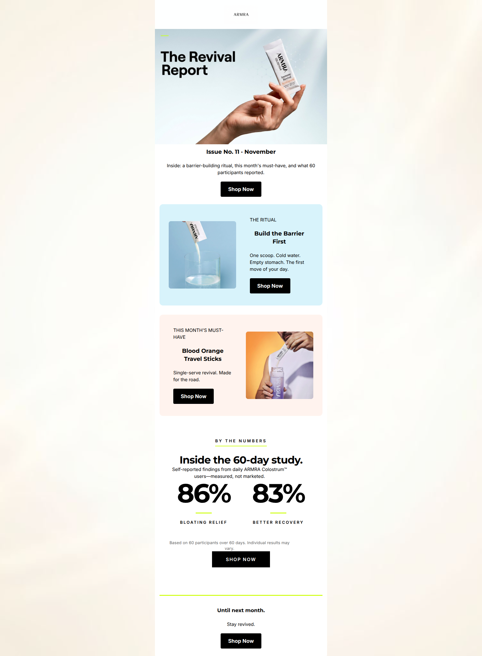
“The Revival Report: Your November Edition”
Design Score
88/100This is a highly effective, premium-feeling newsletter that flawlessly executes the brand's 'clinical-luxe' aesthetic. The copy is exceptionally tight, the visual hierarchy guides the eye effortlessly, and the inclusion of stark, oversized social proof acts as a massive conversion driver. While the modular structure is strong, minor inconsistencies in alignment and the premature placement of the first CTA present small opportunities to refine an already stellar email.
Create Your Own
Generate professional email designs like this one in seconds with Kopi AI.
Email Details
- Subject Line
- The Revival Report: Your November Edition
- Brand
- ARMRA
- Industry
- Health & Wellness
- Email Type
- Newsletter
- Created
- May 7, 2026
Brand Colors
Email Copy
Issue No. 11 · November
Inside: a barrier-building ritual, this month's must-have, and what 60 participants reported.
→ Shop Now
THE RITUAL
Build the Barrier First
One scoop. Cold water. Empty stomach. The first move of your day.
→ Shop Now
THIS MONTH'S MUST-HAVE
Blood Orange Travel Sticks
Single-serve revival. Made for the road.
→ Shop Now
Until next month.
Stay revived.
→ Shop Now
Why This Email Works
This is a highly effective, premium-feeling newsletter that flawlessly executes the brand's 'clinical-luxe' aesthetic. The copy is exceptionally tight, the visual hierarchy guides the eye effortlessly, and the inclusion of stark, oversized social proof acts as a massive conversion driver. While the modular structure is strong, minor inconsistencies in alignment and the premature placement of the first CTA present small opportunities to refine an already stellar email.
1. Hero Impact
78/100- High-quality, brand-aligned imagery that sets a premium tone.
- Clear expectation-setting with the teaser text.
- Excellent use of whitespace to let the hero image breathe.
2. Content Structure & Flow
90/100- Distinct visual containers clearly separate different topics.
- Logical narrative progression from routine to product to proof.
- Alternating image/text alignment in the content blocks keeps the eye engaged.
3. Visual Hierarchy & Layout
85/100- The 'By the Numbers' section is a masterclass in visual hierarchy, making the most important data impossible to miss.
- Excellent use of the brand's volt green as an accent color (dividers, underlines) without overwhelming the clinical black/white aesthetic.
- Clear, breathable layouts that prevent the email from feeling cluttered.
4. Call-to-Action Strength
92/100- Unambiguous, consistent primary action ('Shop Now') throughout the entire email.
- High contrast buttons that pass the squint test with ease.
- Strategic placement of CTAs immediately following value propositions (the ritual, the product, the stats).
5. Message Clarity & Tone
94/100- Empowering, active voice that speaks directly to the reader ('The first move of your day').
- Avoids hyperbolic claims, relying instead on stated benefits and self-reported data.
- Consistent brand voice that feels both clinical and luxurious.
6. Readability & Scannability
95/100- Punchy, telegraphic formatting ('One scoop. Cold water. Empty stomach.') makes consuming the information effortless.
- High contrast typography (black text on light backgrounds) ensures excellent legibility.
- Clear typographical hierarchy between kickers, headlines, and body copy.
7. Offer & Value Proposition
90/100- Anchors the value proposition in tangible, self-reported clinical outcomes.
- Frames the product as a solution to specific pain points (bloating, slow recovery).
- Effectively communicates the convenience factor of the travel sticks.
8. Personalization & Audience Fit
85/100- Language resonates deeply with an audience seeking 'optimization' and 'revival'.
- Aesthetic appeal aligns perfectly with the target demographic's premium expectations.
9. Copy Conciseness & Word Economy
96/100- 'One scoop. Cold water. Empty stomach. The first move of your day.' is a perfect example of communicating maximum information with minimum words.
- Every sentence drives the narrative forward or supports a conversion goal.
- Absence of weak adjectives ('incredible', 'amazing'); relies on nouns and verbs.
Quick Wins
- Standardize text alignment across the 'Ritual' and 'Must-Have' content cards (make both left-aligned) to resolve visual friction.
- Remove the 'Shop Now' button from the Hero section to allow the 'Table of Contents' to act solely as an engagement hook.
- Change the color of the legal disclaimer text under the stats to a medium grey so it recedes further into the background.
Create Professional Email Designs
Generate beautiful, on-brand email designs in seconds. Just enter your brand URL and let AI do the rest.