Outdoor & Sports Promotional Email Template
“The mouthguard you'll actually keep in”
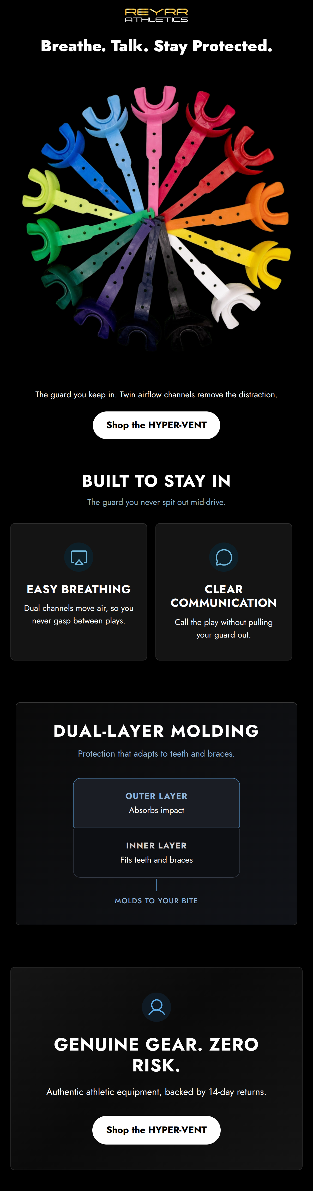
Design Score
84/100This is a structurally sound, highly scannable email that effectively communicates the mechanical benefits of the product. The layout follows a logical inverted pyramid, and the visual hierarchy clearly guides the eye to the primary action. However, the email pulls its punches regarding the brand's 'aggressive, authoritative' identity. The copy feels too clinical and standard for a brand aiming to be the 'demanding head coach' for elite athletes. While it functions well as a basic product feature breakdown, it leaves money on the table by not tapping into the emotional grit and pro-level aspirations of the target audience.
Create Your Own
Generate professional email designs like this one in seconds with Kopi AI.
Email Details
- Subject Line
- The mouthguard you'll actually keep in
- Brand
- Reyrr Athletics
- Industry
- Outdoor & Sports
- Email Type
- Promotional
- Created
- August 12, 2026
Brand Colors
Email Copy
Preview text: Two wide airflow channels mean you breathe and talk without pulling your guard out.
Breathe. Talk. Stay Protected.
The guard you keep in. Twin airflow channels remove the distraction.
→ Shop the HYPER-VENT
Why This Email Works
This is a structurally sound, highly scannable email that effectively communicates the mechanical benefits of the product. The layout follows a logical inverted pyramid, and the visual hierarchy clearly guides the eye to the primary action. However, the email pulls its punches regarding the brand's 'aggressive, authoritative' identity. The copy feels too clinical and standard for a brand aiming to be the 'demanding head coach' for elite athletes. While it functions well as a basic product feature breakdown, it leaves money on the table by not tapping into the emotional grit and pro-level aspirations of the target audience.
Hero (top/initial part) Impact
85/100- Punchy, benefit-driven headline.
- High-contrast product imagery pops immediately.
Content Structure & Flow
90/100- Clear inverted pyramid structure.
- Information is chunked into easily digestible sections rather than walls of text.
Visual Hierarchy & Layout
80/100- Excellent use of the brand's stark black, white, and blue palette.
- Feature cards utilize borders and spacing effectively to separate concepts.
Call-to-Action Strength
95/100- Singular destination focus (no competing links).
- High visual contrast (black text on white pill button stands out prominently).
Message Clarity & Tone
70/100- Copy clearly connects features to specific in-game benefits (breathing, calling plays).
- No confusing jargon; the mechanical benefits are easy to understand.
Readability & Scannability
92/100- Excellent use of headers and sub-headers to establish hierarchy.
- Zero paragraphs; entirely relies on tight, focused text blocks.
Offer & Value Proposition
78/100- Addresses specific, painful player problems (taking the guard out to call plays).
- Includes a strong risk-reversal element at the close.
Personalization & Audience Fit
82/100- Copy focuses on specific in-game scenarios ('mid-drive', 'call the play').
Copy Conciseness & Word Economy
94/100- Zero filler phrases or marketing fluff.
- Features are distilled down to their most concise benefit statements.
Quick Wins
- Rewrite the hero subcopy to use the aggressive brand voice (e.g., 'Engineered for the elite. Oxygenate faster. Call the play. Never compromise.').
- Add a third 'Shop the HYPER-VENT' button between the two-column feature section and the Dual-Layer section.
- Replace the generic user icon in the footer with a shield or lock icon to better match the 'tactical armory' aesthetic.


Create Professional Email Designs
Generate beautiful, on-brand email designs in seconds. Just enter your brand URL and let AI do the rest.