Outdoor & Sports Newsletter Email Template
“Let us grace your feed”
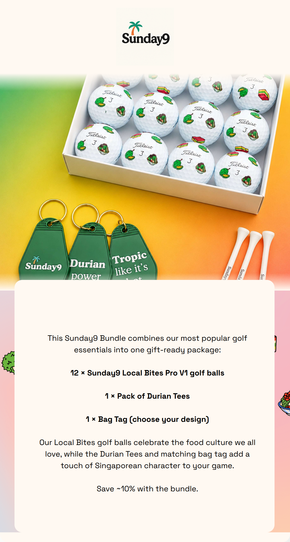
Design Score
84/100Sunday9 delivers a visually cohesive and punchy social-first newsletter that perfectly aligns with its 'weekend-relaxed' aesthetic. The email is exceptionally lean, avoiding the common mistake of over-explaining. It follows the primary CTA rule flawlessly, maintaining a single destination to drive traffic. The main weakness is a lack of immediate brand differentiation in the hero section—the generic 'Grip It and Rip It' headline and plain white tee imagery don't immediately communicate the brand's unique localized/cheeky value proposition, which only appears later in the scroll.
Create Your Own
Generate professional email designs like this one in seconds with Kopi AI.
Email Details
- Subject Line
- Let us grace your feed
- Brand
- Sunday9
- Industry
- Outdoor & Sports
- Email Type
- Newsletter
- Created
- September 1, 2026
Brand Colors
Why This Email Works
Sunday9 delivers a visually cohesive and punchy social-first newsletter that perfectly aligns with its 'weekend-relaxed' aesthetic. The email is exceptionally lean, avoiding the common mistake of over-explaining. It follows the primary CTA rule flawlessly, maintaining a single destination to drive traffic. The main weakness is a lack of immediate brand differentiation in the hero section—the generic 'Grip It and Rip It' headline and plain white tee imagery don't immediately communicate the brand's unique localized/cheeky value proposition, which only appears later in the scroll.
Hero (top/initial part) Impact
76/100- Excellent use of vertical space with a high-impact product image.
- Clear brand identity with the logo prominently placed at the top.
Content Structure & Flow
88/100- Inverted pyramid structure in the top section effectively funnels attention to the first CTA.
- The mosaic layout provides a non-linear but highly scannable 'buffet' of brand attributes.
Visual Hierarchy & Layout
91/100- The asymmetric grid is visually engaging and keeps the eye moving.
- Typography is consistent and reflects the brand's modern, bold personality.
Call-to-Action Strength
82/100- Excellent high-contrast buttons that pass the 'squint test'.
- Consistent use of 'Join the Club' reinforces the community-focused objective.
Message Clarity & Tone
85/100- Avoids corporate jargon entirely.
- The 'Why Hang With Us' headers are punchy and benefit-driven.
Readability & Scannability
95/100- Short, punchy sentences.
- Checkmark icons in the mosaic help the eye quickly categorize the benefits.
Offer & Value Proposition
74/100- The 'Cheeky local vibes' tile successfully highlights the brand's core differentiator.
Personalization & Audience Fit
80/100- Lifestyle imagery feels authentic rather than like stock photography.
Copy Conciseness & Word Economy
98/100- Eliminates 'throat-clearing' openers.
- Uses visual tiles to replace long descriptive paragraphs.
Quick Wins
- Replace the hero image of generic white tees with a shot of the custom-printed Titleist balls to show off the brand's 'secret sauce' immediately.
- Add the @sunday9.shop Instagram handle as a text link in the first section to provide a direct path for social growth.
- Update the hero headline to something more 'disruptive' and less cliché.



Create Professional Email Designs
Generate beautiful, on-brand email designs in seconds. Just enter your brand URL and let AI do the rest.